Which new ORM logo is the best?

Nullium

Registered Member
Joined
Oct 12, 2015
Messages
50
Reaction score
20
I have an ORM business that's doing well, but I wanted to 're-brand' it with a new name and logo. Luckily, I don't advertise the business and reach out to businesses instead of the other way around so a change won't make a huge impact on business.

I designed them with the words local, map, quote, review, and help in mind. I wanted them to be minimalistic but clever.

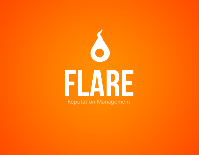
The first one is a basic map pin, but upside down to look like a flame.
The second is supposed to be a combination of a rhinoceros and a typographical quote mark.
The third is also a map pin made to look like a rocket ship.

Which one should I use? I want your first impression of them, good or bad! :)
 

Attachments

  • flarerm.png
    flarerm.png
    89.6 KB · Views: 41
  • rhinorm.png
    rhinorm.png
    153.9 KB · Views: 43
  • rocketrm2.png
    rocketrm2.png
    162.3 KB · Views: 38
I like the first one, but I think it would look even better if you made it look a little more like a flame.

A bit like this, but cleaner.
DPAXZc1
 
I like the first one, but I think it would look even better if you made it look a little more like a flame.
A bit like this, but cleaner.

Zwielicht, thank you for your suggestion. I agree that the upside-down map pin doesn't look enough like a flame, so if I choose that one I will definitely make it look more like the image you made. Thank you again.
 
A fellow reputation management professional. Nice to meet you.

Rhino, 100%. I love the simplicity and dual meaning of a comma on its side.
 
My vote's for Flare. Zwielicht's modification makes it look even cooler.
 
The FLARE one looks the best and with just a bit of work will become great.
 
A fellow reputation management professional. Nice to meet you.
Rhino, 100%. I love the simplicity and dual meaning of a comma on its side.

Sherbert Hoover,

It's good to meet you too. I've been lurking around the forums forever and finally decided to hop on-board after all of these years. I thought the Rhino one was always the most clever. If I don't end up going with two of the three, they're up for grabs if anyone wants them. ;) Have you had quite a bit of success with ORM also? I'm thinking of starting a very detailed journey soon...

My vote's for Flare. Zwielicht's modification makes it look even cooler.
First one
The FLARE one looks the best and with just a bit of work will become great.

It looks like I may be heading towards the Flare logo/name... Aww, no love for the rocket? Haha.
 
Last edited:
Sherbert Hoover,
It looks like I may be heading towards the Flare logo/name... Aww, no love for the rocket? Haha.
I thought all 3 of them were creative, but I was drawn more to the Flare logo more thaan the rocket logo.

Originally, I would've gone with the rhino logo, but I feel like it could be interpreted as "phallic imagery" by some people (yes, I know, that sounds a bit silly). In other words, they may see the rhino logo more like this:
8rnsfJL.jpg


Other than that, it's definitely a close second and Sherbert made a good point about the rhino logo.

As for the rocket, I just feel like I've seen that somewhere before. Maybe it looks like a logo I saw on an ice cream bar or a pack of gum I bought 10 years ago, I'm not sure.
 
Last edited:
I thought all 3 of them were creative, but I was drawn more to the Flare logo. Originally, I would've gone with the rhino logo, but I feel like it could be interpreted as "phallic imagery" by some people. In other words, they may see the rhino logo more like this: [Hilarious Image Here] Other than that, it's definitely a close second. As for the rocket, I just feel like I've seen that somewhere before.

Hahaha, thanks for the good laugh Zwelicht, I should definitely have seen that one coming! I was messing with a lot of designs in Photoshop, I can definitely see any one of these being made before since they're so simple. I'm working on a new Flare one based on your suggestion, there's still a lot of tweaking to do (it's not perfectly round or centered among other things).

Once again, thank you all for your input! It's highly appreciated.
 

Attachments

  • flare.png
    flare.png
    94.4 KB · Views: 5
That looks great! I guess you added the flame on the right to the side of the oval and the location dot looks just a tiny bit off center which annoys the living crap out of an OCD I didn't know I have. If I were you I'd add just a bit of meat to the left or shave a tiny bit off the right, just to have the dot be an equal distance from both sides. I'm not sure it's worth it and I doubt many people would notice it. But yeah, FLARE is a nice name and the logo looks very nice.
 
I like the rhino best but it seems most prefer the first one. In general all look great. You created this yourself?

As http://www.blackhatworld.com/members/zwielicht.701565/ mentioned, the rocket one feels familiar and I would avoid using it.
 
That looks great! I guess you added the flame on the right to the side of the oval and the location dot looks just a tiny bit off center which annoys the living crap out of an OCD I didn't know I have. If I were you I'd add just a bit of meat to the left or shave a tiny bit off the right, just to have the dot be an equal distance from both sides. I'm not sure it's worth it and I doubt many people would notice it. But yeah, FLARE is a nice name and the logo looks very nice.

Haha, I completely felt the OCD twitch coming on when I was whipping that new Flare design up. It's off by a tiny bit, but it's bugging me also (will be fixing when I have time). Thanks for the kind words, I appreciate the info!

I like the rhino best but it seems most prefer the first one. In general all look great. You created this yourself? As Zwielicht mentioned, the rocket one feels familiar and I would avoid using it.

Thanks for the input George! I'm glad you like the Rhino best, I like it a lot too but like you said it seems most like the Flare. Yes, I whipped them up in Photoshop. I did a search on Google Images to see if I could find anything that looked like it. If anyone finds something that looks like it let me know! I'll 'disqualify' it if so, haha. :)
 
Thank you for the input RuthSam! Noted...
 
Honestly I don't really like them. I suggest you to take a look on the app store (apple's app store), and check under finance category, there you'll find some great logos for inspiration.

I like Base's and Mint's logo to give you an idea. I chose to use them just because of their colors, sleek designs, and yes, logos.

Behance under branding category is also great.
 
Honestly I don't really like them. I suggest you to take a look on the app store (apple's app store), and check under finance category, there you'll find some great logos for inspiration. I like Base's and Mint's logo to give you an idea. I chose to use them just because of their colors, sleek designs, and yes, logos. Behance under branding category is also great.

Completely understandable! I don't normally do logos like this (especially this minimalistic). I tried it this way to tie into the new website (extremely simple but sleek) for my non-tech savvy clients. I really appreciate the input and will take that into consideration before I finalize anything. I honestly didn't know how well the style would hold up here.
 
Last edited:
Back
Top