Nullium
Registered Member
- Oct 12, 2015
- 50
- 20
I have an ORM business that's doing well, but I wanted to 're-brand' it with a new name and logo. Luckily, I don't advertise the business and reach out to businesses instead of the other way around so a change won't make a huge impact on business.
I designed them with the words local, map, quote, review, and help in mind. I wanted them to be minimalistic but clever.
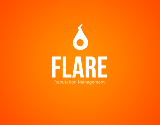
The first one is a basic map pin, but upside down to look like a flame.
The second is supposed to be a combination of a rhinoceros and a typographical quote mark.
The third is also a map pin made to look like a rocket ship.
Which one should I use? I want your first impression of them, good or bad!
I designed them with the words local, map, quote, review, and help in mind. I wanted them to be minimalistic but clever.
The first one is a basic map pin, but upside down to look like a flame.
The second is supposed to be a combination of a rhinoceros and a typographical quote mark.
The third is also a map pin made to look like a rocket ship.
Which one should I use? I want your first impression of them, good or bad!