
I am working on a campaign that is about educating the unprivileged children, for that we had to illustrate different designs. I am sharing the logo I made for this campaign.
About the logo: the backend is a metaphor for pencil, focusing on the significance of education. The front describes a candle, a metaphor for excel.
The concept is that through the use of a pencil, one can make his future bright.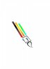
I want you people to share your comments. Criticism will also be appreciated.
About the logo: the backend is a metaphor for pencil, focusing on the significance of education. The front describes a candle, a metaphor for excel.
The concept is that through the use of a pencil, one can make his future bright.
I want you people to share your comments. Criticism will also be appreciated.