Critique My Logo!!

Lol @ dudes telling him to outsource.

Italic looks much better. If I had to critique one thing it would be the sharpness. The outsides of the top layer of 'Cash' could be better quality. Maybe it's just how you're outputting it or something.

Other than that, insane shit as usual.
 
Very, very nice. The italics definitely looks better. All I can say is do with the 'A' as you did in the second one.

I've seen a lot of your work around, you're a very talented designer. Keep it up.
 
Thanks for all your very kind words everyone!!

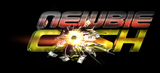
I made some more changes based on everyone's input., went back to italic I like the idea of "fast money".
M0XB8
 
Last edited:
i think it looks great. the "A" is a little hard to read but really doesn't matter much since it is easy to see what it is supposed to be. Good job
 
Thanks for all your very kind words everyone!!

I made some more changes based on everyone's input., went back to italic I like the idea of "fast money".

M0XB8


Looks Amazing.

I am certainly part of your niche. I would like to either see some extra bling, or a little more vibrant coloring as previously mentioned for example in the BHW logo.

Plus the picture of @IntenseE 's cat would really actually be perfect in creating more extensive stir within the newbie market.

Overall you rock Kayzne, your work rocks, and I am sure whatever this logo is leading up to is going to be massively profitable!

 
I thinks it a real visually impacting logo but my eye is still drawn to the explosion of cash over the A and I remember that more than the name itself.

If you are liking the idea of 'fast money', how about getting rid of the cash explosion over the A, adding some car wheels at the bottom middle of C and H, then having the explosion of cash from an exhaust pipe at the back.
 
I thinks it a real visually impacting logo but my eye is still drawn to the explosion of cash over the A and I remember that more than the name itself.

If you are liking the idea of 'fast money', how about getting rid of the cash explosion over the A, adding some car wheels at the bottom middle of C and H, then having the explosion of cash from an exhaust pipe at the back.

I am loving your creativity about the car idea! Although I think it's nice n subtle the way it is.

Tag lines good be as it is now

"Explosive Results"

"Explosive Cash Flow"

"Explode your cash flow"
 
Good logo, but the "A" at "cash" is way too confusing :/ Try to balance it so it is more readable.
 
Nice design and skill...

But I'm not so sure things (design, texture etc) jive with the words NEWBIE and CASH.

Each word should have a soul and meaning, and the design of the text should reflect that. :)
 
Id keep it like it is now.... did you make it yourself? ifso man you are really good.;)
 
I think it looks great, although some people are saying the A is hard to pick up, you don't need every letter to be clearly visible, as long as the purpose of the logo is clear (in this case since you have money in the logo, 'cash' instantly comes to the viewers mind). Definetely prefer it in italics also.
 
Looking at your latest revised logo again, I had another idea of making the hole in the A look like a keyhole with the cash exploding out, as in 'doorway to internet riches'.

Often get ideas looking at art, even though i couldn't produce anything near that quality LOL.
 
i also think it looks great! the only problem i see is the letter "A". it's hard to see, and that's the first thing that i noticed.

other than that, it's awesome! :)
 
Back
Top