
TheGreenMachine
BANNED
- Jul 9, 2011
- 93
- 17
nice work on the logo dude,


Thanks for all your very kind words everyone!!
I made some more changes based on everyone's input., went back to italic I like the idea of "fast money".
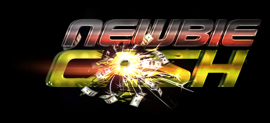


I thinks it a real visually impacting logo but my eye is still drawn to the explosion of cash over the A and I remember that more than the name itself.
If you are liking the idea of 'fast money', how about getting rid of the cash explosion over the A, adding some car wheels at the bottom middle of C and H, then having the explosion of cash from an exhaust pipe at the back.
Wow, that looks great IMO! How long did that take to put together OP?
3-4 Hours or so. With revisions included.

Good logo, but the "A" at "cash" is way too confusing :/ Try to balance it so it is more readable.


Id keep it like it is now.... did you make it yourself? ifso man you are really good.
Yes i did!


