
You are using an out of date browser. It may not display this or other websites correctly.
You should upgrade or use an alternative browser.
You should upgrade or use an alternative browser.
I Need Feedback On My Logo
- Thread starter Proxy Cake
- Start date


- Feb 28, 2010
- 5,501
- 4,420
Thats nice do u freelance?
Yeah I do mate.

Webbers UX
Elite Member
- Apr 3, 2010
- 4,944
- 5,288
Maybe a bit more metallic color  ?
?
?
kayzne
Power Member
- Dec 26, 2007
- 705
- 1,968
You can do better than that man. Start over.
There's nothing unique about it. "Abstract" I don't see it within the typography. The font is a basic sans serif.
It's clean, sure, but..boring, not very memorable. More Color, Modern font, something. It's bland.
<3 you tho!
There's nothing unique about it. "Abstract" I don't see it within the typography. The font is a basic sans serif.
It's clean, sure, but..boring, not very memorable. More Color, Modern font, something. It's bland.
<3 you tho!
- Feb 28, 2010
- 5,501
- 4,420
You can do better than that man. Start over.
There's nothing unique about it. "Abstract" I don't see it within the typography. The font is a basic sans serif.
It's clean, sure, but..boring, not very memorable. More Color, Modern font, something. It's bland.
<3 you tho!
It was actually Myraid Pro! Lol. Na you're right though, def gotta change the font

VelvetVampire
Junior Member
- Apr 29, 2010
- 105
- 46
maybe its too early or i didnt have enough coffee yet but i cant spot the difference between the 2 lol. nice design IMO tho


badut jenaka
Regular Member
- Apr 11, 2010
- 276
- 69
Change the font to that reflect "abstract" would be perfect I think..
- Feb 28, 2010
- 5,501
- 4,420
Change the font to that reflect "abstract" would be perfect I think..
Check it
- Feb 28, 2010
- 5,501
- 4,420
Getting better!!!!
P.S. I love Myriad Pro
Usually!! hahaha

- Feb 28, 2010
- 5,501
- 4,420
Seems I cant edit the original post so here it is with some color added.. A little too much maybe? Also look in the glass of the helmet, theres a reflection of space Also I'm going to change the text. Just put it up like that for now.
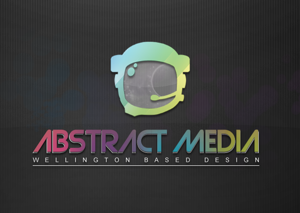
Also I'm going to change the text. Just put it up like that for now.
Last edited:
badut jenaka
Regular Member
- Apr 11, 2010
- 276
- 69

amazingRay
Junior Member
- Jun 15, 2010
- 140
- 25
naaaah facebookdude, don't like yours. no offence though, it looks good but too much colors for my liking! from the original ones i like the 3rd one, the font of it and the underlines kinda fit the logo.
Last edited: