
You are using an out of date browser. It may not display this or other websites correctly.
You should upgrade or use an alternative browser.
You should upgrade or use an alternative browser.
Low Adsense Revenue
- Thread starter boujlal
- Start date
-
- Tags
- adsense viral website
- Status
- Not open for further replies.


boujlal
Newbie
- May 26, 2017
- 5
- 0
How?
How?I can help you out.


simplestyle
BANNED
- May 27, 2017
- 21
- 4
USA, UK,FR, etc.. is good Audience
boujlal
Newbie
- May 26, 2017
- 5
- 0
The problem is the number of clicks.revenue mostly based visitor country. If your visitors are from NON USA then its seems to be normal.
ThefrostIntel
BANNED
- Mar 22, 2017
- 106
- 14
Try to target tier 1 countries. For that ratio, I think you are getting traffic from tier 3's..
If you need guidelines, pretty sure there are plenty out there. Just use the search box.
Good luck!
If you need guidelines, pretty sure there are plenty out there. Just use the search box.
Good luck!

GeorgeCarl
Junior Member
- Jun 30, 2012
- 147
- 112
I'd recommend experimenting with ad-layouts, your CTR is way too low which is hurting your RPM and revenue.
boujlal
Newbie
- May 26, 2017
- 5
- 0
I'm using 3 336x280 Ad units inside articlesMake sure to use a banner above the fold possibly a 728x90 banner, also add a 300x250 banner and a banner inside articles.

curiouskt
Regular Member
- Apr 5, 2017
- 233
- 146
Best practices for ad placement
Organise your site content logically and make your website easy to navigate. Here are a few questions to ask yourself when considering where to position your ads:
Show off your content
above the fold and easy to find.
For more tips about how to balance content and ads, see our Inside AdSense blog post: Content is king.
Keep your ads looking like ads
Choosing ad colours that complement your website is great, but avoid aligning images with your ads or making nearby content mimic their formatting. Displaying ads like this isn't permitted by our programme policies.
Call them what they are
While it may be tempting to call them "resources" or to place them immediately below your website's headings, take care to avoid labels and headings that may mislead users. Ad units may only be labelled as "Advertisements" or "Sponsored links". Also, avoid placing ads in locations where they might be confused with menu, navigation or download links.
Less can be more
Provided that you don't place more ads than content on your pages, you can put a combination of ad units, link units and/or search boxes on each page of your site. See our valuable inventory policy for more information. However, bear in mind that placing lots of ads on your page may make it look cluttered. If users can't find what they're looking for on your website, then they may turn elsewhere for information.
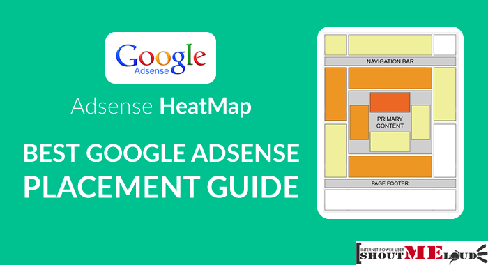
First, consider your usersI'm using 3 336x280 Ad units inside articles
Organise your site content logically and make your website easy to navigate. Here are a few questions to ask yourself when considering where to position your ads:
- What is the user trying to accomplish by visiting my website?
- What do they do when viewing a particular page?
- Where is their attention likely to be focused?
- How can I integrate ads into this area without getting in the users' way?
- How can I keep the page looking clean, uncluttered and inviting?
Show off your content
above the fold and easy to find.
For more tips about how to balance content and ads, see our Inside AdSense blog post: Content is king.
Keep your ads looking like ads
Choosing ad colours that complement your website is great, but avoid aligning images with your ads or making nearby content mimic their formatting. Displaying ads like this isn't permitted by our programme policies.
Call them what they are
While it may be tempting to call them "resources" or to place them immediately below your website's headings, take care to avoid labels and headings that may mislead users. Ad units may only be labelled as "Advertisements" or "Sponsored links". Also, avoid placing ads in locations where they might be confused with menu, navigation or download links.
Less can be more
Provided that you don't place more ads than content on your pages, you can put a combination of ad units, link units and/or search boxes on each page of your site. See our valuable inventory policy for more information. However, bear in mind that placing lots of ads on your page may make it look cluttered. If users can't find what they're looking for on your website, then they may turn elsewhere for information.

Blakester
Supreme Member
- Mar 17, 2012
- 1,245
- 1,425
This might the reason that kills your CTR. Use one at the top under the logo or next to the logo, one 300x250 or 250x250 above the fold too and one inside articles or footer. Experiment to see what's best for you.I'm using 3 336x280 Ad units inside articles


HoZoBoRoLo
Regular Member
- Mar 25, 2017
- 364
- 71
I think you can block low CPC from Adsense that could be helpful...
http://www.crackout.in/block-low-cpc-adsense-list-2017/
http://www.crackout.in/block-low-cpc-adsense-list-2017/

SejtanovRatnik
Regular Member
- Nov 26, 2015
- 484
- 238
Clickjacking will fix your problem!

CopyPasteKingdom
BANNED
- Jun 18, 2014
- 140
- 36
Clickjacking will fix your problem!
LOL dude, how many accounts have you burnt so far?

boujlal
Newbie
- May 26, 2017
- 5
- 0
What do you mean?LOL dude, how many accounts have you burnt so far?
- Status
- Not open for further replies.
This thread has been auto closed due to the forum's thread age policy. Read more.