This Landing Page : Good or S#it?

Joined
Mar 17, 2018
Messages
761
Reaction score
263
Hey all, what do you think of this landing page?
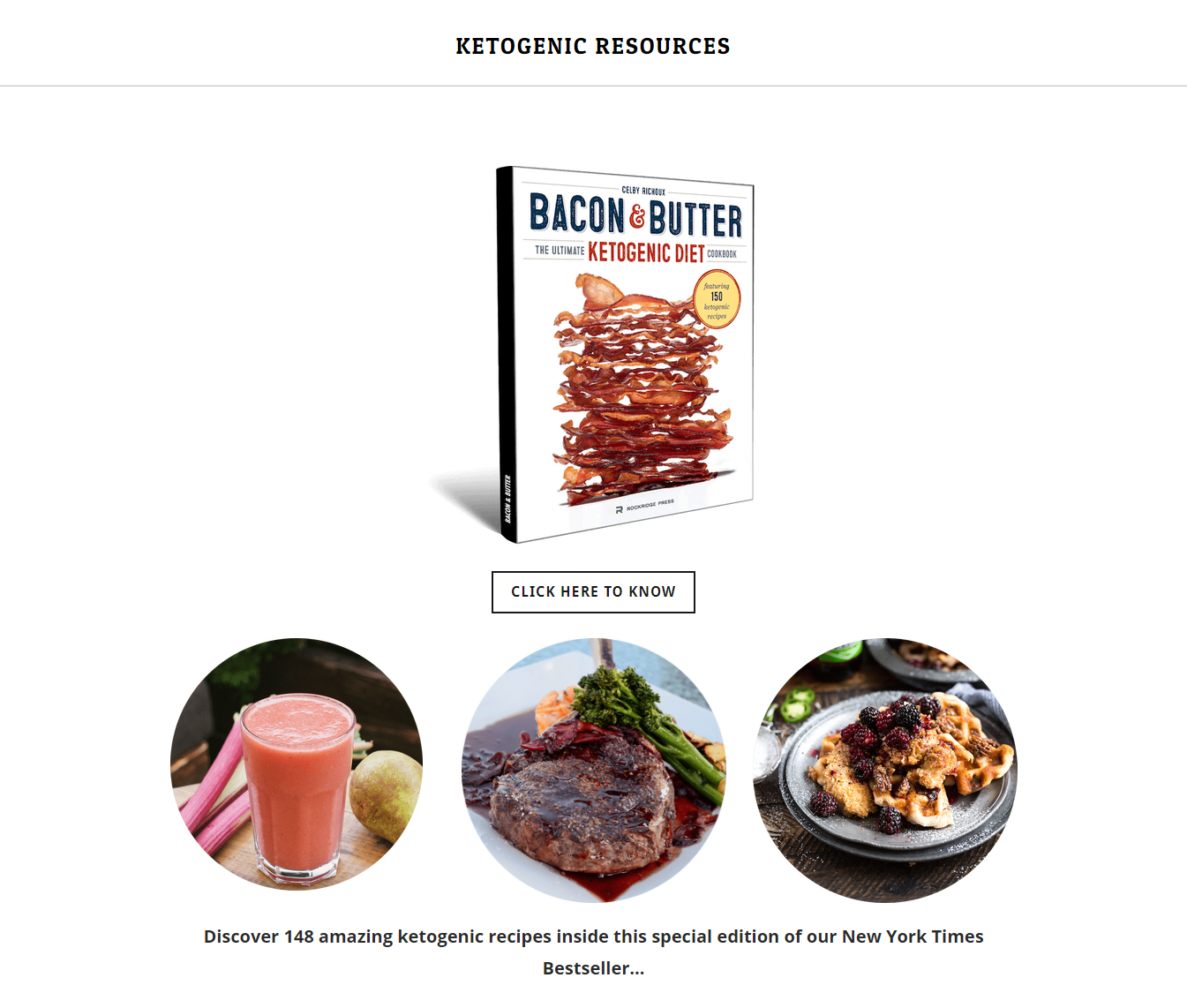
lp.png

It's hosted on weebly.com

What do you think and would you click on it?
 
By the way, CLICK HERE TO KNOW??? To know what?
 
You offering a free ebook pertaining the information to grab subscribers or what?
 
Needs more bacon

Agreed, and I don't see a single avocado.

What I do see are three different font/styles used in 21 words total.

Also, a single word at the bottom line that could easily just tie into the first line with a slightly smaller font size, and two periods instead of one at the end.

Other than that, title bigger, a little more even spacing between elements. Solid, minimal approach though.
 
Look up copywriting formulas and try to use them.

You will end up with an eye catching headline, maybe a bit more description about what the page is actually talking about and that alone would make a lot of difference.
 
Back
Top