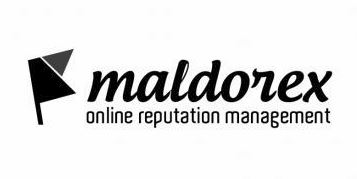
[POLL] Logo #1 or #2?

#1 or #2

  • Concept #1

    Votes: 0 0.0%
  • Concept #2

    Votes: 0 0.0%

  • Total voters
    0

Jubv

BANNED
Joined
Dec 12, 2013
Messages
247
Reaction score
104
Hi guys,

A new company that I've just started. It will be dealing with online reputation management and my primary clientele will be local businesses.

What logo do you guys prefer? Please keep in mind these are grayscale versions and I'll be adding some colour and possibly making some other changes i.e. font size.

Maldorex-01.jpg

Thank you,
Jubv
 
Logo one would be better, but you need to make another version of this logo. Logo is identity for your brands, it should be something simple but creative.
 
IMO the second one looks a bit more professional. But then again, I'm obsessed with minimalism so I guess that's why I chose the second one
 
I like the Concept #1.
Its looks batter than #2.
 
Prefer the font in the 2nd image. The font used in the first image, looks like something used on feminine hygiene products.

Exactly my thoughts. I think the design of the second logo is too generic but the font of the first doesn't really sit well with me.
I was thinking of using the first concept, but changing the font.
 
#2 is my pic.

Are they all black and white? Use colors like green and blue and or orange :)

-Sasha
 
The biggest difference and factor I see here is the shape. The first one is close to square while the bottom is more of a horizontal shape.

If you are placing it on the top of a website, the rectangle will fit nicer. If it's going on polo shirts, the square one would look nice too.

Something to consider.
 
Prefer the font in the 2nd image. The font used in the first image, looks like something used on feminine hygiene products.


hahahahaah i totally agree

maldorex keeps you safe all day
 
the x in second one looks like k, it might look like a small thing but its quite valuable.
 
The biggest difference and factor I see here is the shape. The first one is close to square while the bottom is more of a horizontal shape.

If you are placing it on the top of a website, the rectangle will fit nicer. If it's going on polo shirts, the square one would look nice too.

Something to consider.

Logo will be used mainly on a website and also for marketing materials i.e. business cards, envelopes, letterheads.

I can always change the placement and structure of the logo though. I'm more concerned about the actual design of the logos.
 
Concept #2 definitely looks more brandable and professional IMO.
 
#2 has better typography and is just more professional overall.
 
Font in number two isn't the my favourite. Logo one looks better, but sometimes such vertical logos make it difficiluty to integrate them into places. A more horizontal logo is easier to integrate into other design work.
 
I'd stay away from using typefaces that emulate the popular hand lettering unless it's truly a unique one off and has been done by hand and vectored because it's over used and that particular typeface looks suspiciously like Lobster.

I'd like to see #2 with the flag straightened out, just for reference but yeah #2!
 
Back
Top