
You are using an out of date browser. It may not display this or other websites correctly.
You should upgrade or use an alternative browser.
You should upgrade or use an alternative browser.
Is my website good?
- Thread starter Leszual
- Start date
- Status
- Not open for further replies.

- May 11, 2014
- 2,146
- 2,063
Are you trying to sell outside the market place ?

- Apr 4, 2009
- 13,911
- 70,951
What is your goal with the website? Who is your customer?
Straight up, I would say, fix your logo, fix your anonymous contact page to be more open with details on you, contact a "real" copywriter to go over your texts, there is a lot to do on this website if you do not only want to sell your services on forums like this, in real world, customers are more careful about who they do business with.
On the positive side of things, you made a website and that is good, your taking action.
Straight up, I would say, fix your logo, fix your anonymous contact page to be more open with details on you, contact a "real" copywriter to go over your texts, there is a lot to do on this website if you do not only want to sell your services on forums like this, in real world, customers are more careful about who they do business with.
On the positive side of things, you made a website and that is good, your taking action.
Last edited:
No, i've spend the last 4 months learning SEO and im looking to hit up local business in my area so i built a website to add some credibilityAre you trying to sell outside the market place ?
What is your goal with the website? Who is your customer?
Straight up, I would say, fix your logo, fix your anonymous contact page to be more open with details on you, contact a "real" copywriter to go over your texts, there is a lot to do on this website if you do not only want to sell your services on forums like this, in real world, customers are more careful about who they do business with.
On the positive side of things, you made a website and that is good, your taking action.
Hey thanks for the advice =)
Just a few questions:
Whats is wrong with the logo?
So i should make my contact details more personal and trustworthy rather then to a email address? ( so add my phone etc)

Linus persson
Registered Member
- Jan 15, 2017
- 68
- 22
This post feels a lot like something called self-advertising
Im sorry if it appears that way =/ I just wanted opinions from people that live SEO so i can best improve my site.This post feels a lot like something called self-advertising
I can remove the thread if i must.

Timk
BANNED
- Nov 10, 2016
- 15
- 6
greatest site I've seen all monthHey all,
Just looking for some opinions on my website and how to improve it.
myseotraffic.com
Thanks in advance!
Honestly?greatest site I've seen all month
Thanks alot! =)
- Apr 4, 2009
- 13,911
- 70,951
Whats is wrong with the logo?
Make it more professional, it look´s like some newbie have done it. If you can´t do it, then outsource it to a real designer, would cost you anywhere between $150-$250 depending on who you get to make it.
So i should make my contact details more personal and trustworthy rather then to a email address? ( so add my phone etc)
Yes, company name, address, phone numbers, details on staff members and so on, will definitely make your appearance more trustworthy to real (non-forum) customers.
- Apr 4, 2009
- 13,911
- 70,951
This post feels a lot like something called self-advertising
Yes, it does, but why not help the guy/girl out and have him change his business website to the better, maybe someone else here in the forum reads the tips and get helped to, you know that helpfulness is the core of what we are in Sweden, yes? .. =)
Linus persson
Registered Member
- Jan 15, 2017
- 68
- 22
Yes, it does, but why not help the guy/girl out and have him change his business website to the better, maybe someone else here in the forum reads the tips and get helped to, you know that helpfulness is the core of what we are in Sweden, yes? .. =)
Yea we are definitely friendly in Sweden •cough•.
But yea you're right. Well I can only see the problem with contact us. It needs a phone number, possibly an adress too.

swon
Junior Member
- Oct 16, 2016
- 107
- 167
"DAILY COFFE"
Coffee has double E
My opinion:
top banner: "Located in Bunbury (Australia? include country).
change your logo, remove the wing-like thing, make it more "horizontal".
Our services section - make it 2 rows of 3.
correct "Online presence analysis" to "Online Presence Analysis".
Statistics:
Satisfied Customres - spelling mistake.
2 awards - customers MIGHT ask about this?
Daily coffeE - is unnecessary.
I didnt read word by word but make sure to double check for spelling and vocabulary.
Other than that looks nice. good luck.
Coffee has double E
My opinion:
top banner: "Located in Bunbury (Australia? include country).
change your logo, remove the wing-like thing, make it more "horizontal".
Our services section - make it 2 rows of 3.
correct "Online presence analysis" to "Online Presence Analysis".
Statistics:
Satisfied Customres - spelling mistake.
2 awards - customers MIGHT ask about this?
Daily coffeE - is unnecessary.
I didnt read word by word but make sure to double check for spelling and vocabulary.
Other than that looks nice. good luck.

Zwielicht
Elite Member
- Aug 31, 2013
- 21,128
- 40,576
Are you trying to sell outside the market place ?
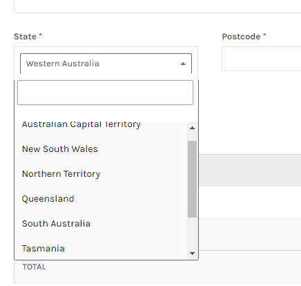
I checked out OP's site. I tried ordering one of the packages from the site just to test OP's claims, and you can't checkout unless you live in Australia (based on the billing details page). So it appears that the OP is telling the truth about only servicing locals.This post feels a lot like something called self-advertising
Your thread can stay up, though in a few hours, I'm going to remove your site's link from your post as, despite your interest in servicing locals, BHW members from Australia would still be order from there.Im sorry if it appears that way =/ I just wanted opinions from people that live SEO so i can best improve my site.
I can remove the thread if i must.
I checked out OP's site. I tried ordering one of the packages from the site just to test OP's claims, and you can't checkout unless you live in Australia (based on the billing details page). So it appears that the OP is telling the truth about only servicing locals.
Your thread can stay up, though in a few hours, I'm going to remove your site's link from your post as, despite your interest in servicing locals, BHW members from Australia would still be order from there.
Thanks for letting it stay open =)
Take it down when you feel appropriate no problems

mynameisfrankenstein
Regular Member
- Apr 2, 2015
- 429
- 385
since youre a newbie and not an actual agency i would put some more personality/attitude into the landing page.
dont be aftaid to get them emotional. tell them theyre going to die a slow death if they keep letting their competitors get the top spots. make fun of businesses that think just having a website is good enough. marketing is everything. be unique, be funny. you dont have anything to lose and being memorable and full of life rather than your canned agency talk, will be much cooler
dont be aftaid to get them emotional. tell them theyre going to die a slow death if they keep letting their competitors get the top spots. make fun of businesses that think just having a website is good enough. marketing is everything. be unique, be funny. you dont have anything to lose and being memorable and full of life rather than your canned agency talk, will be much cooler
Leo Harris
BANNED
- Dec 12, 2016
- 72
- 18
Checked your website out. I must say, the website is properly designed and has a smooth experience. But, it feels a bit unprofessional due to typos and grammatical errors. You need to hire a copywriter with a background in advertising to see actual sales. Also, change the logo and try to add a slider with an info. Additionally, put up more information about your company and team, change the colors scheme of contact page(It's really hard to see gray texts in white background and text such as 'Let's talk business is not appropriate and professional)'.
If you can not hire a copywriter, read all the content of your page and correct the grammar mistakes and change headlines in few places(Such as Why we instead of Why choose us and We help your site get found to something else) and add in places where needed(You have added info about your statistics but seems irrelevant due to the lack of headline there) . "How we do" is also not an appropriate term to describe your process.
In a nutshell, read copywriting tips from Neil Patel and compare your content with what he says sells. You will find what needs improvement. Design is flawless, loved it.
If you can not hire a copywriter, read all the content of your page and correct the grammar mistakes and change headlines in few places(Such as Why we instead of Why choose us and We help your site get found to something else) and add in places where needed(You have added info about your statistics but seems irrelevant due to the lack of headline there) . "How we do" is also not an appropriate term to describe your process.
In a nutshell, read copywriting tips from Neil Patel and compare your content with what he says sells. You will find what needs improvement. Design is flawless, loved it.

MatteoMatt
Regular Member
- Sep 28, 2016
- 389
- 293
Actually to be honest the website design is very clean, and looks good. My only critique is that the main Above the fold section is not very eye catching.
I almost was unsure if it had even loaded till I scrolled down. It looks good and clean, but is too plain to catch the viewers eye. My suggestion is to keep a similar look, but step it up a bit and catch the viewers attention right when the page loads.
I almost was unsure if it had even loaded till I scrolled down. It looks good and clean, but is too plain to catch the viewers eye. My suggestion is to keep a similar look, but step it up a bit and catch the viewers attention right when the page loads.

dzabic
Newbie
- Oct 29, 2013
- 28
- 20
Sometimes editing a template is simply not enough. There are countless things beyond the visual aspect of the website. Google does not like badly coded websites, promoting SEO services on one of them is like selling ice in Antarctica
Jokes aside, design is not so bad but fix your errors!

GoDesain
Regular Member
- Feb 26, 2011
- 491
- 224
if you ask my opinion is...
Much better if you use contact other than using shopping cart...
to many space.. need more text about what you offer...
don't know this important or not.. use ssl will be good..
seoinc or yoast is good inspiration to build your website
Much better if you use contact other than using shopping cart...
to many space.. need more text about what you offer...
don't know this important or not.. use ssl will be good..
seoinc or yoast is good inspiration to build your website
- Status
- Not open for further replies.