How does this page look? Ideas on making it better?

Scorpion Ghost

Elite Member
Executive VIP
Jr. VIP
Joined
Mar 22, 2013
Messages
9,150
Reaction score
10,490
Yes I know, it looks bad, outdated, yada yada yada. That's fine, I'm not looking to win any trophies for web design. But the page hasn't looked much different in 6 years, and it still made money.

new.JPG

Due to a recent gaypal issue, I've been forced to remove gaypal as a payment option from the site, and I decided to add Perfectmoney and Crypto as payment options.

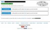
So this is the page I have now. It's all simple and clear, but it doesn't really look great.

Anyway I want to roll it out to my entire site. That's like 200 pages that I have to change, and each page has specificities.

But before I do it I want to ask if anyone has any ideas on what I can do to make it look better? Maybe change the CSS border? Maybe add the Perfectmoney and Coinpayments Logos on the Pay buttons?

Any ideas/recommendations?
 
-add bootstrap or material design libraries.
-you can add some box shadow to the div that wrapping button and that text near. left alignment is good , better to keep that.
- make estimate delivery time more shiny. (for example:green background , white font )
- you can reverse the colors at footer and add some top border. Like white colour, blue background with white top border.

Other than that I wouldn't change so much if you have sales with this design
 
-add bootstrap or material design libraries.
-you can add some box shadow to the div that wrapping button and that text near. left alignment is good , better to keep that.
- make estimate delivery time more shiny. (for example:green background , white font )
- you can reverse the colors at footer and add some top border. Like white colour, blue background with white top border.

Other than that I wouldn't change so much if you have sales with this design

Okay, so your first point is rocket science, and I'm no rocket scientist.

Your second point, I tried playing with box-shadow on the buttons and the text, but didn't manage to create anything that didn't look like a $5 dollar hooker :p

Your third point, I did that. Very good, gives some color to the page. I like it. Thank you :)

Your fourth point, I think the footer is all right the way it is. It blends nicely with the page. There's a clear separation, and it doesn't stand out.

So anyway, I think we're ready for the 21st century! :D

alll.JPG
 
I think having more payment options will be a good way to increase conversation sad truth is most users love to pay with PayPal and if you don’t accept them more option could be of value to your business.
 
Already looking great

Yeah it's nice.

Also the "Pay" buttons have a hover:active in CSS which turns the buttons to Green when hovered over (at least on desktop/with a mouse), so it all looks nice :)
 
Already looking great

Oh it just hit me, I used to also have the price displayed on the page. But I forgot to add the price after this little change.

I added it though, I think now it's perfect.

top.JPG
 
Back
Top