- Mar 22, 2013
- 9,150
- 10,490
Yes I know, it looks bad, outdated, yada yada yada. That's fine, I'm not looking to win any trophies for web design. But the page hasn't looked much different in 6 years, and it still made money.

Due to a recent gaypal issue, I've been forced to remove gaypal as a payment option from the site, and I decided to add Perfectmoney and Crypto as payment options.
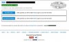
So this is the page I have now. It's all simple and clear, but it doesn't really look great.
Anyway I want to roll it out to my entire site. That's like 200 pages that I have to change, and each page has specificities.
But before I do it I want to ask if anyone has any ideas on what I can do to make it look better? Maybe change the CSS border? Maybe add the Perfectmoney and Coinpayments Logos on the Pay buttons?
Any ideas/recommendations?
Due to a recent gaypal issue, I've been forced to remove gaypal as a payment option from the site, and I decided to add Perfectmoney and Crypto as payment options.
So this is the page I have now. It's all simple and clear, but it doesn't really look great.
Anyway I want to roll it out to my entire site. That's like 200 pages that I have to change, and each page has specificities.
But before I do it I want to ask if anyone has any ideas on what I can do to make it look better? Maybe change the CSS border? Maybe add the Perfectmoney and Coinpayments Logos on the Pay buttons?
Any ideas/recommendations?