Help to visualize table in mobile.

marce12

Junior Member
Joined
Apr 19, 2019
Messages
179
Reaction score
53
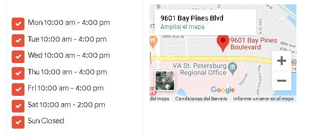
Hello, I have a problem because I have a website with many hours of work, buy a template Blogger and it turns out that a two-column table is displayed badly, I uploaded images.
Maybe there is some CSS code.
Thanks for the help, otherwise I will have to change everything.
Mobile
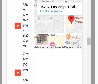
foro.png

PC
foro2.png
 
Last edited:
Keep in mind, a mobile doesn't have the space a monitor has.

In the first div, put the google maps.
In the second div, put the table.

This will display the opening time below the picture.

Or put them both in another div and display them as block, on mobile it should show below, and on desktop next to each other.


EDIT:

Should be like

<div class="Class1">
<div class="Table">
..
</div>
<div class="GoogleMaps">
..
</div>
</div>

// css

.Class1
{
display: block;

// or use display: flex, idr.
}
 
Last edited:
Thank you very much for your knowledge, I will.
Greetings
 
Back
Top