
D
Deleted member 969102
Guest
Now I'm by no means really into SEO, but I do read about it literally every day, and I often see people spouting the BS that they see in case studies (I have to admit, I was guilty of this too when I first started reading them)
The main problem with SEO case studies, at least the two that I'm going to mention, later on, is that they are absolutely shit at statistical analysis. They can't distinguish the difference between correlation and causation.
I think it's much easier for me to use an example to explain what I mean, so, to begin with, we're going to be looking at Ahref's recent case study regarding page age and rankings:
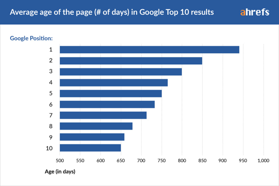
What conclusion would you draw from this graph? Be honest, would it be that Google prefers older content? (I know it would)
While it may be true that Google prefers older content, this isn't actually what this graph shows, and the way that Ahrefs have presented it is actually very misleading. In Science, at least at the level that I study, we talk about how our results show a correlation between a variable and an outcome, but we don't have the knowledge, time, or equipment to prove that this outcome is caused by [Variable A]
In this case study, Ahrefs analysed 2,000,000 SERPS, noted down the age of the top ten results, plotted it in this fancy graph, and then strongly implied that Google prefers older content, when actually all this shows is that the top spots are older, not that all old content ranks better.
I know that some of you won't be able to tell the difference between the two scenarios, and you're the exact people who get take this shit for fact. That case study didn't take into account the fact that webmasters will obviously spend more time and money on SEO as time goes on, yet nowhere in the article did they acknowledge this.
I'm going to come back to my Science comparison for a minute. When we are testing something, we make a conscious effort to control every single variable that we can, so that we know it's actually [Variable A] that is causing the change, and not B, C, D, or E.
In cases that we can't control a variable, we measure that too and work it into our results. I guarantee you that if ahrefs, moz, or any other SEO blog that conducts these case studies measured other factors such as links, domain authority, traffic (Many, many more) their graph would look nothing like that.
But they wouldn't do that, would they? Where's the story in that?
Now, some may argue that they did mention that this isn't a perfect representation right at the end, but that's not what matters. I've seen the graph that I shared above, and others from the case study, taken out of context and shared around so much, that people just take it as fact.

This is another example of what I mean. Someone who sees that graph come up in an SEO thread is going to start believing that it's true, without questioning the case study and how they conducted it. Did they take into consideration that people who spend more money on SEO may also spend more money on content? If so, how do I know from the graph?
tl;dr - If you can't control a variable, measure it. The vast majority of case studies that I have seen draw attention to the fact that there is a correlation between something like Article length and average position, and then conclude that the outcome is caused by the variable.
To be clear, I am not arguing that these case studies are wrong in their conclusions (They are, but that's not the point here) I'm saying that the way they represent their data is wildly misleading and leads to the spread of misinformation and pure SEO lies. Take a look at this thread and then tell me I'm wrong.
What do you think? Do I make sense, or am I talking out of my ass?
The main problem with SEO case studies, at least the two that I'm going to mention, later on, is that they are absolutely shit at statistical analysis. They can't distinguish the difference between correlation and causation.
I think it's much easier for me to use an example to explain what I mean, so, to begin with, we're going to be looking at Ahref's recent case study regarding page age and rankings:
What conclusion would you draw from this graph? Be honest, would it be that Google prefers older content? (I know it would)
While it may be true that Google prefers older content, this isn't actually what this graph shows, and the way that Ahrefs have presented it is actually very misleading. In Science, at least at the level that I study, we talk about how our results show a correlation between a variable and an outcome, but we don't have the knowledge, time, or equipment to prove that this outcome is caused by [Variable A]
In this case study, Ahrefs analysed 2,000,000 SERPS, noted down the age of the top ten results, plotted it in this fancy graph, and then strongly implied that Google prefers older content, when actually all this shows is that the top spots are older, not that all old content ranks better.
I know that some of you won't be able to tell the difference between the two scenarios, and you're the exact people who get take this shit for fact. That case study didn't take into account the fact that webmasters will obviously spend more time and money on SEO as time goes on, yet nowhere in the article did they acknowledge this.
I'm going to come back to my Science comparison for a minute. When we are testing something, we make a conscious effort to control every single variable that we can, so that we know it's actually [Variable A] that is causing the change, and not B, C, D, or E.
In cases that we can't control a variable, we measure that too and work it into our results. I guarantee you that if ahrefs, moz, or any other SEO blog that conducts these case studies measured other factors such as links, domain authority, traffic (Many, many more) their graph would look nothing like that.
But they wouldn't do that, would they? Where's the story in that?
Now, some may argue that they did mention that this isn't a perfect representation right at the end, but that's not what matters. I've seen the graph that I shared above, and others from the case study, taken out of context and shared around so much, that people just take it as fact.
This is another example of what I mean. Someone who sees that graph come up in an SEO thread is going to start believing that it's true, without questioning the case study and how they conducted it. Did they take into consideration that people who spend more money on SEO may also spend more money on content? If so, how do I know from the graph?
tl;dr - If you can't control a variable, measure it. The vast majority of case studies that I have seen draw attention to the fact that there is a correlation between something like Article length and average position, and then conclude that the outcome is caused by the variable.
To be clear, I am not arguing that these case studies are wrong in their conclusions (They are, but that's not the point here) I'm saying that the way they represent their data is wildly misleading and leads to the spread of misinformation and pure SEO lies. Take a look at this thread and then tell me I'm wrong.
What do you think? Do I make sense, or am I talking out of my ass?
Last edited by a moderator:


