
-
Please take a moment to look over the Suggestions & Feedback rules before making a post: READ RULES HERE
You are using an out of date browser. It may not display this or other websites correctly.
You should upgrade or use an alternative browser.
You should upgrade or use an alternative browser.
[Announcement] Introducing: The New BHW
- Thread starter Zwielicht
- Start date
- Status
- Not open for further replies.


- Nov 2, 2008
- 59,100
- 26,627
@MrDenz @Diamond Damien @Zwielicht
sorry for delayed reply, been in , out
bhw last 2 weeks with flu, i will just add im running firefox with
forum txt up from 100% to 120% and im sitting here squinting
at my screen, txt tiny with slight blurryness .
anyways ty faking the time to reply DD and mrdenz ty for the post ping
@MrDenz @Diamond Damien @Zwielicht
that was not meant to say
anyways ty faking the time to reply DD and mrdenz ty for the post ping
it should have said
anyways ty taking the time to reply DD and mrdenz ty for the post ping

- Jan 23, 2015
- 5,633
- 11,290
@MrDenz @Diamond Damien @Zwielicht
that was not meant to say
anyways ty faking the time to reply DD and mrdenz ty for the post ping
it should have said
anyways ty taking the time to reply DD and mrdenz ty for the post ping
I got it the first time, all good

I hope you are feeling better.

- Feb 18, 2008
- 1,107
- 455
After waking up the team, who do they think they are wanting more than 3 hours sleep anyway!
We have gone through the constructive feedback, a big thanks to those that provided their suggestions and reasoning behind it rather than just opinions that often had others sharing the opposite opinions. Some of the items on the list raised the discussion around "how did we miss that".
That overall made our lives easier to make choices on what was more important to the community. We then balanced this list with what we can do quickly to make the biggest positive effect the quickest. Some changes were quite complicated and time consuming but offered the biggest benefit (font size for instance), some were of course easier. We aren't stopping working on this so please continue to provide feedback and suggestions. If it gets suggested we look at it but it doesn't necessarily mean it makes the top of the list.
With that said here are the changes to be deployed shortly in no particular order
1. The font size is increasing in the posts, thread titles and input boxes
2. The collapse of the forums has been implemented
View attachment 343557
3. More space between the bottom add and the breadcrumb
4. The page navigation has been added to the top of the page in mobile view
View attachment 343567
5. Many minor fixes we have seen ourselves during this latest phase
I appreciate that the team is actively listening and making a bunch of changes, it shows they are excited for a fresh modern look but still listen to their users.
On that, I just noticed a HUGE feature not here anymore I cant believe I didnt see anyone say it (or I missed it)
THREAD HOVER PREVIEWS. With the amount of fluff or other stuff here, its nice to be able to hover over a thread and see if its worth clicking and reading. Now I can't do that. Now if we see a thread in the MAKE MONEY sub such as "Make money with google" instead of hovering and realizing it's a noobie ASKING how to, instead of some pro typing out a method, we have to click to find out. Honestly that will lead to having to pick and choose what you want to click on/read, time is precious in 2024 (attention spans), may lower engagement. Since we have to think more proactively on what we click on.

Zwielicht
Elite Member
- Aug 31, 2013
- 21,128
- 40,576
That should still be there as I can see previews of threads when I hover over their links.I appreciate that the team is actively listening and making a bunch of changes, it shows they are excited for a fresh modern look but still listen to their users.
On that, I just noticed a HUGE feature not here anymore I cant believe I didnt see anyone say it (or I missed it)
THREAD HOVER PREVIEWS. With the amount of fluff or other stuff here, its nice to be able to hover over a thread and see if its worth clicking and reading. Now I can't do that. Now if we see a thread in the MAKE MONEY sub such as "Make money with google" instead of hovering and realizing it's a noobie ASKING how to, instead of some pro typing out a method, we have to click to find out. Honestly that will lead to having to pick and choose what you want to click on/read, time is precious in 2024 (attention spans), may lower engagement. Since we have to think more proactively on what we click on.
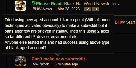
Unless you're referring to something else?
chbicolosira
Registered Member
- Nov 9, 2020
- 99
- 37
already 41 pages guys , lets go to 50 !!

- Oct 2, 2009
- 1,372
- 2,824
I appreciate that the team is actively listening and making a bunch of changes, it shows they are excited for a fresh modern look but still listen to their users.
On that, I just noticed a HUGE feature not here anymore I cant believe I didnt see anyone say it (or I missed it)
THREAD HOVER PREVIEWS. With the amount of fluff or other stuff here, its nice to be able to hover over a thread and see if its worth clicking and reading. Now I can't do that. Now if we see a thread in the MAKE MONEY sub such as "Make money with google" instead of hovering and realizing it's a noobie ASKING how to, instead of some pro typing out a method, we have to click to find out. Honestly that will lead to having to pick and choose what you want to click on/read, time is precious in 2024 (attention spans), may lower engagement. Since we have to think more proactively on what we click on.
Ad blockers prevent the hover from workingThat should still be there as I can see previews of threads when I hover over their links.
Unless you're referring to something else?

zebestof230
Power Member
- Jun 7, 2016
- 617
- 322
It's actually harder to read the titles. (EDIT : Or to read at all, I liked the fact that yellow on black was emphasizing the information we wanted to read).
Feels like there is more space but not for the right reasons.
This is a bold move.
I guess we will get used to it but the forum was great the way it was. It's like Amazon, everyone know it's shit, but now people are so used to it it's impossible for them to change it.
EDIT: Threads are good tho, just maybe I don't think having a whole section on the left for who posted is important but well, I cannot appreciate everything.
Feels like there is more space but not for the right reasons.
This is a bold move.
I guess we will get used to it but the forum was great the way it was. It's like Amazon, everyone know it's shit, but now people are so used to it it's impossible for them to change it.
EDIT: Threads are good tho, just maybe I don't think having a whole section on the left for who posted is important but well, I cannot appreciate everything.
Last edited:


zotix
BANNED
- Oct 21, 2023
- 1,147
- 696
One thing to mention: @Zwielicht : Much appreciated for answering all the questions, even though you answered them multiple times.
This is truly an indicator that you care about what the community says.
This is truly an indicator that you care about what the community says.

cpanewbiehere
Junior Member
- Mar 5, 2018
- 160
- 25
Loved the Boxed Style, feels like vintage and classic together.

- Dec 16, 2020
- 13,481
- 6,864
Can you please show the first 3 and last 3 pages buttons in the bottom for mobile? It got harder to navigate long threads
View attachment 343732

There doesn't seem to be enough space for that. It would be too cluttered. That's why we have "Previous" and "Next" buttons


Albert Wesker
Regular Member
- Jan 18, 2024
- 302
- 150
The old theme was 100% better.


Ahmed Al Banna
Regular Member
- Apr 4, 2023
- 447
- 300
i dont like
- Feb 18, 2008
- 1,107
- 455
Doesn't seem to work for me, at least not on Firefox (the browser of choice for IM). But I will try again and update if it does work for meThat should still be there as I can see previews of threads when I hover over their links.
Unless you're referring to something else?
Strange, for some reason it works on one pc (Win 11), but not on my other pc, (win10). I will try to update that browser. Or it could be a firefox plugin I have or maybe blocking javascript or something.That should still be there as I can see previews of threads when I hover over their links.
Unless you're referring to something else?
- Status
- Not open for further replies.