Your eyes bleeding design is also not an option to acceptChange is one of those things that we all fear and appreciate in equal measure. Will new members enjoy the redesign and we will sign up more? Only time will tell.
Updates are indeed meant to improve things, and according to our accessibility scores (yes, I'll bang on about these), they have.
I appreciate your above points reiteriating those who have mentioned the same previously. We will look into these.
Comments like "The sales threads are off" will need more reference screenshots, and explanations are ideal, as per my previous comment on this.
Examples with screenshots please and which "eye comfort" service are you using?
Examples with screenshots please and which "eye comfort" service are you using?
The reaction score remains on the profile. Placed there as it relates to the profile not the post, this way we can display more information on the user and keeping the post less busy. But hear your thoughts around adding back into the post.
View attachment 342877
The link to your website is in your profile, as it doesn't add value to the post but rather enriches your profile.
I'd disagree with your assumptions here, but only time will tell.
I appreciate your feedback.
I'll touch on the bits we've not already covered in previous posts, as you can read all about them there.
When you say
and
Can you provide URL's and screenshots to we can test this issue? That definitely shouldn't happen.
This isn't an option due to all the reasons already posted.
We're hearing this a lot and appreciate the feedback we will review.
Thanks the image really helps me understand your previous points.
We're looking at the font size.
https://www.blackhatworld.com/seo/announcement-introducing-the-new-bhw.1585112/page-19#post-17649400 and the old theme, unfortunately, couldn't be saved.
This isn't an option for all the reasons provided previously.
Sorry not with you here what can be easily solved?

-
Please take a moment to look over the Suggestions & Feedback rules before making a post: READ RULES HERE
You are using an out of date browser. It may not display this or other websites correctly.
You should upgrade or use an alternative browser.
You should upgrade or use an alternative browser.
[Announcement] Introducing: The New BHW
- Thread starter Zwielicht
- Start date
- Status
- Not open for further replies.


- Jan 22, 2008
- 5,797
- 8,171

This is how I would see the gold replacement.
Also forum titles in gray square.
Not changed more because no time for that.
Gold fonts I would change for white fonts
Basicaly forum should be gray scale in same palette, different grays.
Red for only important items like "Post thread".

GooogleDev
BANNED
- Apr 2, 2024
- 121
- 120
but bro, there are guys here that their wife's boyfriend don't mind thatIt's like cheating on your wife or girlfriend; in the beginning, it feels uncomfortable, but later on, you love it. (joke, don't do that)
EmailListForSale
Newbie
- Apr 15, 2024
- 26
- 6
i actually thought soething with the logo was different, so it's no surprise i read the update below
yeah it looks kind of the samw to me...but i'm a newb
yeah it looks kind of the samw to me...but i'm a newb

- Jun 11, 2010
- 1,164
- 346
Is there any way to use the old theme?


- Feb 26, 2021
- 986
- 563
Old theme was iconic; not sure if I am liking this new one tbh.


Zwielicht
Elite Member
- Aug 31, 2013
- 21,128
- 40,576
If there are suggestions that any of you have regarding bugs or the layout, just post them in this thread as all of the posts are being reviewed by the design team. Please don't tag me or any of the specific moderators in this as we can't edit the theme.
However, adding a third theme isn't the answer. It would just be another theme that would need to be maintained and cause long-standing division within the community. I know some will say that this new theme being released created division as any major designs overhauls tend to do, although it's ideal to avoid dividing the community with options. I might not be explaining this well, but I suppose a good example would be what happened with Jagex re-releasing "Old School Runescape" to cater to their nostalgia crowd when people complained about the game changing; now they have two games that need to be updated with people complaining about the inadequacies of both constantly. It's just a mess.
You bringing up your monitor actually highlights an interesting point here: we're all using different panels and screen sizes, so BHW might look worse on your 49" IPS than does on my 32" VA. I've seen others mention the new theme looks a lot better on mobile than it does on the desktop, at least for them.
I can't answer most of those questions, although in regards to banned members, there's a strike-through and a "BANNED" user title.
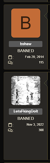
I took this screenshot in incognito mode, so it should look this way for everyone.

Scroll to the bottom of the page and click "BHW Theme - Dark". There will be an option to select the light theme.Hearing of the white theme how do i turn it on.
I know what you mean about using a poll to get feedback, but all of the external threads on this topic are getting locked and re-directed here so everything is in one place.I don't understand the need to lock a simple Poll thread by @ContentExpert
I appreciate the hard work that has gone into this but only a simple poll helps in getting better feedback in general if the new layout is well accepted.
I can't answer any questions about the colour palette or the accessibility bit outside of what's already been posted.I don't really understand how this new colour palette is justified with accessibility.
Around 5% of the population is color blind.
Why do you feel the need to make these new colours universal and force them to all?
That's just bad UX.
Accessibility modifications are most often implemented as extra features, and not forced to everyone.
Why not just change the colour palettes to the original ones and add a third theme that's specifically made with accessibility in mind?
However, adding a third theme isn't the answer. It would just be another theme that would need to be maintained and cause long-standing division within the community. I know some will say that this new theme being released created division as any major designs overhauls tend to do, although it's ideal to avoid dividing the community with options. I might not be explaining this well, but I suppose a good example would be what happened with Jagex re-releasing "Old School Runescape" to cater to their nostalgia crowd when people complained about the game changing; now they have two games that need to be updated with people complaining about the inadequacies of both constantly. It's just a mess.
This is something that's being looked into. Thank you and everyone else who brought this up.I prefer to have the reaction score back to the profile as it was a trust indicator for multiple people here.
There were regular complaints about the old background colour being too dark or too difficult to see before.I'll leave my own opinion on dark theme:
1. The background color of the dark theme should be #000. It makes the text much easier to read, at least on my monitor 49" LG with IPS panel. Right now it reflects.
2. userExtras from left side should be a little bit bigger, 1rem probably. Its too small right now.
3. The avatar will look much better at 192px instead of 48px.
4. It's hard to differentiate if a post has been read or not.
5. Probably a BANNED user title should be added, along with a strike text on the username.
You bringing up your monitor actually highlights an interesting point here: we're all using different panels and screen sizes, so BHW might look worse on your 49" IPS than does on my 32" VA. I've seen others mention the new theme looks a lot better on mobile than it does on the desktop, at least for them.
I can't answer most of those questions, although in regards to banned members, there's a strike-through and a "BANNED" user title.
I took this screenshot in incognito mode, so it should look this way for everyone.
Well, if I ever want a purple username again, I know how to get it...And
https://www.blackhatworld.com/account/upgrades
Premium Membership THE PINK ONE
Isn't Pink anymore
It's #962296 on both Themes which is more purple/violet (I like this color more then the pink)
maybe update the upgrades page,
"ROSES ARE RED, VIOLETS ARE PREMIUM, ALL IT COST IS 97 A YEAR"
View attachment 342868
@MrT131 riot now, you are no longer THE PINK ONE!!!!
Because it is not practical
Last edited:

hexagonal
Senior Member
- Apr 17, 2022
- 819
- 883
Don't like this.
Watching wayback machine forum has keep a consistent color palette, redesign should have followed a brand book or some guidelines on how things should suppose to look.
Also it feels that the forum is a niche forum, which is not the case I was expecting a redesign focused on updating the forum not to make it look like 2000-2005
Watching wayback machine forum has keep a consistent color palette, redesign should have followed a brand book or some guidelines on how things should suppose to look.
Also it feels that the forum is a niche forum, which is not the case I was expecting a redesign focused on updating the forum not to make it look like 2000-2005

- Mar 12, 2017
- 234
- 50
Users usually don't like such changes.
To me, new look feels like everything is in kind of disabled state. Too gray-ish, I would say.
But it's a big project, anyway, so props to the developers for the amount of work done.
P.S. You're using red color for positive buttons such as "Post" and "Save". It's really confusing. Red color is usually about deleting something.
To me, new look feels like everything is in kind of disabled state. Too gray-ish, I would say.
But it's a big project, anyway, so props to the developers for the amount of work done.
P.S. You're using red color for positive buttons such as "Post" and "Save". It's really confusing. Red color is usually about deleting something.

Larry Igna
Power Member
- Nov 25, 2016
- 663
- 715
For me is good now, I only see improvements.
Only the light theme is too ... white. If possible, change that white toblack something more grey-ish. It's light theme, but not light on the eyes IMO
Anyways, I'm using the black one, so.. thumbs up for that.
Only the light theme is too ... white. If possible, change that white to
Anyways, I'm using the black one, so.. thumbs up for that.

newbiebewbie
Junior Member
- Aug 22, 2017
- 112
- 38
Doesn't look bad, but i love the old style more.


Neptun2020
Junior Member
- Oct 25, 2020
- 122
- 130
While the old yellow may have been a bit old school, it made everything much easier to read. This dark brown / mud color makes the site feel a bit dead.

- Jan 16, 2017
- 5,075
- 10,327
I very strongly suggest reconsidering this and allowing member home page links to show in posts.The link to your website is in your profile, as it doesn't add value to the post but rather enriches your profile.
I'd disagree with your assumptions here, but only time will tell.
It may not pertain precisely to what they post but sellers very much rely on it to get traffic to their site or service, not to mention, it encourages community involvement by way of rewarding members with visibility for their participation. I really, really hope to see this return, as I am sure most others do too.

- Apr 4, 2009
- 13,911
- 70,951
+1 - Removing perks for happy paying active customers is not a good idea.I would highly reconsider this and allow member home page links to show in posts.
It may not pertain precisely to what they post but sellers very much rely on it to get traffic to their site or service, not to mention, it encourages community involvement by way of rewarding members with visibility for their participation. I really, really hope to see this return, as I am sure most others do too.
- Status
- Not open for further replies.