CSS Help - element appears, takes up space, moves elements next to it

Scorpion Ghost

Elite Member
Executive VIP
Jr. VIP
Joined
Mar 22, 2013
Messages
9,144
Reaction score
10,489
So I'm trying to make the search bar on my Palemoon (think old Firefox) browser look a certain way.

My current CSS:

CSS:
[anonid="findbar-textbox-wrapper"] { -moz-box-ordinal-group: 4 !important; margin-left: 30px !important; }
.findbar-closebutton { -moz-box-ordinal-group: 2 !important; margin-left: 880px !important;}
.findbar-highlight { -moz-box-ordinal-group: 1 !important; }
.findbar-case-sensitive { -moz-box-ordinal-group: 0 !important; }
.findbar-entire-word { -moz-box-ordinal-group: 0 !important; }
.findbar-find-fast.find-status-icon { -moz-box-ordinal-group: 2 !important; display:none !important; }
.findbar-find-fast.found-matches { -moz-box-ordinal-group: 3 !important; }
.findbar-find-fast.findbar-find-status { display: none !important; }

This is how it looks now:

sweet.JPG


I had an issue when I would search for something and Nothing is found, this would happen:

asasas.JPG


And when that text appears it moves everything to the right of it further to the right, hiding the X close button off page. So I put display:none in the CSS above for this selector ".findbar-find-fast.findbar-find-status", and now we're good:

afttt.JPG


But when I search for something and Something is found, then this happens:

src.JPG


And again it moves everything to the right, hiding my close button. I don't want to hide that text with display:none, I want it to appear. What I tried doing is playing with position:absolute and position:relative and margin and padding, to try and leave empty space there so that when that text does appear it just takes up empty space and doesn't move the elements to the right of it. But I didn't manage to get it working.

Here is how the, um, html? code? Here is how the code looks:
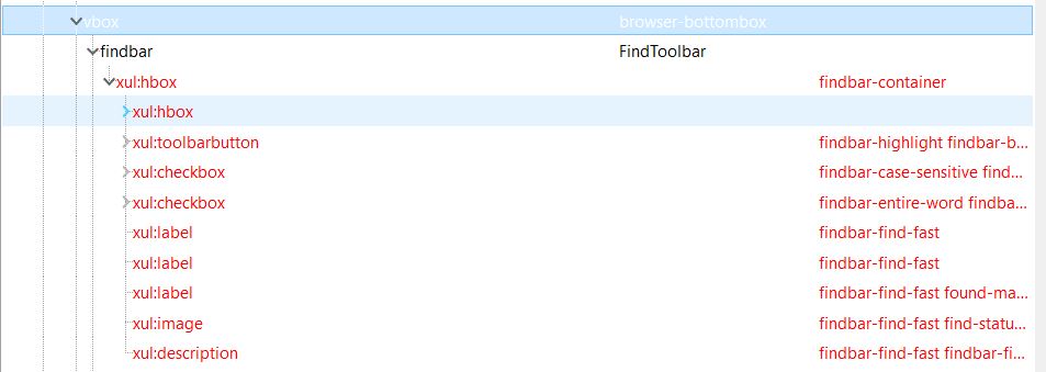
httt.JPG


Any ideas how to leave an empty space for that text so that when it appears it doesn't affect/move the elements to the right of it?
 
there's an addon for Pale Moon called DOM inspector that allows you to see what each component is called. You can use that to identify what that browser.chrome element that is, then use the Gecko reference (I put up a mega.nz link to the reference PDF) to get syntax/operations for it.
I haven't dealt with this particular DOM object, but that's how I edited DOM elements like navigatorObject.
 
there's an addon for Pale Moon called DOM inspector that allows you to see what each component is called. You can use that to identify what that browser.chrome element that is, then use the Gecko reference (I put up a mega.nz link to the reference PDF) to get syntax/operations for it.
I haven't dealt with this particular DOM object, but that's how I edited DOM elements like navigatorObject.

I did that. See my last screenshot. I have the name of each component. I aligned everything how I wanted. The original search box is differently aligned than the one in my screenshots.

But the "1 of 1 match" text just appears and takes up space if something is found in a search, and I can't figure out how to make it not take up the space. Or let it take up the space, I'll give it the space it needs by default. But no matter how much space I give there, whenever the text appears it moves everything to the right of it more to the right.

The only thing I can do to stop it bothering me is to set it "display:none" so that it never appears. And that works, but I'd like to keep that text appearing if I can make it not affect/move the rest of the elements down there when it appears.
 
I did that. See my last screenshot. I have the name of each component. I aligned everything how I wanted. The original search box is differently aligned than the one in my screenshots.

But the "1 of 1 match" text just appears and takes up space if something is found in a search, and I can't figure out how to make it not take up the space. Or let it take up the space, I'll give it the space it needs by default. But no matter how much space I give there, whenever the text appears it moves everything to the right of it more to the right.

The only thing I can do to stop it bothering me is to set it "display:none" so that it never appears. And that works, but I'd like to keep that text appearing if I can make it not affect/move the rest of the elements down there when it appears.
ah, sorry, that last image didn't load for me last time. I'll take a look.
 
You want to fix the position of the position of the findbar to be able to do an X,Y mouse click on something, right? I'm just trying to understand the use case. I found an example of someone right aligning the entire findbar:
but it doesn't address the fixed position thing you're referring to.
 
1633208619516.png

Funnily enough, I'm using MyPal atm, and the findbar is bottom left, and Phrase not found is the rightmost element, so it doesn't shift anything around. Would this default config not work for you if you wanted everything to be in the same position?
 
Just show me the site and I will give you the css in 5 mins

It's actually the css for the browser UI.

This...

View attachment 187286
Funnily enough, I'm using MyPal atm, and the findbar is bottom left, and Phrase not found is the rightmost element, so it doesn't shift anything around. Would this default config not work for you if you wanted everything to be in the same position?

I moved things around so that the search bar is not at the bottom left, and so that the X close button is on the far right, and so that the match case and whole words are bottom left, and the highlight all next to them.

See my screenshots, I aligned it like that using the CSS that I shared in my opening post.

No the default config would not work for me. That's why I changed the default config :)
 
I never heard of -moz-box-ordinal-group: but realised its outdated code. But you can see here

".findbar-find-fast.found-matches { -moz-box-ordinal-group: 3 !important; }"

I assume that is for matches so change it to -moz-box-ordinal-group: 4 !important;

But yeh this was outdated a few years before I started learning code. so it looks weird to me
 
I never heard of -moz-box-ordinal-group: but realised its outdated code. But you can see here

".findbar-find-fast.found-matches { -moz-box-ordinal-group: 3 !important; }"

I assume that is for matches so change it to -moz-box-ordinal-group: 4 !important;

I'm no expert by the way...

My understanding is that it's code that defines the position of elements in a box, or the position of containers within a container, whatever you wanna call it.

So if we have a container that holds 5 elements, and you wanted to align them left to right, you'd use this:

".findbar-find-fast.found-matches1 { -moz-box-ordinal-group: 0 !important; }"
".findbar-find-fast.found-matches2 { -moz-box-ordinal-group: 1 !important; }"
".findbar-find-fast.found-matches3 { -moz-box-ordinal-group: 2 !important; }"
".findbar-find-fast.found-matches4 { -moz-box-ordinal-group: 3 !important; }"
".findbar-find-fast.found-matches5 { -moz-box-ordinal-group: 4 !important; }"

And they would align how you set it...

But that's not my problem, I did that and that worked. My problem is the text that pops up and when it does it takes up space and moves other things and messes up the alignment I set.
 
I'm no expert by the way...

My understanding is that it's code that defines the position of elements in a box, or the position of containers within a container, whatever you wanna call it.

So if we have a container that holds 5 elements, and you wanted to align them left to right, you'd use this:

".findbar-find-fast.found-matches1 { -moz-box-ordinal-group: 0 !important; }"
".findbar-find-fast.found-matches2 { -moz-box-ordinal-group: 1 !important; }"
".findbar-find-fast.found-matches3 { -moz-box-ordinal-group: 2 !important; }"
".findbar-find-fast.found-matches4 { -moz-box-ordinal-group: 3 !important; }"
".findbar-find-fast.found-matches5 { -moz-box-ordinal-group: 4 !important; }"

And they would align how you set it...

But that's not my problem, I did that and that worked. My problem is the text that pops up and when it does it takes up space and moves other things and messes up the alignment I set.
Just change the code to flexbox as playing with outdated code makes no sense to fix. Saying that I have no idea what palemoon is, I have only ever owned ios.

How much can you edit? I would just do something like

[anonid="findbar-textbox-wrapper"]{

display:flex
justify-content: space-between
}

since -moz-box-ordinal-group: was replaced by flexbox and for good reason.


Or

if you want the x on its self at the end you will need to wrap the first part in one div and the close in another div.

<div id="findbar-textbox-wrapper">
<div class="items">
items
</div>
<div class="close">
close button
</div>
</div>

<style>
#findbar-textbox-wrapper,.items{
display:flex
justify-content: space-between
}

.close{
display:flex{
align-content:flex-end;
}
</style>
 
Last edited:
Found some related legacy docs:
https://developer.mozilla.org/en-US/docs/Web/CSS/box-ordinal-groupapparently ordinal group the legacy version of the CSS property 'order' https://developer.mozilla.org/en-US/docs/Web/CSS/order

Also, related: flex group https://developer.mozilla.org/en-US/docs/Web/CSS/box-flex-group
box direction - https://developer.mozilla.org/en-US/docs/Web/CSS/box-direction
and box pack - https://developer.mozilla.org/en-US/docs/Web/CSS/box-pack

would if work if you laid out some of the elements with normal direction (left to right) and the rest of them in reverse? then you'd have an empty space in the middle which would be wide enough to accomodate the varying messages
 
Found some related legacy docs:
https://developer.mozilla.org/en-US/docs/Web/CSS/box-ordinal-groupapparently ordinal group the legacy version of the CSS property 'order' https://developer.mozilla.org/en-US/docs/Web/CSS/order

Also, related: flex group https://developer.mozilla.org/en-US/docs/Web/CSS/box-flex-group
box direction - https://developer.mozilla.org/en-US/docs/Web/CSS/box-direction
and box pack - https://developer.mozilla.org/en-US/docs/Web/CSS/box-pack

would if work if you laid out some of the elements with normal direction (left to right) and the rest of them in reverse? then you'd have an empty space in the middle which would be wide enough to accomodate the varying messages

Yes you could have 3 divs wrapping and 1 center div for space. But better 2 just have 1 main wrapping div and 2 inner ones wrapping the items then add flexbox. Its very little code then
 
display:flex
justify-content: space-between

I added these, just to see what happens. Here is what happens.

mes1.JPG


mes2.JPG


:alien:

Found some related legacy docs:
https://developer.mozilla.org/en-US/docs/Web/CSS/box-ordinal-groupapparently ordinal group the legacy version of the CSS property 'order' https://developer.mozilla.org/en-US/docs/Web/CSS/order

Also, related: flex group https://developer.mozilla.org/en-US/docs/Web/CSS/box-flex-group
box direction - https://developer.mozilla.org/en-US/docs/Web/CSS/box-direction
and box pack - https://developer.mozilla.org/en-US/docs/Web/CSS/box-pack

would if work if you laid out some of the elements with normal direction (left to right) and the rest of them in reverse? then you'd have an empty space in the middle which would be wide enough to accomodate the varying messages

How would I lay them out in reverse?
 
Yes you could have 3 divs wrapping and 1 center div for space. But better 2 just have 1 main wrapping div and 2 inner ones wrapping the items then add flexbox. Its very little code then

But I can't change the structure of the page though...
 
Here, I added a border to the 2 elements that are causing me the problem, just so you guys can see clearly...

bor1.JPG


bor2.JPG


See?
 
But I can't change the structure of the page though...
Oh that is a shame. If you could should me the actual html structure I could give you the css that would fix it.Also the overflowing is probably due to the main bar being position:fixed and then some margins overflowing
 
Back
Top
