Cryptocurrency analysis and predictions using AI and big data

I had that thought at first as well.
But as I kept looking more and more into the 3D shapes, it started making more and more sense.
Thanks to the 3D volume-price-time plot I could see the pattern of supply & demand much better than on a 2D plot.
So I'm looking for patterns in 3D shapes that could help me visualize things in 2D better and/or maybe even help me make better prediction algorithms.

For instance, I would personally use the 3D to determine when to buy or sell.
When I look at the plot for the past ±36 hours, I see when most trades were done.
And so if we could have such a plot across many days/weeks -- we could identify whether we are on the far left or the far right of the plot (relative to the volume). So for instance, right now is a good time to buy because a lot of people are selling.
We see a small cluster evolving "between 12:00 and 18:00 GMT" where people are buying/selling like crazy.
fIGYpfd


But that's more of a philosophical thing right now :D
You are right, the 2D data is much more important at this stage.

Thanks!

Bolded bit - do you think that has anything to do with the price going down? facepalm.

You don't need a 3D chart to tell you more people were selling as the price dropped off a cliff again.
 
Bolded bit - do you think that has anything to do with the price going down? facepalm.

You don't need a 3D chart to tell you more people were selling as the price dropped off a cliff again.
I think you missed the point of the analysis, but I won't waste my time explaining myself :) let's move on
 
================
==== 22 Jan. 2018
================

Just made a few predictions using three parameters: price, absolute hype figures and volume24h:
https://i.imgur.com/vQd2198.png
https://i.imgur.com/SlaOOLW.png
https://i.imgur.com/YNNV69F.png
https://i.imgur.com/tJwnf2K.png
https://i.imgur.com/hgYWFzP.png
These were made on 22 Jan 2018, 21:30 GMT+1.
I will compare these tomorrow against the real values.

Have a good night all! :)

Hi all :)

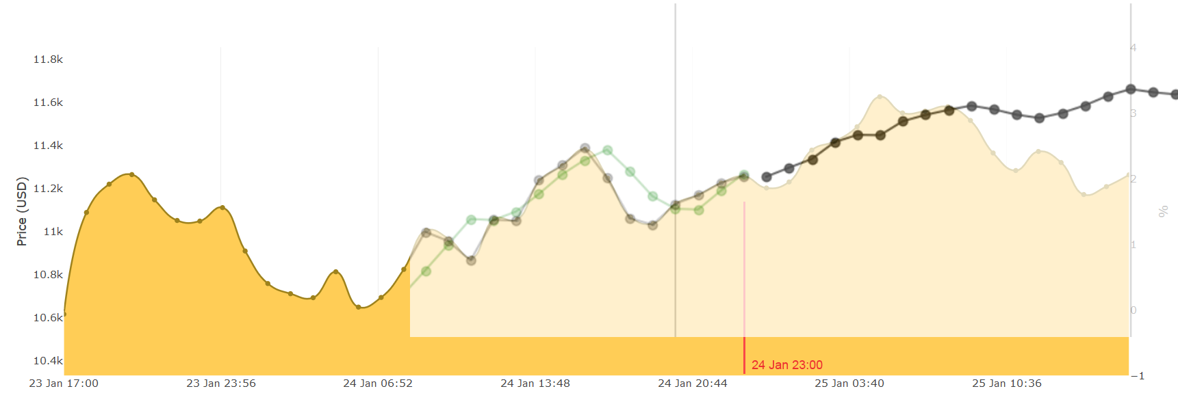
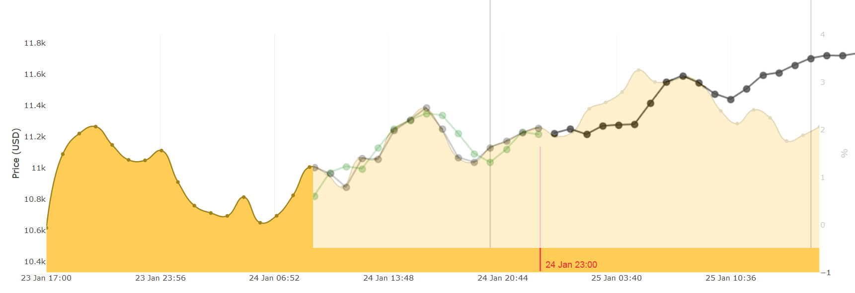
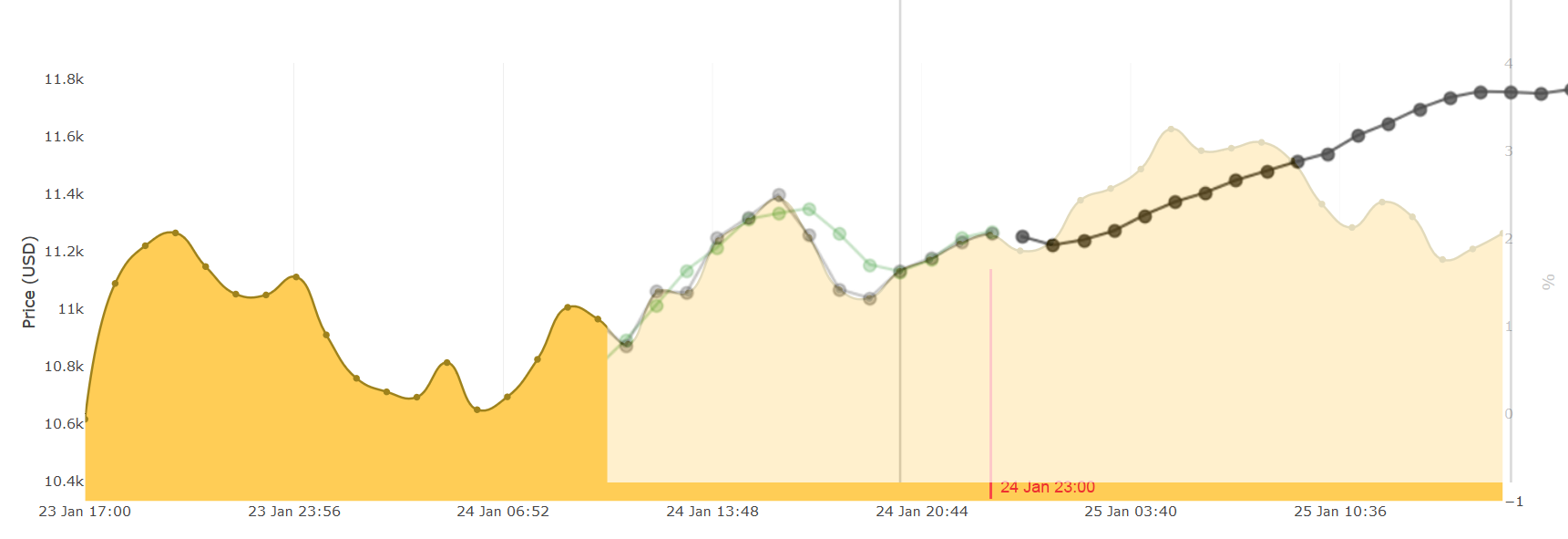
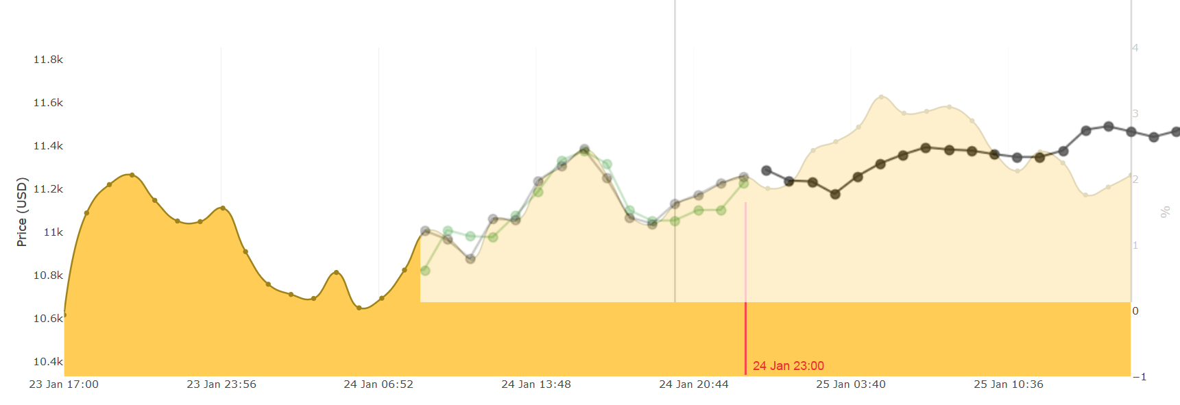
Let's have a look at our predictions for BTC-USD price.

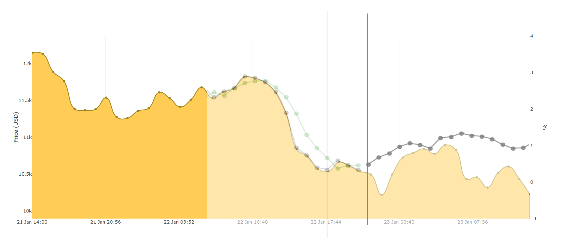
Below is a graph of the real data.
Everything before the red line was used to make the predictions yesterday.
And everything after the red line is the newly accumulated data:
( the red line is drawn at exactly 22 Jan. 2018 21:30 GMT+1).
v0gB4rX


Below is a list of images where I've put the prediction on top of the real data:
https://i.imgur.com/5ns5xAs.png
https://i.imgur.com/mLZcrnC.png
https://i.imgur.com/73peYbj.png
https://i.imgur.com/jvNlRBv.png
https://i.imgur.com/sGpo9xf.png

IMHO this one is the most accurate prediction:
73peYbj

It did not predict the valley at 23:00 (2nd prediction-point),
but for the next 7 hours/points it was a pretty accurate prediction (until it the price dropped at 07:00).

A few notes for the geeks:
  • Each point represents an hourly interval.
  • The predictions were made using 3 features: price, volume and hype.
  • All predictions used 2 neurons in the LSTM.
  • The only variations were: the LSTM batch sizes and input sequence lengths.
  • The training set was 144 hours (= 6 days). However for the volume I only had 2-days worth of data. In cases where data was missing I've let it ignore zero-values by using a masking input layer.
Cheers! :)
 
Great work and thread! Thank you for sharing this with us. I have a few questions regarding your work.

1) Once you have a semi-accurate and working model, what are your plans? Are you offering a subscription servers or...?
2) You have been focusing on short-term trends, have you tried any mid-term trends yet? (I know you stated you plan on going longer-term)
3) How do you plan on implementing volume into the predictions? To me it seems that it may be a good indicator of more volatility/greater price changes. For example volume to me is a good indicator to buy/sell depending on the overall sentiment of the trend. Is it currently implemented into your price predictions or is it just a separate indicator for now?

Keep up the great work.
 
If and when you build the prediction - would be nice to get some integrations into some basic exchanges to test - happy to drop $100 into any coin to test and see how it goes (spare change from LTC) - let me know if and when we get there :D In the meantime - enjoying the read and the progress. the 3D map confuses the heck out of me, though the 2D rep makes more sense to me.

Would be interesting to see elliot waves, and other commonly used prediction models that are on the market to see how closely it works/maps or whether there is gaps that current models could 'weigh' in on..
Not a pro here - just regurgitating what i've been reading :D
 
======
====== 21 Jan. 2018
======

Once I was done with the above, I immediately tackled a new challenge.
For quite some time I wanted to cluster data visually and this is one of the reasons I changed to PlotlyJS -- it has 3D charts.

The idea is to use clustering to categorize coins by their "stage", as suggested by @Ensili (on page 2). I haven't gotten to this part yet, so that's still work in progress.

My first attempt was to visualize 3 variables: time, hype and price. But this didn't appear to be very meaningful (a 2D chart was better for this).
My second attempt was: hype, price, trading volume (past 24hrs) -- yet again not much to conclude for this plot.

But the following did have something to say:
ZB3zg0q

I have plotted (for the past 24hours, with 2-min intervals): time, BTC/USD price and trade volume (24hrs).
Here are a few things we can conclude:
  • The cluster where most trades were done ==> the price was lowest (so at midnight UTC Jan. 22): buy low.
  • There is a specific cluster between volumes 115k and 120k, where the price was highest: sell high.
  • All volumes in between the highest price and lowest price are people who were too late to the selling/buying party -- or don't know what the heck is going on.
Have a good night all :D !

This is a great representation so far and incorporating stages will most definitely make your predictions more reliable. I am closely following your progress and what you have come up with in such a short time frame is simply amazing. Keep up the great work, I read every single one of your posts in this thread as soon as I see it.
 
Honesty.... I think the 3rd thing is gimmicky. Doesn't add much value. I say cut that fat and focus on the 2d version and making that awesome.

So far it's supposed to be a fun project so I don't see any reasons not to play around with such feature. If it has an added benefit of visualization why not try it out. This is a relatively unexplored area of chart prediction analysis (at least for cryptocurrencies). Any new perspective may go a long way - as long as he doesn't focus on style over substance.
 
Great work and thread! Thank you for sharing this with us. I have a few questions regarding your work.

1) Once you have a semi-accurate and working model, what are your plans? Are you offering a subscription servers or...?
2) You have been focusing on short-term trends, have you tried any mid-term trends yet? (I know you stated you plan on going longer-term)
3) How do you plan on implementing volume into the predictions? To me it seems that it may be a good indicator of more volatility/greater price changes. For example volume to me is a good indicator to buy/sell depending on the overall sentiment of the trend. Is it currently implemented into your price predictions or is it just a separate indicator for now?

Keep up the great work.
Hey, thanks for the good questions :)
  1. Yes that is correct. As you know most people on this forum are here to make money.
  2. To make mid-term predictions we'll need a bit more data. I have read blog posts of people making predictions for the entire 2018 (that's very long-term), but to be honest with you those will be super inaccurate, nobody knows whether if/when some coin will just die. We can always extrapolate the data since 2008, but that will just show a nice line going up. Most people don't invest to cash-out in a year or two, most are day-trading (or week/month-trading).
  3. I have used volume for predictions in my post above "22 Jan. 2018". The thing that I noticed is that most parameters (hype, volume, ...) are following (aka. lagging behind with) the price. When you look at a 2D chart: the price is not directly influenced by the changes in volume, but the reverse is true. The challenge is to find data that are influencing the changes in price (it appears sentiment analysis is a better indicator).
Does this answer your questions?

If and when you build the prediction - would be nice to get some integrations into some basic exchanges to test - happy to drop $100 into any coin to test and see how it goes (spare change from LTC) - let me know if and when we get there :D In the meantime - enjoying the read and the progress. the 3D map confuses the heck out of me, though the 2D rep makes more sense to me.

Would be interesting to see elliot waves, and other commonly used prediction models that are on the market to see how closely it works/maps or whether there is gaps that current models could 'weigh' in on..
Not a pro here - just regurgitating what i've been reading :D
Thanks :D
Right now the the data is pulled (and averaged) from all exchanges where a certain crypto coin is traded.
So I don't plan to create a chart of every possible exchange out there (at least not anytime soon).
I also don't plan to turn this into an auto-trading bot anytime soon.
The next steps is to automate the prediction algorithm, improve its accuracy and then do a lot of backtesting.
If all goes well, we can start investing our life savings and big loans. :p

----

23–24 Jan. 2018 — In all secrecy I have spent yesterday preparing a public beta version of our platform. My primary focus was improving the user interface and making it easy to use for a regular non-tech person. There’s still a lot of room for improvement but we have got to start somewhere.

Apart from UI/UX improvements, I have identified and patched various bugs. The most important one was improving the server-side caching system. This allows users to quickly obtain pregenerated data instead of re-computing it over and over again. A final addition is news sentiment analysis. Until now I only plotted the social sentiment results but now we also have results for news articles.

URL: http://cryptanal.com/
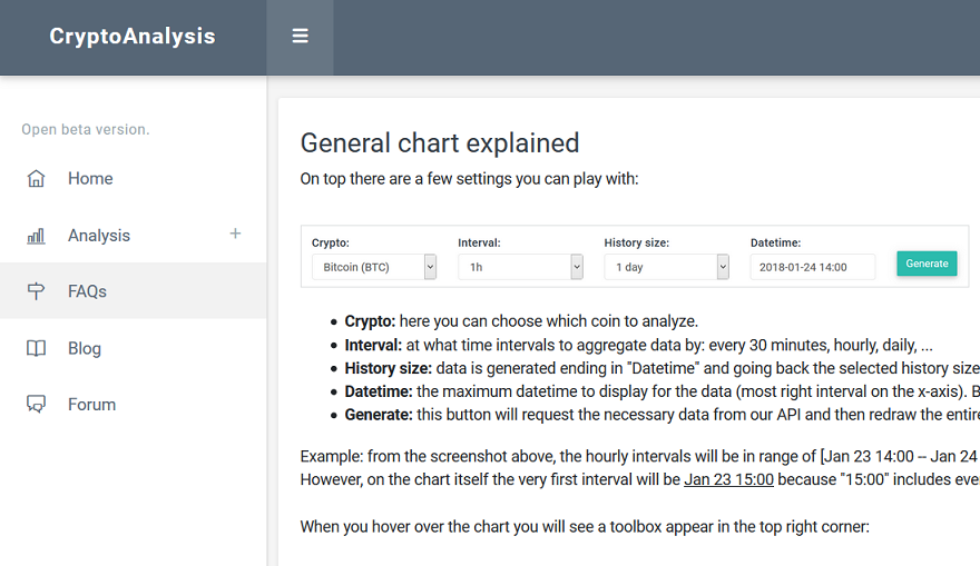
Make sure to read the FAQs to fully comprehend the general chart, because it contains a lot of items that may not be intuitive on first sight.
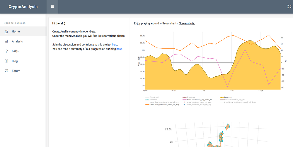
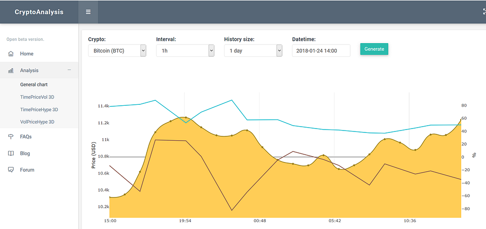
Here are few screenshots:
1*VQ9hOUIJx-XoMB4-SW2WkQ.png

1*nF8lscwhIJpx2txke85sQQ.png

1*7jLTZ8GiNWgnLdlISyh0EQ.png

I would love to hear your feedback, suggestions and/or new feature recommendations :)

Have a great day all!
 
You've always mentioned "we", how many people have you been collaborating with for this project?
 
You've always mentioned "we", how many people have you been collaborating with for this project?
It's more of a we-me thing.
At this stage it's just me involved in the development.
However behind the scenes I am connected with various people (IM friends and passive investors) with whom we exchange ideas. I also receive a lot of valuable feedback from BHW members. So it would be very egocentric to say it was all "my" work/ideas/improvements. :)
 
Hey healzer, if you are finding data is somewhat accurate but you can explain a drop or surges... Look into pump&dump groups. They send a signal/message of when to buy and when to dump for profit. But careful, there are a lot of scammer groups out there too ie they charge a fee to be part of their group.

Looking good so far!
 
This is great stuff! Love statistics and analysis such as this. Will definitely be following.
 
Hi guys :)

Today I have added nine more altcoins to our platform.
You can already see a few hours of data for these, but it will take a few days if you want daily-interval stats.
bhgEUez


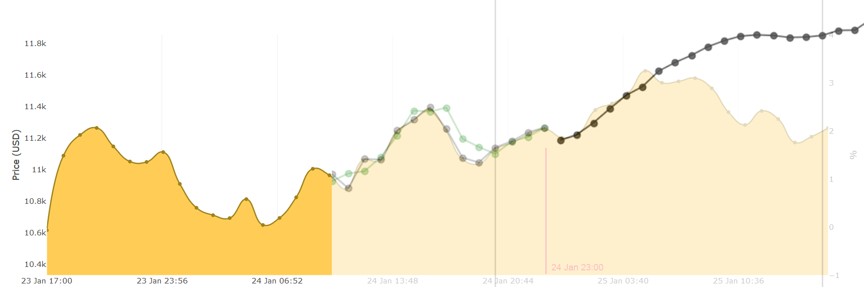
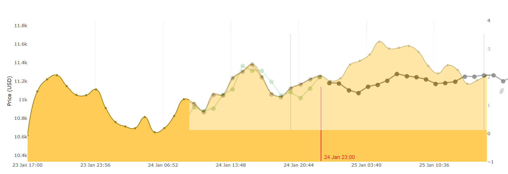
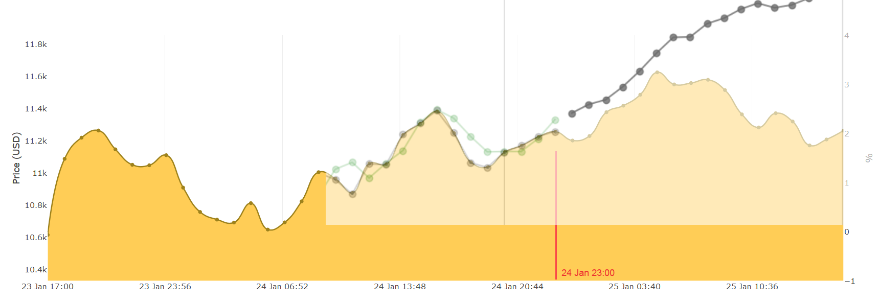
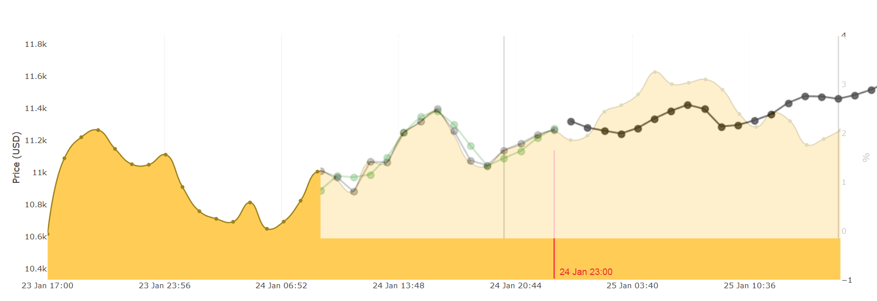
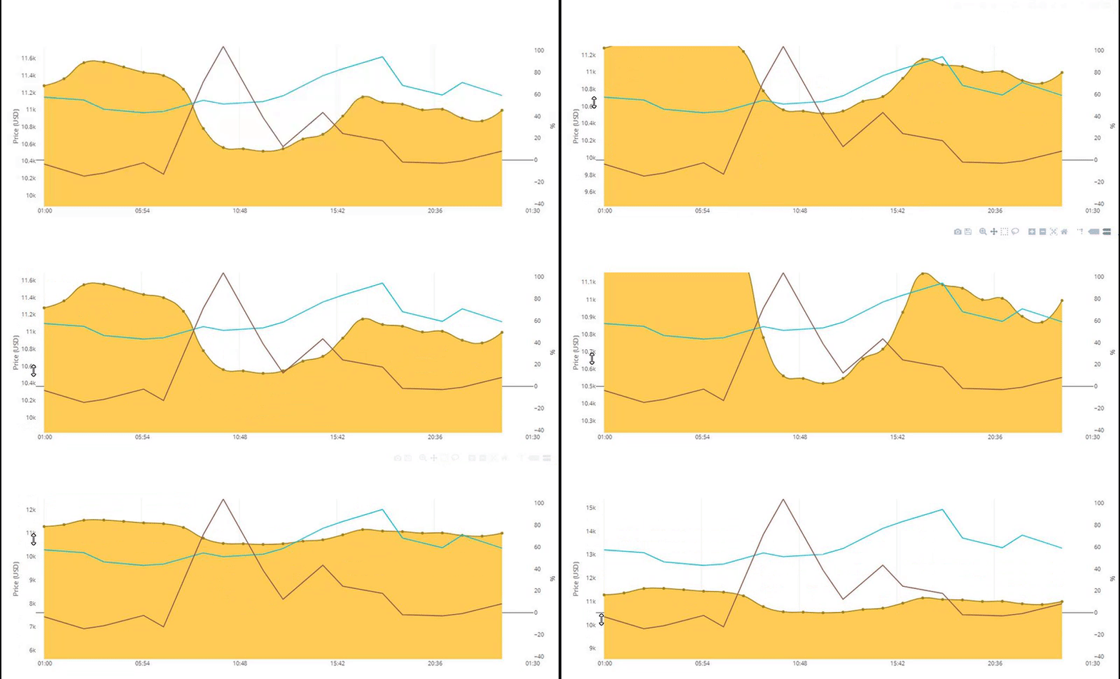
Then I've spent time with the prediction making algorithm. I wanted to understand the difference between different features (price, hype, volume, sentiments). Let's go over them and see what we can discover.

If you are not familiar with my graphical conventions, then the image below shows you what data is used.
The red line shows when the predictions start. The yellow area on the background is the actual data (taken the next day).
So everything before the red line is used for training the neural network. And after the red line is where we compare reality and prediction.
Notice that the X-axis has hourly (60min) intervals. So the RNN is also trained at these intervals.
qnhBSoJ


Making predictions takes several parameters.
In the predictions below I have used these settings:
  • Crypto: Bitcoin (BTC)
  • sequence length: 50
  • neurons: 2
  • epochs: 500 (I could've gone higher, but to save time and prevent over-fitting I kept it relatively low)
  • batch size: 20
features: price and social mentions/hype
NaMug3B

THRq6kh

weZAUbb


features: price and trading volume (24hrs)
Tl911GB

iASG6fH

LkUmgkf


features: price, volume and social hype
gJ2wcdq

XYEA12f

fq557ly

kwJs1uB


features: price, volume, social hype, sentiment analysis from social hype
pQUQWTv

O9J5mPJ

yfPcUTb


features: price, volume, social hype, sentiment analysis from news articles
pFSDE8k

XyYgVWO

aaJQGKW


features: price, volume, social hype, sentiment analysis from news articles and social hype
MZWxcHJ

lkNBE3w

wsMnJk1


It appears that some of these predictions are not a good representation of the actual data.
However, most do have a reasonable prediction of 8 - 14 hours. All beyond 14 hours is no longer accurate.
I realized that by just looking at these charts we cannot determine which features are more useful than others (maybe more isn't better).
So the next step is to design an indexing/rating algorithm that rates a certain prediction.
Then I can generate 100 predictions for every combination of features and calculate the index.
From those results I will be able to detect which features allow us to make the most accurate predictions.

Stay tuned for more soon.
Cheers!
- Ilya
 
Last edited:
Hey all :)

Yesterday I had an idea on how to realize @Ensili 's idea of categorizing crypto coins into "stages".
Every coin has a few features that make it unique in the marketplace:
  1. The hype around it (be it news or social media).
  2. The traded volume.
  3. And its price, which is, related to and influenced by, the two above.
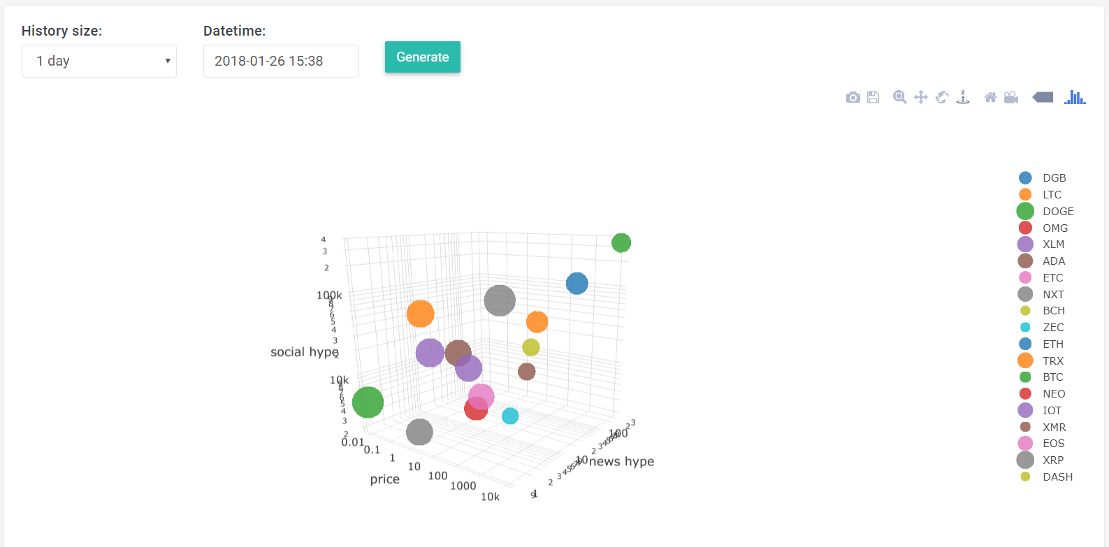
So my thought was to visualize all three features for each coin, at a certain point in time (e.g. the past 24 hours).
We can only (practically) work up to three dimensions, but I have two types of hype: news and social media.
A basic workaround for this problem would be to multiply news mentions by social mentions (unless any is zero).
But if you think about it, we would be very interested in seeing news and social separated.

So I had to introduce a ""4th"" dimension.
This was realized by changing the size of a data-point according to the traded volume (larger dot means more trades).

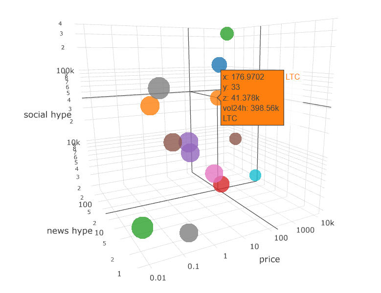
Here's my result:

giphy.gif


7Sk8fv5


AowWScM


1aRgiMv


You can play around with this plot yourself on this link: http://cryptanal.com/stagesPriceHypeVol3d.php
A few notes about the data:
  • In this example we have used data from the past 24 hours.
  • The price of a coin is the average of prices in the past 24 hours.
  • The news hype is the sum of news mentions in the past 24hrs.
  • The social hype is idem ditto ^.
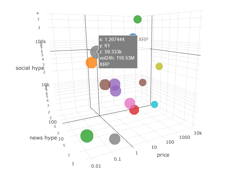
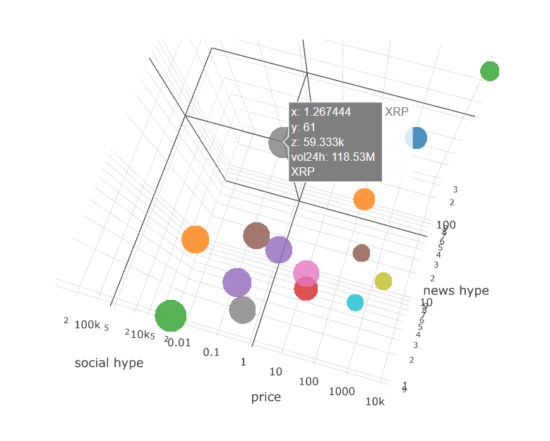
  • Volume: some coins (e.g. XRP) have a traded volume24h of hundreds of millions, while others (e.g. BTC) are between 80k and 180k. So to display the size of a dot properly we have a formula like: dot_size = log( vol24h**2 )/log(6) . If we don't take the log, we'll end up with crazy large dots that take the entire plot size.

  • x axis is the price
    y axis is news mentions
    z axis is social mentions

You will see that Bitcoin is at the highest stage, followed by ETH and then LTC.
We also see that BTC, ETH and LTC are lining up, and it seems that IOT and/or XMR will be next to line-up.

It's also very cool to see which coins are heavily traded (e.g. DOGE) but are very low on social/news mentions.
XRP is the most heavily traded one, and floats in its own "zone", away from the masses:
8NPfxth


A next step for "staging" coins would be to show their respective paths.
I mean, it would be even more meaningful if we could see how a certain coin (e.g. LTC) evolved in the past 3 months.
Once we can visualize its path, we could see which coins have followed a similar path as LTC did and might go to where LTC is now (within X weeks/months).

Have a great day all! :)
- Ilya
 
Last edited:
Love the site. Not sure about the domain though ;)

It would be nice if the charts could have horizontal overlays to see the price a bit easier, so I don't have to look at the left side all the time.

It's also slightly weird that you can move the price without moving the other data.

0e2b617fc182f115e58bb97528eb5652.gif
 
Back
Top