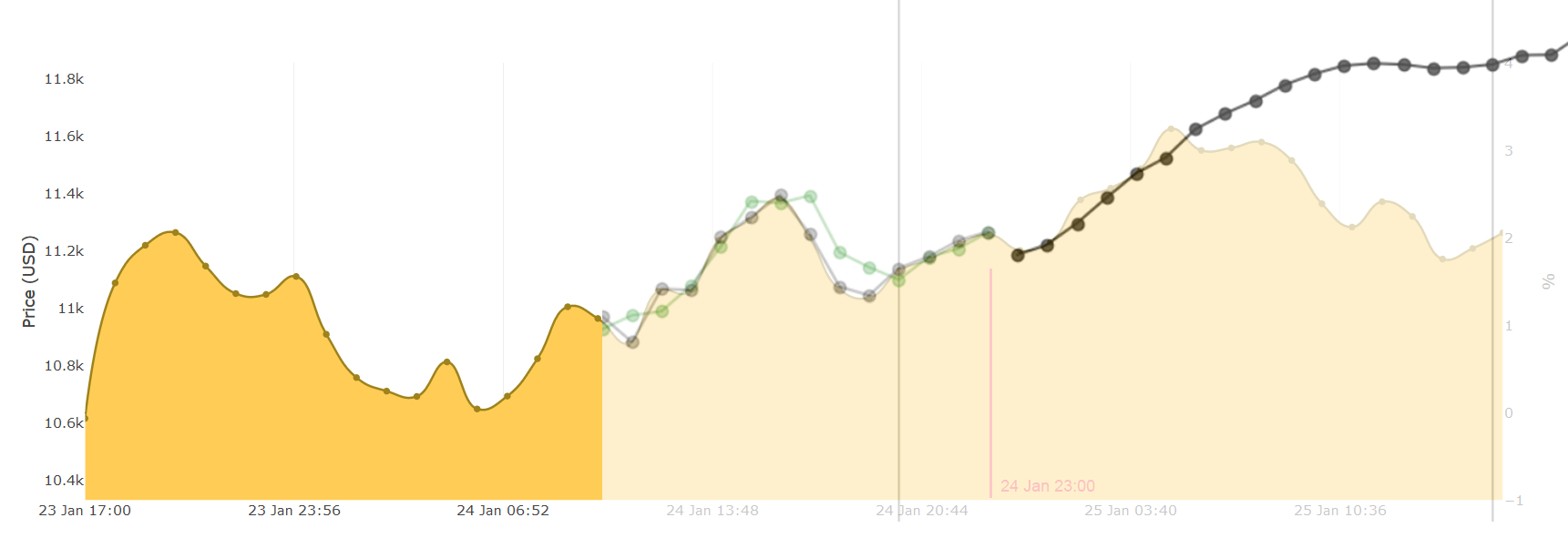
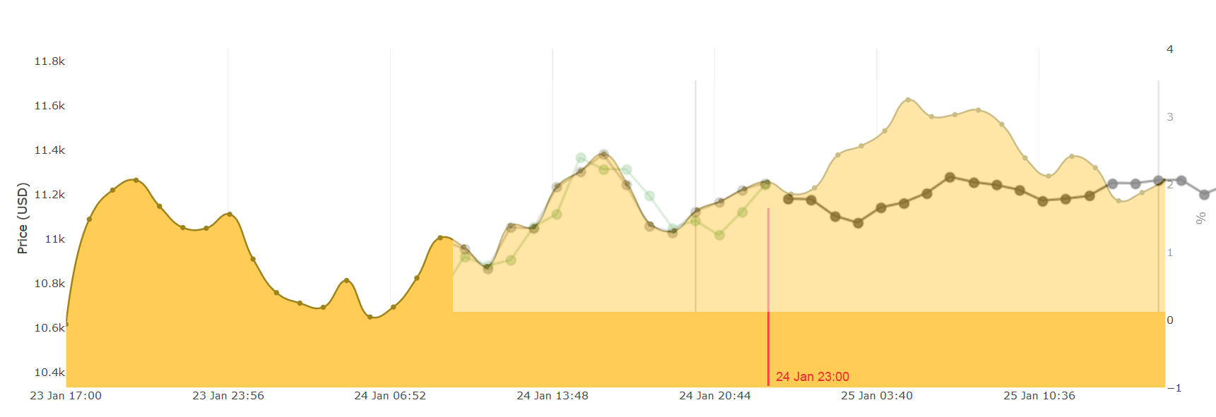
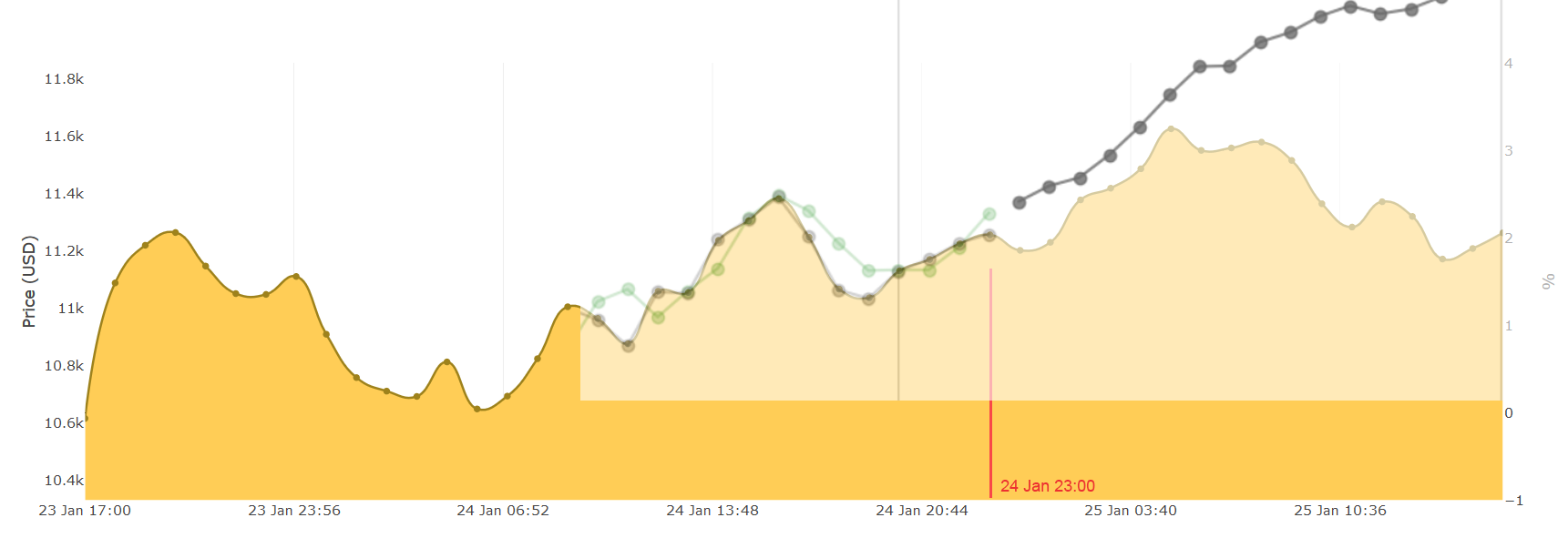
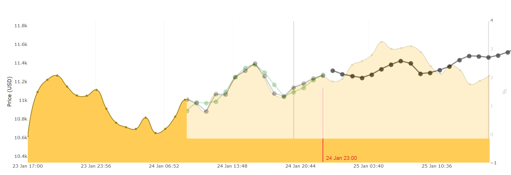
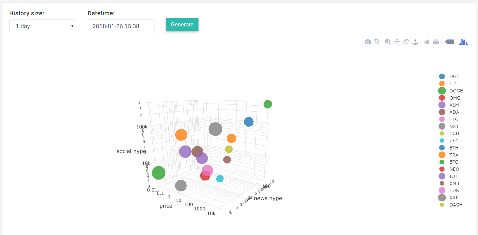
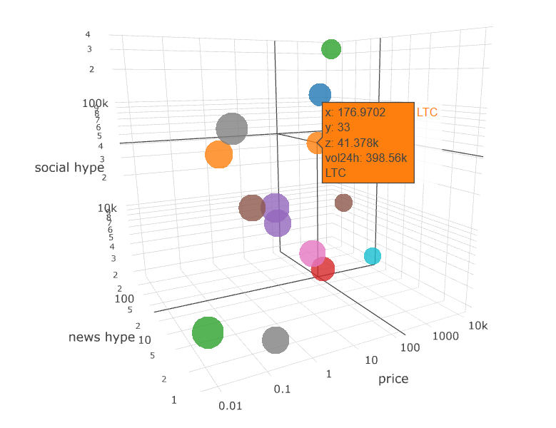
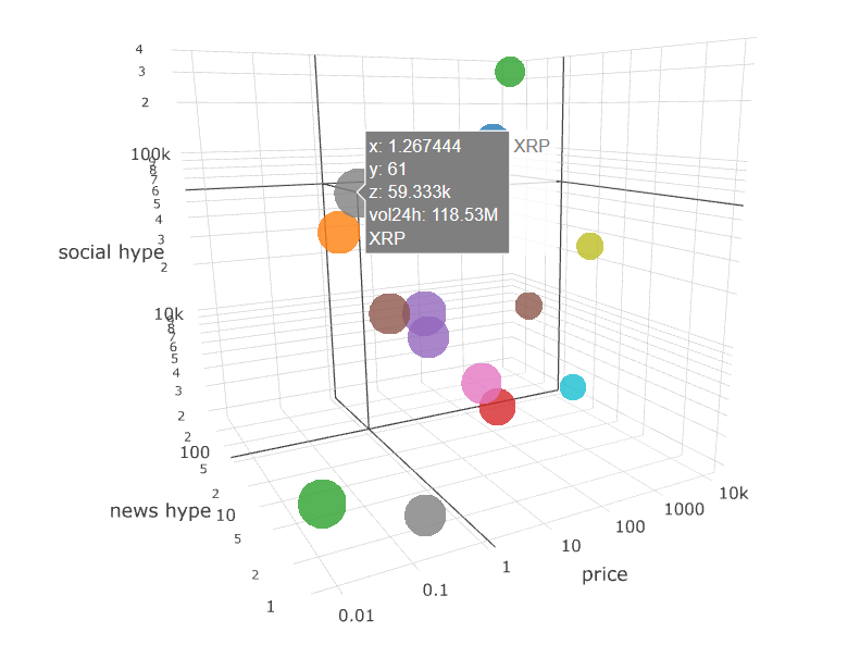
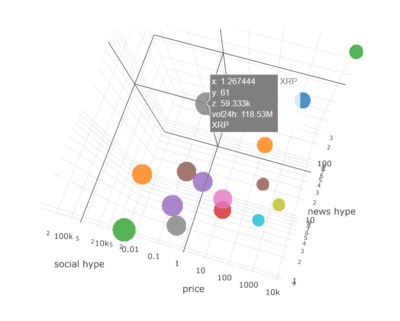
I had that thought at first as well.
But as I kept looking more and more into the 3D shapes, it started making more and more sense.
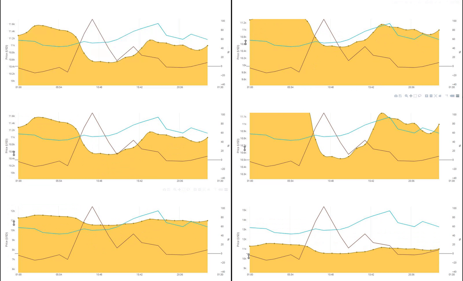
Thanks to the 3D volume-price-time plot I could see the pattern of supply & demand much better than on a 2D plot.
So I'm looking for patterns in 3D shapes that could help me visualize things in 2D better and/or maybe even help me make better prediction algorithms.
For instance, I would personally use the 3D to determine when to buy or sell.
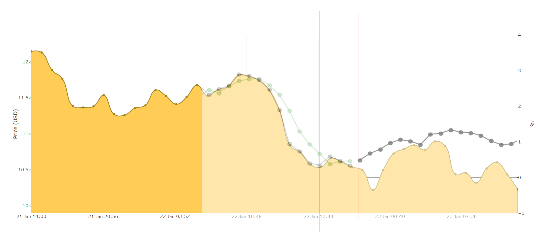
When I look at the plot for the past ±36 hours, I see when most trades were done.
And so if we could have such a plot across many days/weeks -- we could identify whether we are on the far left or the far right of the plot (relative to the volume). So for instance, right now is a good time to buy because a lot of people are selling.
We see a small cluster evolving "between 12:00 and 18:00 GMT" where people are buying/selling like crazy.

But that's more of a philosophical thing right now
You are right, the 2D data is much more important at this stage.
Thanks!

Bolded bit - do you think that has anything to do with the price going down? facepalm.
You don't need a 3D chart to tell you more people were selling as the price dropped off a cliff again.