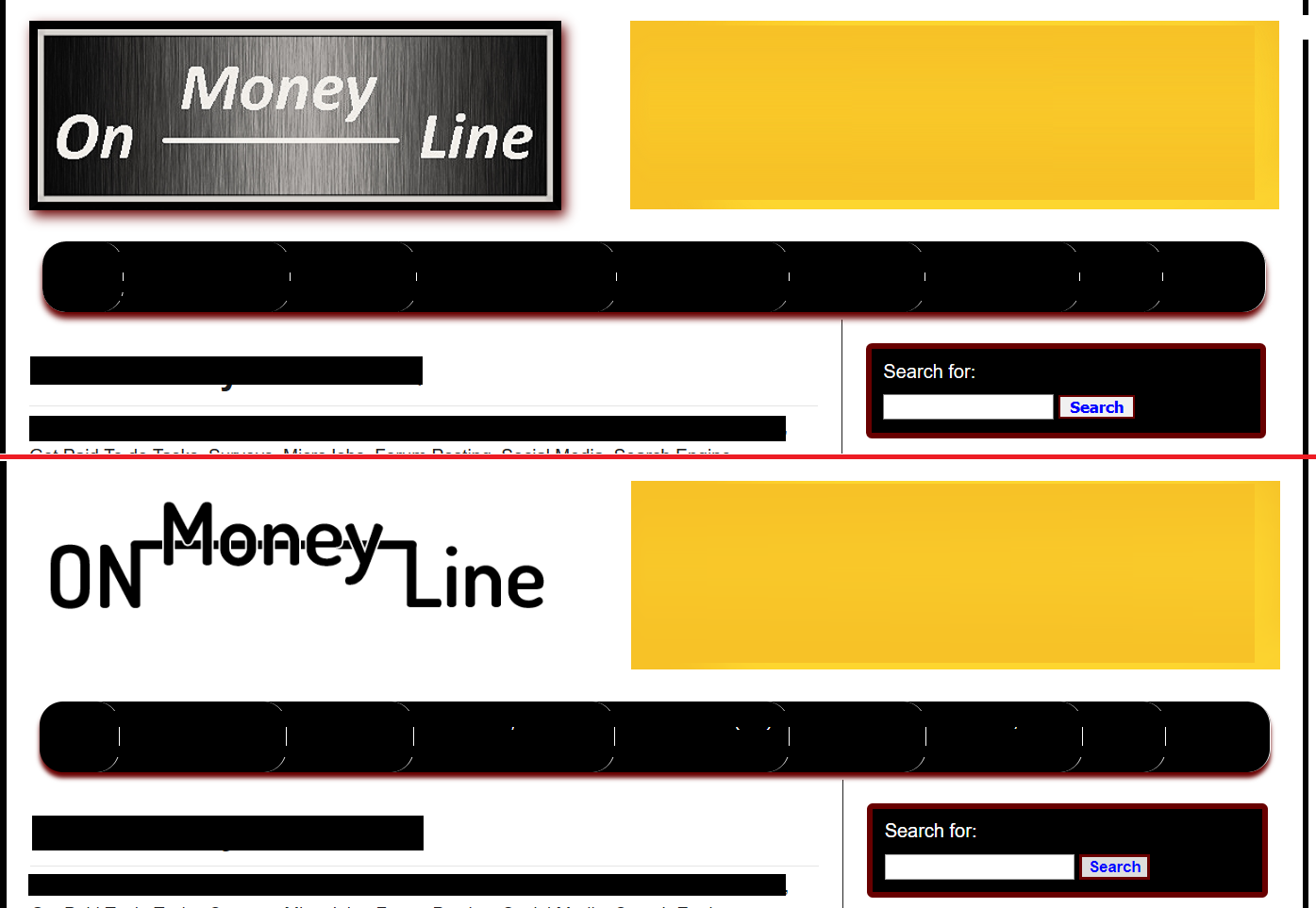
While logo is better?

Scorpion Ghost

Elite Member
Executive VIP
Jr. VIP
Joined
Mar 22, 2013
Messages
9,145
Reaction score
10,489
Which logo looks better?

tbZaxXM


The one on top I created and it has been on my blog for 3 years or so. I never loved it, but, eh, good enough.

The lower one was sent to me by a client of mine. I gave him a discount on something, he was thankful and asked me if I wanted him to make me one, so I told him my idea and he made that.

Which one do you like better?
 
Bottom one seems better, though I got a stupid question:

what is " on money line" means lol
 
The bottom one is more modern but I think it needs a bit more work - it looks a little disjointed for having that big gap where the word money is raised up.
 
Bottom one seems better, though I got a stupid question:

what is " on money line" means lol

Thank you. It seems the bottom one is more liked, and I personally like it. It's slicker and smoother.

Well, when I created that website (my first ever real website - by real I mean self-hosted), I wanted to make a "Make Money Online" blog. And I figured:

On-Money-Line = Online Money = Make Money - Online

Like a little play on words. And even before I made the website I had the logo in mind. Like a On ---money--- Line :D

The bottom one is more modern but I think it needs a bit more work - it looks a little disjointed for having that big gap where the word money is raised up.

Hey thanks. Yeah, I guess. But I'm no photo editor. I had to change the dimensions on the photo to make it fit nicely in the header there. But I can't edit that part, I don't have the skills, and it's not a huge deal.

Thanks for your input :)
 
Really? I don't know, I'm liking the bottom one.

Okay, let's see some more replies. Thank you for your input.

The one on top is just more pleasing to my eye, but clearly some people think otherwise. I just feel like the one on the bottom feels... incomplete/empty. Maybe if you can make it look more complete it could be better :)
 
The one on top is just more pleasing to my eye, but clearly some people think otherwise. I just feel like the one on the bottom feels... incomplete/empty. Maybe if you can make it look more complete it could be better :)

Actually, I feel you. I felt that too :)

But if I start editing the photo, like maybe add a dollar sign somewhere or something or other, before you know it I'll turn the photo into a whorehouse :D

I think, 80/20 rule, good enough as it is. I just did a bit CSS magic and centered it nicely, and it's good.

Thanks again :)
 
honestly both of them need a lot of sorry for being harsh but i am telling it from the perspective of graphic designer.
But if you wanna choose from only these two and dont wanna do anymore work then its okay.
i will go with bottom one
 
The top seem like an old-school thing.
The bottom one trying the portray the " money line" tag.

I will go with the bottom...
 
Got it. Thank you all for your replies. I went with the bottom one.

I centered the bottom logo with a bit of CSS, so now it look a little more natural.

If the site ever makes a million Trillion BAJILLION dollars!!!... i'll pay someone on Fiverr $5 bucks to do a re-touch :D
 
The bottom one it's ok.

The top one looks like " web page maker software "
 
Neither looks better. They're both ugly and poorly designed spend a few hours looking at real logos then try again is my advice.
 
Which logo looks better?

tbZaxXM


The one on top I created and it has been on my blog for 3 years or so. I never loved it, but, eh, good enough.

The lower one was sent to me by a client of mine. I gave him a discount on something, he was thankful and asked me if I wanted him to make me one, so I told him my idea and he made that.

Which one do you like better?
top one
 
While I'd like to vote for the 2nd one, in all honesty, both of them need a ton of brush up.

Considering the kind of staggering graphics are people coming up with today.
 
Back
Top