

arsen99
Power Member
- Nov 28, 2010
- 554
- 77
Imho:
v2
v4
v3
v5
v1
For me the best is v2. Clear, smart, simply. v5 and v1 - I don't recommend you.
So- my vote is version 2.
I hope, that my opinion will be helpful for you.
Before you close this topic, please post, what version did you choice.
v2
v4
v3
v5
v1
For me the best is v2. Clear, smart, simply. v5 and v1 - I don't recommend you.
So- my vote is version 2.
I hope, that my opinion will be helpful for you.
Before you close this topic, please post, what version did you choice.
Hi,
I'm going to launch a local retail business soon which is a store selling various small home products focusing on Green Environment.
I've created 5 versions of logo. I need help deciding which one is better and need improving.
Thanks!
V.1

V.2

V.3

V.4
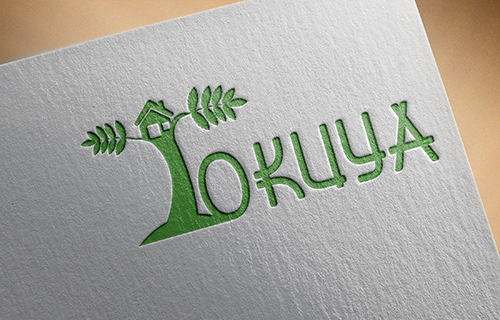
V.5


