Which Logo Version is Better?

Status
Not open for further replies.

Vanrithy

Power Member
Joined
Jun 11, 2013
Messages
730
Reaction score
409
Hi,

I'm going to launch a local retail business soon which is a store selling various small home products focusing on Green Environment.
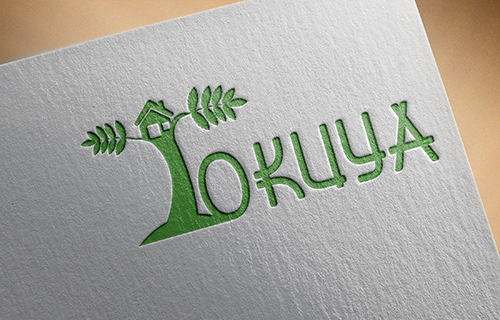
I've created 5 versions of logo. I need help deciding which one is better and need improving.

Thanks!
V.1
q7cOmfz


V.2
wUH4ySs


V.3
73Tih7O


V.4
dbMSH5E


V.5
tSP1SaG
 
I'd go with Ver 2. Looks simple but at the same time a little glimpse of what your business is.
The last ver. looked a bit like an elephants' trunk! Lol :D
 
Last edited:
2 and 3 look best but it still needs work i wouldnt use those as my final logo.
 
2 and 3 look best but it still needs work i wouldnt use those as my final logo.
they are pretty blan although that's normal with a store front. Id say these are pretty quaint and would fit the store vision pretty well wich is a simplified green style of living.
 
v1 is cool for me because it can be a big lightbox logo in the store and v2 looks a perfect fit for handbags, paper, merchandise. etc.
 
I really liked the first one. It's playful, catches the eye.
 
Definitely version 2. My reasoning is that the other versions all can be interpreted as other names, but its pretty obvious that version 2 is "Tokuya".

Version 1 could be "okuya" with a tree as a symbol.

Version 3 could be "Iokuya" with leaves coming off of the 'I'.

Version 4 is similar to version 1, where it might not be obvious that the tree is actually a 'T'.

Version 5 honestly just looks like a weird building in front of "okuya".
 
Version 3 for me, but depends how ur site will look like.
 
Status
Not open for further replies.
Back
Top