
You are using an out of date browser. It may not display this or other websites correctly.
You should upgrade or use an alternative browser.
You should upgrade or use an alternative browser.
Which logo is better? I need your opinion.
- Thread starter richdaddy7
- Start date


Gestein
Registered Member
- Dec 16, 2013
- 56
- 14
Both are senseless. Just a font. The font in the kibik is certainly a very clever move, but senseless as shit in the toilet. Throw out both. And done from scratch. From hand to draw it will be hand maid.
Design should make a person go where you want. At you it deadlock ... Without hints...
My option is better. Here painted. There's more meaning. The company trades Dolbypangolin. 1 ore 2? There is at least a hint.

Design should make a person go where you want. At you it deadlock ... Without hints...
My option is better. Here painted. There's more meaning. The company trades Dolbypangolin. 1 ore 2? There is at least a hint.


jennionline
Junior Member
- May 3, 2018
- 129
- 25
Logo A does look like "LOREM" but I still think it's more eye-catching than the other one. Logo B looks too simple in my opinion.Hey guys, so I'm planning to make my first clothes for my brand, but I have to choose the right logo.
So can you help me a little bit with that situation, because I'm confused? Right now for me is really hard to choose the right logo.
Please be honest, but don't make fun from that.


nayannp
Power Member
- Oct 1, 2017
- 740
- 199
I would agree with the saying of you that "Design should make a person go where you want. At you it deadlock ... Without hints...Both are senseless. Just a font. The font in the kibik is certainly a very clever move, but senseless as shit in the toilet. Throw out both. And done from scratch. From hand to draw it will be hand maid.
Design should make a person go where you want. At you it deadlock ... Without hints...
My option is better. Here painted. There's more meaning. The company trades Dolbypangolin. 1 ore 2? There is at least a hint.
"Yes it should make the person to feel the brands values its importance and work
But the thing i wanna say that you said about the text logos,there are different kind of logo designs like minimalistic or vintage etc and typographic ones are
also a type of them which can be pretty effective if applied with grace and intelligence.


Fresherwink
Junior Member
- Apr 7, 2018
- 150
- 50
NOne


Billy Batts
BANNED
- Dec 16, 2016
- 5,883
- 11,015
I am impressed!!A is sick love it ....
if you could drop shadow the letters be even better .
drop shadow is a slight out line shadow to show the letters 3d.
Didn't you say multiple times across the forum you are blind, you got no eyes etc when peoplegave you crap about your grammar? That's some next lvl X-men Abilities.
@Op A by the way.
Last edited:
Gestein
Registered Member
- Dec 16, 2013
- 56
- 14
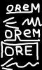
I agree. But I think all the same something in the logo should be on the human factor. This can be done in 2 ways. Or a picture drawn by hand. Or a font drawn by hand. Then the content appears. I think this is the minimum. Here it is clearly not fulfilled. Although this logo also has a place. But this is too boring ... Ideally, and the font should be unique and logo. We just have an inscription ... And that's it. It is not enough! For such an important element. After all, the logo talks about the creator and his approach to work.I would agree with the saying of you that "Design should make a person go where you want. At you it deadlock ... Without hints...
Yes it should make the person to feel the brands values its importance and work
But the thing i wanna say that you said about the text logos,there are different kind of logo designs like minimalistic or vintage etc and typographic ones are
also a type of them which can be pretty effective if applied with grace and intelligence.
Well, at least such sketches would have done ...
And yes rebranding is not so difficult. Topicstarter you know better.
Attachments
nayannp
Power Member
- Oct 1, 2017
- 740
- 199
Well i said thats why to go with the A one cuase it dont look like a simple text putted out of somewhere and i said him to do something with AI agree. But I think all the same something in the logo should be on the human factor. This can be done in 2 ways. Or a picture drawn by hand. Or a font drawn by hand. Then the content appears. I think this is the minimum. Here it is clearly not fulfilled. Although this logo also has a place. But this is too boring ... Ideally, and the font should be unique and logo. We just have an inscription ... And that's it. It is not enough! For such an important element. After all, the logo talks about the creator and his approach to work.
Well, at least such sketches would have done ...
And yes rebranding is not so difficult. Topicstarter you know better.
As do a negative space or something like that.
Some like this can also work

keeping the OR at one side of the perspective and keeping the EM on the other side of perpective
I hope you understand what i meant

richdaddy7
Junior Member
- Jul 5, 2016
- 128
- 43
Thank you guys for all of your answer. I really appreciate them! I think that I stay at the B version because of these reason: It is more generic but I can use it more easily everywhere. When I uploaded the first logo to the Instagram or Facebook it doesn't look very well. So I will use it only at some tees as custom design. I also attached the logo how it look's like, when I upload it to the Instagram...
And if you have some better ideas, I will really appreciate them.
And if you have some better ideas, I will really appreciate them.
Attachments



m0reira
Newbie
- Apr 12, 2018
- 41
- 24
I guess it depends on the style your brand is about, both designs are awesome. If you´re brand is targeting a younger audience then i would go with the first one cause it looks cool, but if you´re brand is casual i would go with the second one wich looks more professional.