- Apr 25, 2011
- 19,848
- 28,295
Just personal opinion that on the mobile version of the site the text should be bigger and there should be less text maybe - for example a simplified version of the breacrumbs (Maybe only the current section you are in), less notifications, less menu items (For example like the "watched threads" and "new posts" links).
The reason I say this is because even though its a mobile display in terms of the page width etc it still feels like its a desktop version being viewed on a mobile and that makes it feel less user friendly when browsing.
This forum is a good example:
http://www.bleepingcomputer.com/forums/
The desktop version contains quite a lot of info.
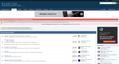
Whereas the mobile version seems a lot simpler and it feels more like a mobile version (Apart from all the notifications at the top).

The reason I say this is because even though its a mobile display in terms of the page width etc it still feels like its a desktop version being viewed on a mobile and that makes it feel less user friendly when browsing.
This forum is a good example:
http://www.bleepingcomputer.com/forums/
The desktop version contains quite a lot of info.
Whereas the mobile version seems a lot simpler and it feels more like a mobile version (Apart from all the notifications at the top).