• Please take a moment to look over the Suggestions & Feedback rules before making a post: READ RULES HERE

Text size on mobile version

Status
Not open for further replies.

davids355

Super Moderator
Moderator
Executive VIP
Jr. VIP
Joined
Apr 25, 2011
Messages
19,848
Reaction score
28,295
Just personal opinion that on the mobile version of the site the text should be bigger and there should be less text maybe - for example a simplified version of the breacrumbs (Maybe only the current section you are in), less notifications, less menu items (For example like the "watched threads" and "new posts" links).

The reason I say this is because even though its a mobile display in terms of the page width etc it still feels like its a desktop version being viewed on a mobile and that makes it feel less user friendly when browsing.

This forum is a good example:
http://www.bleepingcomputer.com/forums/

The desktop version contains quite a lot of info.
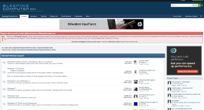
AJMo8Gi


Whereas the mobile version seems a lot simpler and it feels more like a mobile version (Apart from all the notifications at the top).

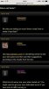
zLuAxaA
 
Thanks David -

We're seeing this as text size on the forum. Could you upload what you're seeing?

IMG_1238.jpg
 
I had to remind myself what I was actually talking about there.......

I think the mobile version looks good and really I am just being picky; but what I was trying to say was that it feels like the desktop version of the site has just been resized to fit a small screen rather than really being optimized for mobile.

I think that it could make better use of the space on the small mobile screen and perhaps try to make elements fill the width of the screen - the whole point of mobile display in my opinion is to get away from small elements and make ones that are extremely easy to see and extremely easy to click - sort of like so that you can just chuck your finger at an element and you will hit it and not click on something else by mistake :-)

Examples

kEP7Svv


I think the menu items below the logo could just be removed and have single full width menu button that gives you dropdown.
search row - search forum, recent posts, magnifying glass icon, these are too small and its too many elements on one row when viewing from small display, this could just be a full width "Search" button / box / icon or whatever.

breadcrumbs, again its too many links on one line on a mobile view, this could just show the place where you currently are and maybe a folder symbol to the left indicating that you are / are not at the root level of the site.


AbkSswc


In this second screenshot the user area looks vary bare - its not really making good use of the space and tehre is lots of blank areas. This could maybe have a much bigger icon/avatar for the user and then a large version of name and status - basically so that it fills the screen.

By the way, I am not trying to pick apart the design, I think its really good overall, I am only going in to detail about these little points to try and get across my point.

I hope its helpful.
 
Cheers David - yep there was a bit of a delay thanks for your attention for this.
 
Status
Not open for further replies.
Back
Top