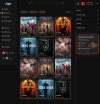
Rate this design (I want it perfect)

ImMagiC?

Regular Member
Jr. VIP
Joined
Jul 2, 2025
Messages
222
Reaction score
88
I'm launching a project and have assembled a great team to work on it.

NOTE: Please remind me if it's prohibited here. Thanks

It's not all the images. not possible to upload them all
 

Attachments

  • about us.jpg
    about us.jpg
    134.7 KB · Views: 29
  • Advertise.jpg
    Advertise.jpg
    119.4 KB · Views: 31
  • Categories.jpg
    Categories.jpg
    286.8 KB · Views: 28
  • downloads.jpg
    downloads.jpg
    107.9 KB · Views: 27
  • downloads-1.jpg
    downloads-1.jpg
    92.1 KB · Views: 24
  • favorite.jpg
    favorite.jpg
    181 KB · Views: 23
  • favorite-1.jpg
    favorite-1.jpg
    87.4 KB · Views: 20
  • first page.jpg
    first page.jpg
    13 KB · Views: 18
  • first page-1.jpg
    first page-1.jpg
    38.4 KB · Views: 16
  • home.jpg
    home.jpg
    593.8 KB · Views: 29
I don't think it's prohibited to request feedback on your project in the Lounge (let me pour you a drink :D )

The design and interface look good to me and I like the dark mode... I generally do for most sites anyway :)
 
I'm launching a project and have assembled a great team to work on it.

NOTE: Please remind me if it's prohibited here. Thanks

It's not all the images. not possible to upload them all
Hi. You have a usability friendly design, what does the light ''Day'' version of the site look like ? Did you add some pastel blue colors there ? Can you send me a screenshot?
 
it looks fine, but I would say to add more attention to shadows and lights and such stuff because on the first screenshots I can see a text on a background, you should never leave people this 2d feedback, they should feel the whole site is a custom thing, not text on a flat image, I hope you understand what I mean here
 
Hi. You have a usability friendly design, what does the light ''Day'' version of the site look like ? Did you add some pastel blue colors there ? Can you send me a screenshot?
I'm sending all the images now ^-^! Thanks for the time
it looks fine, but I would say to add more attention to shadows and lights and such stuff because on the first screenshots I can see a text on a background, you should never leave people this 2d feedback, they should feel the whole site is a custom thing, not text on a flat image, I hope you understand what I mean here
However, I wanted to optimize this site to 100% as it's custom :D Ok, I'm asking the designers to do this


DARK MODE: https://postimg.cc/gallery/sZ4pPpx
https://www.virustotal.com/gui/url/...d2dece41d93c6e2a99676dea4b6e3cabf35?nocache=1

LIGHT MODE: https://postimg.cc/gallery/LpCx0vw
https://www.virustotal.com/gui/url/...16362d27ebd22a4795bd684595cf33d4613?nocache=1
 
Hi. I think your design look good. But if possible, you can increase the size of letters. I see they are quite small
 
Back
Top