Need some feedback for the design

Jothi Web

Junior Member
Joined
Mar 14, 2016
Messages
179
Reaction score
31
Hello,

Its Jothi.. I know many of authority people available in this forum. I would like to get some feedback from you all for the following designes. It will be helpful for more improvement and all.

I hope you understand.

Thanks.

Note: My itentions is not to sell. Just for feedback.

Visiting Card Design:

vc2 E.png


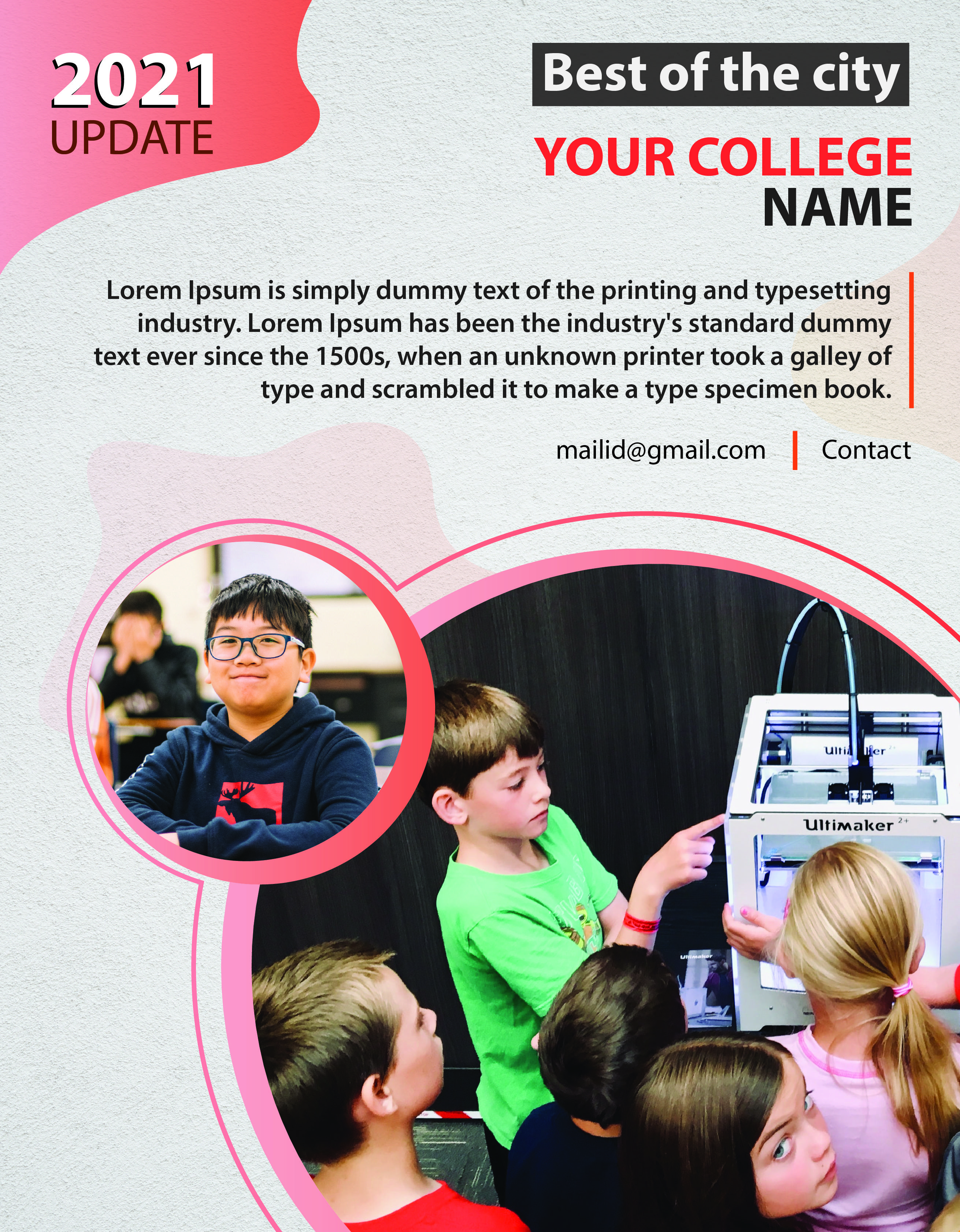
Brochure Design:
QDEOftx
 
very good desighn , i like it
 
I like the second one. I don't like how the pink line diverges in the first design, instead of completing the curve (if that makes sense). I like the colors in both the designs.
 
I’m no graphic designer but the colors seem too sharp and not blended in enough. The 2021 on the second pic stands out like a sore thumb.
 
I like designs. My suggestion is change colors, add different font styles. Good luck.
 
I’m no graphic designer but the colors seem too sharp and not blended in enough. The 2021 on the second pic stands out like a sore thumb.
I like designs. My suggestion is change colors, add different font styles. Good luck.
As for the color scheme, it's not that bad is it? Specially the Brochure. These kind of schemes are heavily used in print medium (like newspapers for example), atleast where I live. ;)
 
I'm not a graphics designer guy. But I think you make mistakes choosing colors for the business card. Try to change the color and use a good font. The brochure looks good but not so attractive.
 
very good desighn , i like it


I like the second one. I don't like how the pink line diverges in the first design, instead of completing the curve (if that makes sense). I like the colors in both the designs.

I’m no graphic designer but the colors seem too sharp and not blended in enough. The 2021 on the second pic stands out like a sore thumb.

I like designs. My suggestion is change colors, add different font styles. Good luck.

As for the color scheme, it's not that bad is it? Specially the Brochure. These kind of schemes are heavily used in print medium (like newspapers for example), atleast where I live. ;)

I'm not a graphics designer guy. But I think you make mistakes choosing colors for the business card. Try to change the color and use a good font. The brochure looks good but not so attractive.

Thank you all for your feedbacks.

Actually the original color of the brochure didnt reflect when I uploaded here.

I understand very well that some poeple like the color and some dont.

If we use light color for printing, it wont give exact result. Thats why using this range.


But your feedbacks are helpful when it comes to use the graphics design for digital form like infographics, facebook cover images and etc.

Really thanks.


Expecting more feedbacks from others.
 
Hello,

Its Jothi.. I know many of authority people available in this forum. I would like to get some feedback from you all for the following designes. It will be helpful for more improvement and all.

I hope you understand.

Thanks.

Note: My itentions is not to sell. Just for feedback.

Visiting Card Design:

View attachment 180316


Brochure Design:
QDEOftx
Look great! You could change the colours man but other than that it looks good.
 
Here is my another design.

Give me the feedback please.

V C 3.png
 
Hey, in the first one, try using a darker shade of grey. This one makes the card seem very dull. The new design you uploaded with the green shades looks a lot more modern, although I think there's too much white space (the green might go great with black). See what you can do about that. Also, the font is too generic. There are a lot of smarter, yet minimal fonts that you can use.
 
Hello,

Its Jothi.. I know many of authority people available in this forum. I would like to get some feedback from you all for the following designes. It will be helpful for more improvement and all.

I hope you understand.

Thanks.

Note: My itentions is not to sell. Just for feedback.

Visiting Card Design:

View attachment 180316


Brochure Design:
QDEOftx

The Both are Brilliant and I would say the Second one are the One i Like alot
 
1st: design overall looks great, not a fan of the way the pink line is curving. could be a bit more "organic"

2nd: overall all the elements are fine, but the curves of the blob in upper left bother me a bit. again, could be a bit more "organic"
 
Hey, in the first one, try using a darker shade of grey. This one makes the card seem very dull. The new design you uploaded with the green shades looks a lot more modern, although I think there's too much white space (the green might go great with black). See what you can do about that. Also, the font is too generic. There are a lot of smarter, yet minimal fonts that you can use.
Thanks for your feedback.
If I reduce the font size, it will be too smal in printed card. Thats why.

The Both are Brilliant and I would say the Second one are the One i Like alot


That design doesn't have original logo. Its a temp logo
Yes. I use dummy logo.

1st: design overall looks great, not a fan of the way the pink line is curving. could be a bit more "organic"

2nd: overall all the elements are fine, but the curves of the blob in upper left bother me a bit. again, could be a bit more "organic"
Alright.
Nice One.
 
Here is my another design.

Give me the feedback please.

View attachment 180431
This one looks much better. Lovely colors (but colors are subjective haha). My only criticism would be the font size of the information like email and websites. The size could be a little bigger. Otherwise, good job.
 
Back
Top