Logo - top or bottom one?

LawtzDesign

Newbie
Joined
Jan 30, 2014
Messages
25
Reaction score
2
Hi guys

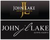
I am just approaching various companies at the moment offering rebranding and I wanted your opinion. I have quickly mocked up a new logo and have put it alongside an existing logo and as an experiment I wanted to see which you guys preferred. I won't tell you which is which. So, top or bottom?

Ta!
Si
John Lake 1.jpg
 
Top is suited to a real estate company. Bottom one is unclear and could be interpreted as a misspelling.
 
LOL OP your attempt to offer re-brands just went to the shits. I can tell the top one was pixelated and the second one was crisp and sharp and everyone liked the first one. Back to the drawing board.
 
top is better for RE. Bottom one would be better for cosmetics or something like this
 
Slightly different although with a minor adjustment I would suggest the second, as pointed out the top is very corporate and likely to be quite similar to completion. Through moving the centre letters of the bottom logo together creating what would like like signed letters could appear more personal and unique in comparison to others in the market.
Outside of this I am assuming you intent to place these on for sale / lettings boards, the top would not catch my eye in a busy street. Where as the latter stands out on its own accord. Although the above is a suggestion I am employed by an investment company and through a distinctive brand in a cluttered industry our signed appears more captivating and professional.
 
Im liking this top one much more:) it strikes me as much more professional looking:P
 
Back
Top