Help me to choose one logo from three concept here !

skynet7

Junior Member
Joined
Aug 26, 2011
Messages
122
Reaction score
17
Hi there,

I have a design for my own personal campaign. My campaign was build a creative media & also a learning site who create many tutorials. But in other side I'm also put news highlight section & e-commerce section into my site.

So please help me from this three concept of logo ,
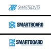
SmartBoardMedia Logo Prefer.jpg

1. Which one do you prefer?

2. Why you choose that logo ?

3. If i give you suggestion to choose a professional but easy to remember logo, which one you will prefer?


Kind Regard,
 
1- Third one

2- Font and colour look really professional and smart. (Although the icon looks like a retarded, deformed windows 8 logo)- see below

k7KwJwl


3- not sure what you mean but can i suggest taking the blue icon from the first logo and placing it on the third logo. I think that would look great.- see below

z49GJOd


PS. Wouldn't the slogan be better as delighting rather than delighted?
 
Last edited:
Are you creating the design yourself? If you are, neither of them. I have an idea that you could do, then you could add a fourth option. :p

Get a regular S and B with let's say Tahoma Bold or something.

Have a...light black B, with the S inside of it in which is blue. Perhaps that's a little too much try hard, let me try it myself. Hold on. D:

Edit: Disregard, that looked retarded.
 
Last edited:
1 - Third one
2 - The overall look and feel of the logo looks more like it suits the niche better. I don't like the first ones icon and I cannot work out what the second one is actually supposed to be.
3 - Same as Smart SEO - not sure what you mean here... but if I'd have to suggest something to change I'd say look at changing the icon slightly - it looks like it says "98" not SB.
 
3 has the best font and impact. Easiest to read. The logo itself is a bit cluttered on 1 and 3. The logo on 2 looks best just because its a cleaner design, but it doesn't really reflect your company name. Plus it looks a bit like a contorted reverse swastika (which is not an image you want).

Also are you sure about your tag line. don't you mean "Delighting You Life with Knowledge" or "Delight Your Life with Knowledge" "Delighted" implies done, move on, our business is finished.
 
Thank you,

I got your point for this , and thanks for all the opinion dude.
 
1. I definitely prefer the second one.

2. I don't really care for the other SB icons.

3. The 2nd one's icon to the left looks much cleaner than the others, so it's much easier to remember.

Although, none of them look bad. ..
 
IMO if you play around with the 1st one a bit, it'll be the logo to go with. I think it stands out from the rest and it's more interesting.

Try and make the font bold, play around with it but keep the format.
 
Back
Top