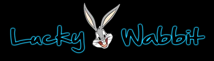
Help me pick my logo. . .

I like this one the best, but you have to make sure the "lucky" is more readable.

lioeo.png
Agreed this one looks SICK !
 
^Very nice kayzne, love it!


Update: Vectored the bunny and added some dice.
2sb2xzp.png
21o3dv.png
 
^Very nice kayzne, love it!


Update: Vectored the bunny and added some dice.
2sb2xzp.png
21o3dv.png

Try image with a horseshoe, this depicts luck better than dice. Looking good on white background.

Kayzne those logos are the rabbits bollocks, really good. :D
 
#1 its neutral, gets the point across, and easy on the eyes. Good job.

Are you using a tablet for the killer bunny vectors?
 
The one that has the orange is by far the best and the most professional.
Definitely the one you should go with.
 
#1 its neutral, gets the point across, and easy on the eyes. Good job.

Are you using a tablet for the killer bunny vectors?

Yeah, cropped the original image from some chinese horoscope site then used my tablet to make my own vector of it. Not happy with the eyes and mouth yet, but getting closer to where I want it to be.
 
The first one is definitely the best one and in my opinion the most professional.
 
21o3dv.png

this one is bad ass! how much for a logo? i would like to place an order
 
i prefer the first one which is black background with dice. If without dice i will choose the old one which is white background with the diamond look bunny. Make it simple and able to show your business personalities will do.
 
Op,
on your original post show me the second logo with the coloring of the first logo. I think I will like it.

Or show me one with a bugs bunny silhouette with mad bitches on him. Now that would be a lucky rabbit.
 
I will vote the third one! :) It show your designing skill, first and second look so simple.
 
Back
Top