Today was yet another productive day

Most of my time I've invested into
optimizing predictions and running
backtest simulations.
This gave me a few new insights -- allow me to show you some interesting charts and patterns.
I've also made several changes to the platform that I'll be discussing below.
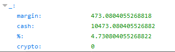
In the past two days my backtesting results weren't superb and in most of the cases had a negative ROI.
This was primarily because I ran them on a very specific region where the BTC's price started crashing (between Feb 2 and Feb 4).
In my previous post I noted that more stable (thus more predictable) regions already yield positive ROI on average.
In the next example I extended the backtesting range to 10 days: from Feb 1 until Feb 10.
Below is a list of the ROI (%) outcomes per feature and per date range:
2018-02-01 --> 2018-02-02
leonard: -9.9827
davinci: -6.7928
jack: -4.2996
maggy: -5.2389
hopkins: -7.8576
zeus: -7.1866
2018-02-01 --> 2018-02-03
leonard: -6.2089
davinci: -5.5678
jack: -10.5669
maggy: -9.9998
hopkins: -6.5830
zeus: -3.9999
2018-02-01 --> 2018-02-04
leonard: -6.8220
davinci: 0.7933
jack: -7.5079
maggy: -0.4476
hopkins: 2.8709
zeus: -5.7064
2018-02-01 --> 2018-02-05
leonard: -13.0994
davinci: -4.3663
jack: -9.8992
maggy: -9.0117
hopkins: -1.4675
zeus: -7.4565
2018-02-01 --> 2018-02-06
leonard: -22.4757
davinci: -12.5854
jack: -22.3420
maggy: -15.1592
hopkins: -9.0237
zeus: -16.4410
2018-02-01 --> 2018-02-07
leonard: -18.4872
davinci: -18.4128
jack: -12.4008
maggy: -7.9708
hopkins: 5.4584
zeus: -8.1996
2018-02-01 --> 2018-02-08
leonard: -15.6049
davinci: -18.6906
jack: -15.8222
maggy: -9.9868
hopkins: 8.4589
zeus: -6.0735
2018-02-01 --> 2018-02-09
leonard: -17.7171
davinci: -18.8250
jack: -18.7335
maggy: -4.0017
hopkins: 8.4400
zeus: -3.7195
2018-02-01 --> 2018-02-10
leonard: -13.3938
davinci: -15.5171
jack: -13.5012
maggy: -5.7064
hopkins: 18.4719
zeus: 2.9718
In the above results, you see that each iteration is one day longer than the previous one.
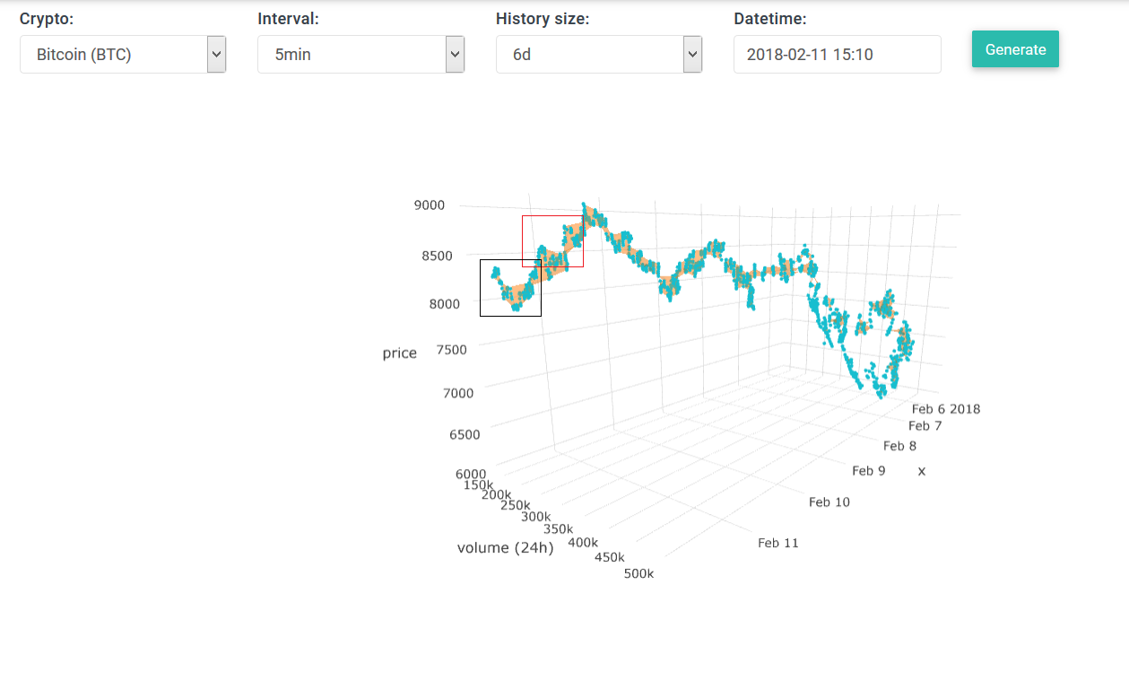
The reasoning for this is that between Feb 1 and Feb 6 there was a big decrease in BTC's price. From Feb 6 it started to increase steadily again.
I believe this decrease was influenced by factors that are not well measurable, I believe this huge drop was artificial and not a natural occurrence -- because of this the predictions are pretty terrible. So if we extend the backtesting beyond this uncertain period, we see that the ROI starts going up, because our trader (
Maggy) is able to get better returns. You can see this in the last three date ranges where the ROI is positive and higher than in the first half.
We also see that in almost every single case it was the "
hopkins" feature type that gave the best positive ROI.
I believe this is
partly because there is much more price and volume data available -- these parameters did not suffer from my system crashes in the past few weeks.
I wanted to investigate my theory more in-depth
without involving many statistical formulas -- but just purely by logical thinking and visual analysis...
Some time ago one of our readers suggested me to look into DEMA (Double Exponential Moving Average) index. So I thought of using a more basic index such as SMA (simple moving average) and use that formula on my training data. Thus instead of training the neural network using absolute values I would first transform it into moving average values.
Before I did that I updated the "general chart". Basically I removed the "trendlines" concept and replaced it with SMA. I quickly realized that my trendline concept is actually a "broke" version of SMA itself -- thus
SMA is better and more precise.
* I haven't yet updated the FAQs on my website, but will do that soon.
On this small GIF you can see what happens to the
SMA(Price) graph when I change the "SMA size" from value
1 to 20:
It's quite similar to the old trendline, except that it does not abruptly breaks -- instead the lines are smooth over the entire range.
Notice that the first #'
size' data points are missing, this is not a bug but just how SMA calculation works.
Before going further into making predictions let me show a few of cool graphs.
* (Pay attention to the selected SMA size)
** if you see a gap in the graphs below, it indicates there was an outage.
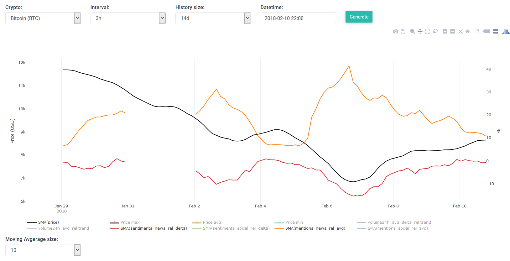
On the above we see how
news mentions and
social mentions look quite alike, especially most of their peaks align nicely. On first sight they don't appear to define any movements in the price per se. But we do see that there is more hype in times of panic (when the price drops low).
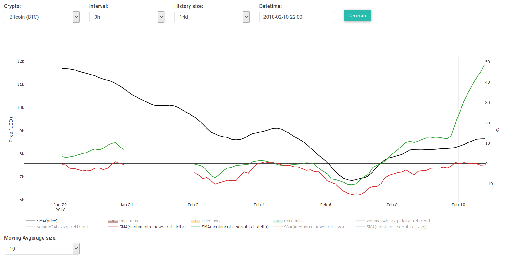
The above shows the SMA of sentiment analysis from news channels. Most values on the above graph are negative, meaning an overall negative sentiment. However the absolute values matter less than whether the value increases/decreases --> we see that there is a more positivity when the price goes up and negativity when the price is low. These sentiments do appear to have an impact on the price (and/or vice versa). It also validates that my basic sentiment analysis algorithm works pretty well to some degree
.
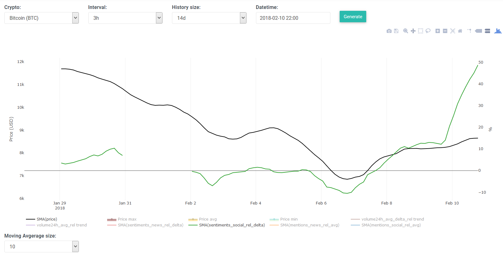
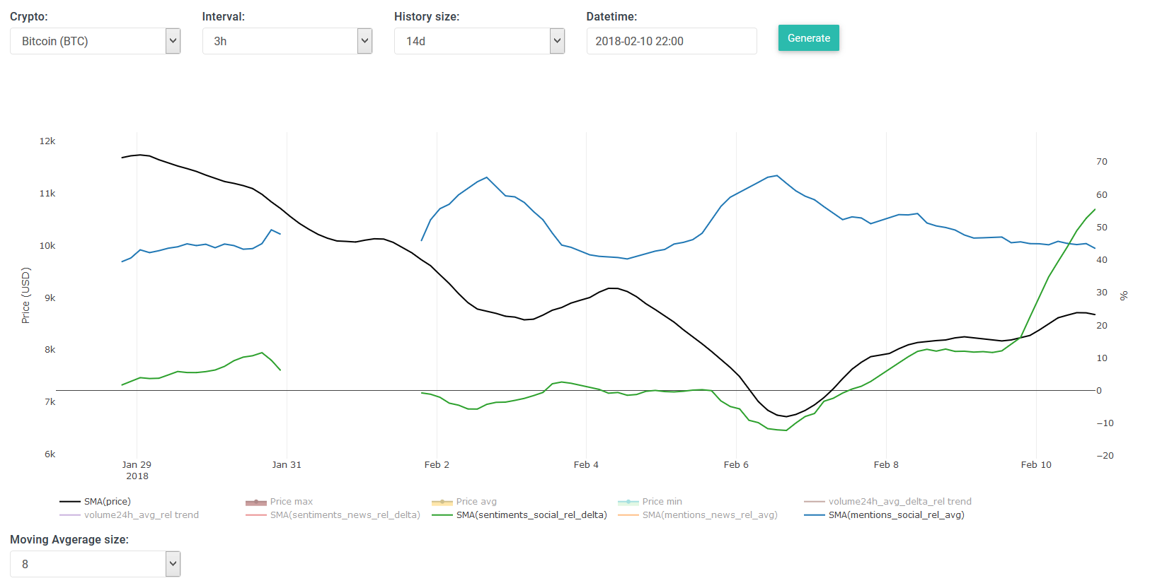
The above shows SMA of sentiment analysis from social channels (Facebook, Twitter and Reddit). It looks quite similar to the SMA of the price, and also to the previous SMA of news mentions but with less dramatic changes/peaks. So this appears to be yet another good indicator for making predictions.
The above shows both SMA's for sentiments from news and social channels -- it's just a combination of what I discussed in the previous two cases. We clearly see how they look alike. Simply beautiful.
Let us now take the
SMA of news sentiments and
SMA of news mentions -- It appears that the mentions are the inverse of the sentiments, which kinda makes sense. When the price drops the media is more active about the topic at hand.
The above is the same scenario but now for social channels -- yet again a similar inverse pattern.
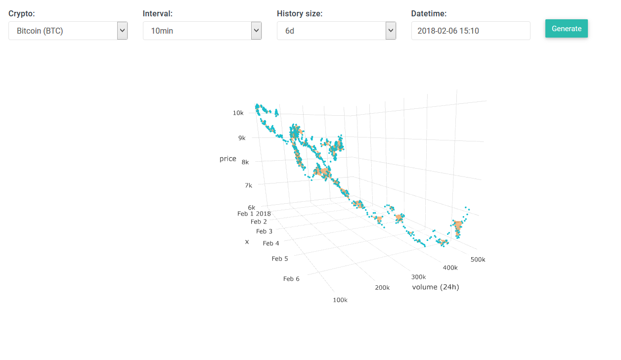
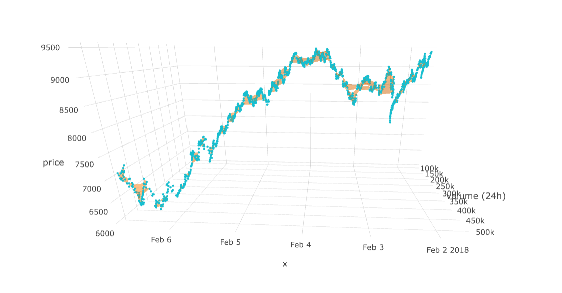
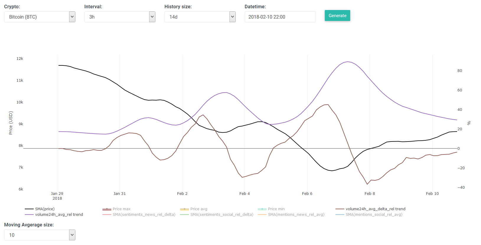
In the above you see the "delta" traded volume (24h). If you've been trading for a while then it's no surprise when I explain that the volume goes up when the price drops --> people who are afraid start selling, but the smart ones start buying, and later sell for profit once it reaches a new high.
You may have seen that there are two types of volume(24h) labels on the general chart. The first one is the "delta" which is derived from the regular "volume24h". The "delta volume24h" is calculated by subtracting the volume24h at interval (t-1) from (t). What this chart reveals is that the "delta" appears to be very in-sync with the price, while the regular one lags behind the price. I think this is quite unfortunate because most trading platforms (and their APIs) only show the regular volume24h data, so people end up with trading volume that's not really useful for "in the moment decisions".
The above shows how some peaks of the
SMA delta traded volume24h look similar to those of the news' & social mentions'.
The above is a similar chart, but in this case I show the volume with the SMA sentiments of news and social channels.
====================================
======
making predictions (continued) ======
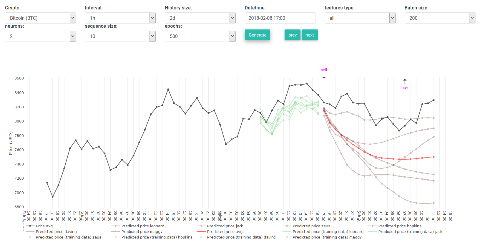
These new insights, thanks to SMA, allowed me to make more accurate predictions.
After many hours of tweaking parameters, testing and fixing bugs I had some nice results.
The annoying part is that each time I want to predict a certain range (e.g. past 24 hours) it takes several minutes (up to 10 minutes) before the calculations are done.
And at times there is a bug which you don't detect until a couple of hours later -- so a lot of time is occasionally wasted without realizing it.
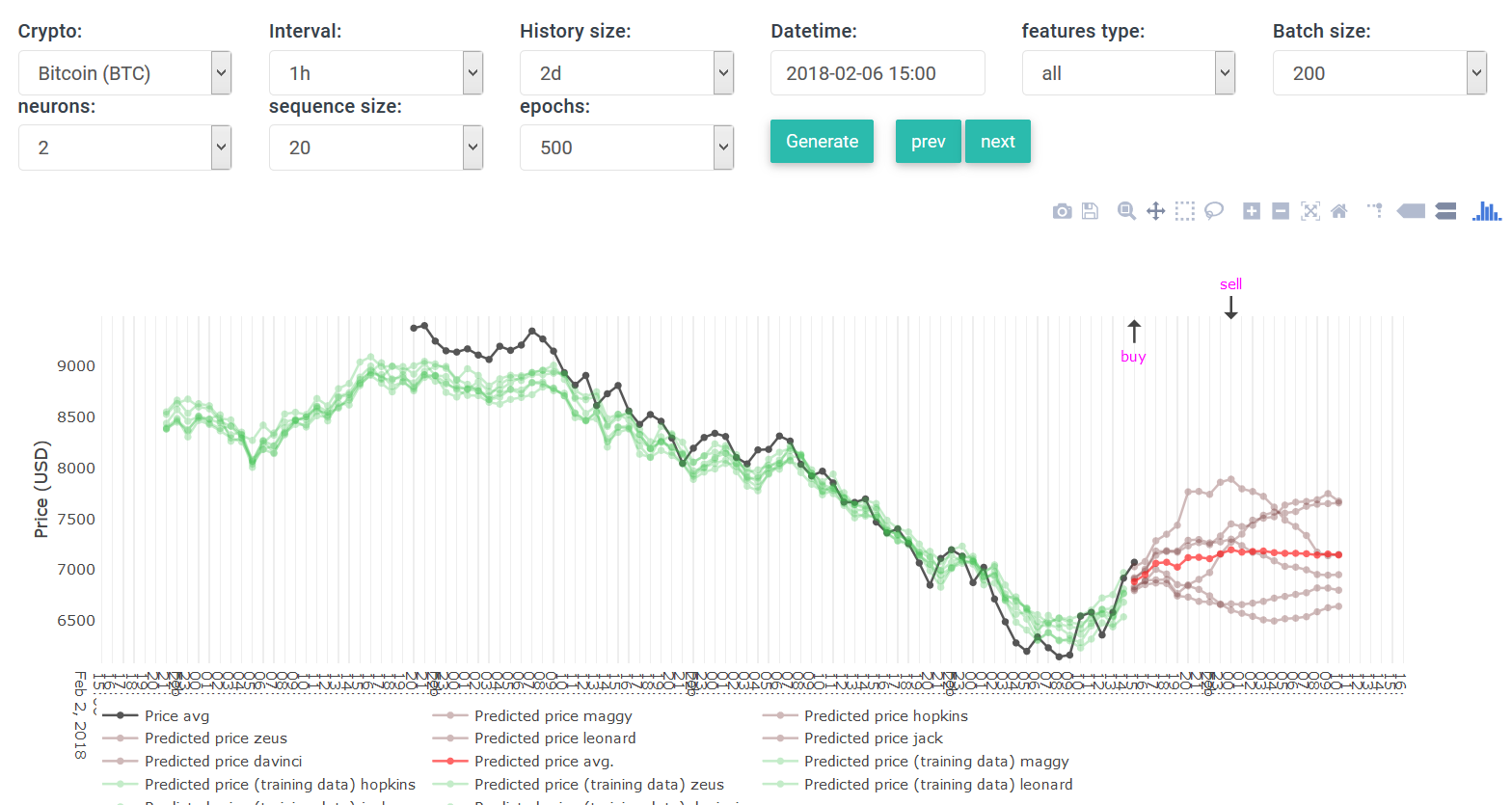
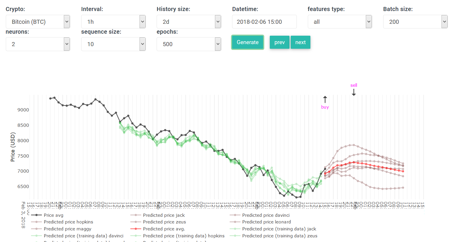
In the results below I have decreased the number of generated predictions to 4 intervals (previously I used 12 intervals, and on the live version it shows 20 intervals).
I have decreased this range in the hope of obtaining better results from my super simple backtesting strategy.
Initially decreasing the number of predictions did nothing, it still yielded negative ROIs. But this started to change when I began using SMA values instead of absolute values.
Below are my new outputs that I've generated in the past 3-4 hours.
I also noticed that sometimes the same data, parameters and same date range yield different ROIs (negative and positive) -- the
first reason is self explanatory, each time the neural network is re-trained in a different manner so the results differ slightly.
Secondly, the backtesting strategy is pretty
dumb, the system can buy/sell even if it would mean a loss, while in reality a reasonable person would hodl until he/she can sell for a profit. That's why I run the same calculations over and over again to calculate an average value.
Below you'll see that the feature types are now called "meany..." -- because they use transformed data using the SMA algorithm.
As I did more tests I also added newer "meany" types:
2018-02-02 --> 2018-02-03
meany2: 9.1556
2018-02-02 --> 2018-02-03
meany2: -7.6578
2018-02-02 --> 2018-02-03
meany2: 0.5394
2018-02-02 --> 2018-02-03
meany5: 0.1558
meany4: 3.4121
meany2: -6.8053
meany3: -6.1363
meany6: 8.9165
2018-02-02 --> 2018-02-03
meany4: 3.9447
meany7: 5.5848
meany5: 5.6072
meany2: 0.6073
meany6: 3.1642
meany8: 4.4083
meany3: -4.5343
2018-02-02 --> 2018-02-03
meany4: -8.0492
meany7: 1.7473
meany6: 3.6045
meany5: 4.5571
meany8: 6.8426
meany2: 7.5231
meany3: -3.0823
2018-02-02 --> 2018-02-03
meany11: 5.1921
meany7: 1.0555
meany10: 2.5474
meany9: 7.3625
meany4: 0.6746
meany3: 4.8770
meany8: 0.3525
meany2: 5.9148
meany5: 4.9839
meany6: 3.5062
2018-02-02 --> 2018-02-03
meany3: 2.5553
meany2: 1.3146
meany8: -0.6510
meany9: 1.6654
meany5: 5.6072
meany10: 3.1642
meany6: 1.7778
meany7: 8.9358
meany11: 5.7275
meany4: 1.1266
2018-02-02 --> 2018-02-03
meany3: 2.5553
meany2: 1.3146
meany7: 8.9358
meany11: 5.7275
meany6: 1.7778
meany10: 3.1642
meany8: -0.6510
meany4: 1.1266
meany5: 5.6072
meany9: 1.6654
The
average ROI of all
these outputs is:
2.5465 %
While the avg ROI of our initial output (with traditional feature types) was:
-8.2110 %
I am
very impressed with these results!!
Because with the traditional feature types we only had negative ROI values for the same date range.
We also notice that meany3 and meany8 don't yield many positive ROIs, so these two are the worst feature types.
Since it's already very late here, I won't have the time to test longer date ranges with the "meany" feature types.
So in the coming few days I'll be running more tests on different date ranges with variable lengths.
I am very excited because we have a lot of positive ROI outcomes from a "dumb" backtesting strategy; so I can't wait to improve the algorithm and allow it to make decisions whether to sell/buy as a real human would.
Have a good night everyone
- Ilya N.