Thanks everyone for the amazing comments!!! Love you all
 @neu009
I will definitely check out NLP google and IBM Watson in the near future.
I would love to see how their results compare to my algorithm, so stay tuned for that.
@Ensili
I loved your post and suggestion!!
Since I started this thread quite a lot of people have Skype'd/emailed me and most referred to your post.
Each coin has its own "stage" and it's pretty important to categorize and detect its stage.
To clarify this a bit more, and maybe you can confirm my understanding:
e.g.: NEO coins are not talked about on major news channels such as CNN/BBC/CNBC/... but Bitcoin is, and ETH sometimes. So from these stats we can already categorize which coins are at a high-stage and which are early-stage.
=====
=====
Friday 29 - Saturday 31, 2017
=====
It took several hours to convert my old system into a new one but it got done.
Meanwhile, my scrapers were gathering social mentions in the background and by Sunday evening I already had three days' worth of data.
(Yes, I worked on new years' eve).
You may remember this graph:
The gray dots are the hype (on this picture the dotted line was hidden).
If you care to know, the black-rectangle area from my first post was at around "Dec 30 10:00".
But here is what I noticed: it's not an intuitive way of viewing this data.
There is too much going on and "seeing" any relationship between "social hype" and BTC price isn't easy...
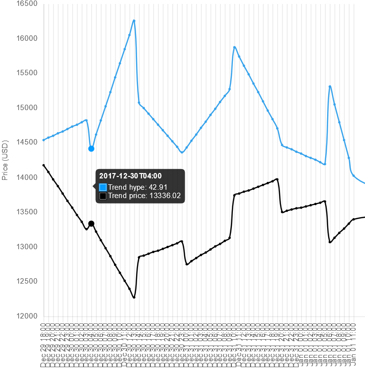
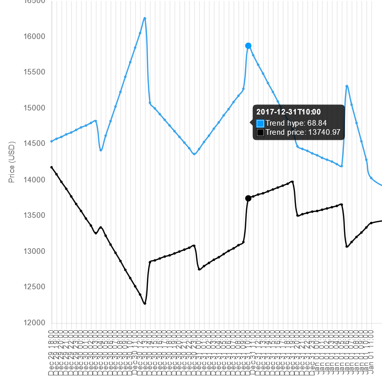
A solution is to draw a trend line: I basically take 3 sequential data-points, create a trend line for these, and repeat this until the end of the data. Finally I just combine all trend lines into one big line.
The graph below has dates from Dec 29 to Dec 31, 2017:
As you can see,
the blue is the trend-line for social hype.
The
black one is the trend for the avg price.
I have drawn
red shapes (in Paint) to indicate interesting zones.
*) remember that both lines are independent, meaning, if they cross (are above or below) at a certain time interval then it means nothing. This is because they both correspond to different Y-axes.
**) The x-axis is a 30 minutes interval.
The most fascinating part is that there are many zones (especially peaks ; local maxima) which look the same for BTC's price as for the Trend hype.
Let me briefly go over some of them:
(remember that
PRICE = BLACK ; HYPE = BLUE)
-------------
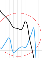
Here it looks like the short spike in BTC's price caused a spike in hype (but it came 60mins later).
Looks like the people responded to this short increase in price.
-------------
The lowest left circle is a very sharp drop in hype and price.
If I remember correctly the drop in hype was because my scraping script crashed or maybe I took it down on purpose to edit (can't remember).
But the drop in price was real. And this drop in price caused massive hype over the next few hours as you can see.
Once again, big hype came after (massive) drop in price.
-------------
Here is a similar situation of the first one: first the price goes up, then half an hour later there is a peak in hype.
-------------
This one on the other hand is different from the three previous ones. Can you see why?
It's pretty obvious, here the hype rises quicker and reaches a peak prior to price's peak. Could it be that people started buying more Bitcoins due to various mentions on social media (from friends, experts, etc...) and then shortly after the price went up? If this is true then by analyzing the current hype we "could" predict a rise in price after 15-60 minutes.
We are getting a step closer to confirming that "there is a relationship between social media and BTC's price".
The next big question is:
can we measure media's impact on the price? if so then we can also make near-future predictions.
=====
=====
Friday 29, 2017 to Monday 1st, 2018
=====
Early on I also added a new scraper.
Instead of scraping social media channels, I added 20+ big news sites (including some crypto-related ones) to analyze them in real-time.
This was a bit harder than analyzing social media since there is no official API of course.
What I soon realized is that news sites such as CNN, CNBC, etc... post much much less frequently than we get mentions from social media (thousands per minute that is).
It took some time to get enough data from these, so the graph contains data from the past 24 hours (since Jan 4 2018 , 11am GMT+1):
*) the date and time on the graph is local to EST timezone.
You can see that at some time intervals there are similar peaks in the news and price of BTC.
But there are far less similarities compared to hype from social channels.
That's it for today folks