Does somebody has interest to evaluate my website?

elkupi

Newbie
Joined
Jul 18, 2015
Messages
22
Reaction score
4
Hi guys,

Im finishing my new website elkupi (design, all programming etc is done so far, except the logo which i hope to get soon) and start to work on text keywords and SEO etc.

Well, Im very curious for some professional feedback out there. Are there things i can better change or improve....?

All critics are welcome, just don't judge too hard :)
 
Code:
http://elkupi.com/en/

if this is the website its not bad but you should make it look more professionally and i suggest you change the colors....
 
Is the chat necessary ? Do you have other people working with you ?

One of the things that annoys the most is when I see this type of chat live hooked up on website only to find nobody answer it when I need it
 
Yes it is! Thanks, which colors (combinations) do you suggest, I will try them out how they look in practice.
Code:
elkupi

if this is the website its not bad but you should make it look more professionally and i suggest you change the colors....
 
I have one guy working with me, which is more technical then me. About the Chat, I faced the problem myself, when nobody is answering. But this one is connected to my phone, which is day nd night in my hands, so i wish to answer all those chats as soon as i get any ;)
Is the chat necessary ? Do you have other people working with you ?

One of the things that annoys the most is when I see this type of chat live hooked up on website only to find nobody answer it when I need it
 
I think it looks good, if anything maybe have the chat box hover on the left and hidden, other than that it looks good, sorry your menu doesn't change into english
 
Hi guys,

Im finishing my new website elkupi (design, all programming etc is done so far, except the logo which i hope to get soon) and start to work on text keywords and SEO etc.

Well, Im very curious for some professional feedback out there. Are there things i can better change or improve....?

All critics are welcome, just don't judge too hard :)

So you are a web designer asking for web design advice?
And you offer SEO services but haven't started SEO?

Is this genuine or are trying to get some sales?

Anyway, I would have the 4 segments the same size, I don't like the colours BUT they do sort of work and I do like the overall design.
 
BUT they do sort of work and I do like the overall design.

You must have made a ton of cash from a ceosam JV, never heard you praise anyones website before! :)
 
Hi W130SN, I was expecting such a comment. First of all, thanks for your time and evaluation :)
I see what you mean by those 4 segments size now. Thanks for that. Although, it depends on the screen size you have i see.

Second, I will answer your confused questions.

So you are a web designer asking for web design advice?
As I answered before, "I have one guy working with me, which is more technical then me. " I never said i'm a webdesigner. I do offer web designs (cooperation)

And you offer SEO services but haven't started SEO?
Exactly, Have you seen a website starting SEO before having filled in all pages? :)

Is this genuine or are trying to get some sales?
As a student you dont teach your teacher, you learn from your teacher.
So, dont worry, Im not trying to sell while im asking for help. It is not the best sales perspective. All i appreciate is some advice and opinion from an independed user

So you are a web designer asking for web design advice?
And you offer SEO services but haven't started SEO?

Is this genuine or are trying to get some sales?

Anyway, I would have the 4 segments the same size, I don't like the colours BUT they do sort of work and I do like the overall design.
 
Last edited:
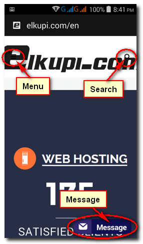
I checked the home page on my 5" android mobile. Looks good. Colors are ok. Opening visible screen (of the home page) needs some work:

Work on the mobile (responsive) header graphics, menu icon, and the search bar/icon. They both are hidden behind/above the header graphics. The header can become smaller, and the graphics need to fit properly inside the mobile container. There is a message bar (button) at the bottom right of the screen... take that to some other place... it is partially hiding the "Satisfied Clients" text. There is also lot of empty space between the header and the first line (Web Hosting). Reduce that... Also the underline below the Web Hosting looks unprofessional.

Scrolling down, everything seems ok. Checked 1 menu item, and it too looks ok.

Didn't had much time to check anything else. :)

Responsive Design: 5/10 at present.

4da66508656ce93fdce1782ec08e359e.png


.
 
Last edited:
Hi srb888,

Thanks a lot for your professional, visible and serious way of analyzing my website!!! I will take it into consideration to improve those details. Very appreciate it, have a good night :)
I checked the home page on my 5" android mobile. Looks good. Colors are ok. Opening visible screen (of the home page) needs some work:

Work on the mobile (responsive) header graphics, menu icon, and the search bar/icon. They both are hidden behind/above the header graphics. The header can become smaller, and the graphics need to fit properly inside the mobile container. There is a message bar (button) at the bottom right of the screen... take that to some other place... it is partially hiding the "Satisfied Clients" text. There is also lot of empty space between the header and the first line (Web Hosting). Reduce that... Also the underline below the Web Hosting looks unprofessional.

Scrolling down, everything seems ok. Checked 1 menu item, and it too looks ok.

Didn't had much time to check anything else. :)

Responsive Design: 5/10 at present.


.
 
The login/register should be located at the top for easy visibility. But its a good job.
 
Back
Top