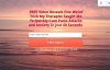
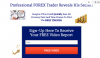
first attempt at landing page

1. Too many words. Try to eliminate about 50% of what you have but still send the same message
2. The Words In Your Heading And Optin Page Should All Be Caps Just Like This Sentence.
3. Take out the name, you will get about 15%-22% more optins if all they have to fill out is their email (I know this from testing) Keep in mind your autoresponder series will not have their name in it but most of the time it is a bunk name anyway.
4. Make these changes and then split test the color scheme and different CTA's (call to actions)

thanks for the input, that's some good advice and I will definitely put it to use.
that being said, it did not answer my question about whether to redirect directly from my opt-in form or to require email confirmation first...
 
i just vomited on my keyboard, thanks op

try insta-page its totally worth it, has a wordpress plugin too
 
take my forex leads, i have about 300 emails

Code:
[TABLE]
[TR]
[TD][/TD]
[/TR]
[TR]
[TD]email[/TD]
[/TR]
[TR]
[TD][EMAIL="[email protected]"][email protected][/EMAIL][/TD]
[/TR]
[TR]
[TD][email protected][/TD]
[/TR]
[TR]
[TD][EMAIL="[email protected]"][email protected][/EMAIL][/TD]
[/TR]
[TR]
[TD][email protected][/TD]
[/TR]
[TR]
[TD][/TD]
[/TR]
[TR]
[TD][EMAIL="[email protected]"][email protected] [/EMAIL][/TD]
[/TR]
[TR]
[TD][/TD]
[/TR]
[TR]
[TD][/TD]
[/TR]
[TR]
[TD][email protected][/TD]
[/TR]
[TR]
[TD][email protected][/TD]
[/TR]
[TR]
[TD][/TD]
[/TR]
[TR]
[TD][/TD]
[/TR]
[TR]
[TD][email protected][/TD]
[/TR]
[TR]
[TD][/TD]
[/TR]
[/TABLE]
 
Looks OK, OP.

My 2 cents: Try to make the sentences shorter.
 
If This Is Your First Attempt So It look Really Cool, Great Keep it Up :)
 
Just some comments.

1) Title is too damn long. Make it short and catch. You can have your current title as a sub title, but the title should be shorter.
2) "Of any method you trade" sounds a little odd. Maybe reword that.
 
The design is clean and beautiful, but the text could be worked at. Title is way too long, use a catchy one-liner instead of that "wall of text" :) Good luck!
 
thanks for the input, that's some good advice and I will definitely put it to use.
that being said, it did not answer my question about whether to redirect directly from my opt-in form or to require email confirmation first...

Test.
Try 2 weeks with the email confirmation and 2 weeks the other way. see how many junk emails you get and what the conversions are.

I personally dont sign up on things that need to confirm my email
 
Test.
Try 2 weeks with the email confirmation and 2 weeks the other way. see how many junk emails you get and what the conversions are.

I personally dont sign up on things that need to confirm my email

Thanks, this I will do. The reason for this question in the first place is, I noticed most people don't end up confirming their email, but aweber does not technically put someone on your list (and start auto-responding) until the email has been confirmed. Is there a work around for this? is this just a downside of aweber?
 
if anyone could clarify this for me that would be great.
in the meanwhile here's my updated page, I will send it live again and see how it does. here's another page i recently created to test another niche. any input on what you guys think would be great.
 

Attachments

  • Screen Shot 2014-12-09 at 6.38.03 PM.png
    Screen Shot 2014-12-09 at 6.38.03 PM.png
    144.9 KB · Views: 23
  • Screen Shot 2014-12-09 at 6.37.19 PM.jpg
    Screen Shot 2014-12-09 at 6.37.19 PM.jpg
    89.4 KB · Views: 33
  • Screen Shot 2014-12-09 at 6.36.50 PM.jpg
    Screen Shot 2014-12-09 at 6.36.50 PM.jpg
    67 KB · Views: 31
center one will get the most opt ins. test them all and I bet you a beer I am correct :) Looks good
 
Nice! The revisions look great.

Maybe add a 'watch' to the cta and make it 'watch free video' or something along those lines
 
center one will get the most opt ins. test them all and I bet you a beer I am correct :) Looks good
spot on. compared with the first draft of the forex page which did not convert well at all, the middle one does perform a bit better than the other variation. click through rate on those is around 2.5%-3%, which seems really low.after studying more, i'm working on some fresh ones.
Nice! The revisions look great.
Maybe add a 'watch' to the cta and make it 'watch free video' or something along those lines
good idea. i'll try that, thanks
 
of course i understand that these pages are best tested through direct experience, but i'm coming up with a number of different approaches, and i figure it wouldn't hurt if i could get some input and maybe narrow down the page variations before i go live
 

Attachments

  • Screen Shot 2014-12-11 at 8.59.20 PM.png
    Screen Shot 2014-12-11 at 8.59.20 PM.png
    163.2 KB · Views: 7
  • Screen Shot 2014-12-11 at 8.58.59 PM.png
    Screen Shot 2014-12-11 at 8.58.59 PM.png
    155.8 KB · Views: 10
  • Screen Shot 2014-12-11 at 8.58.39 PM.png
    Screen Shot 2014-12-11 at 8.58.39 PM.png
    146.8 KB · Views: 15
  • Screen Shot 2014-12-11 at 8.58.18 PM.png
    Screen Shot 2014-12-11 at 8.58.18 PM.png
    144.2 KB · Views: 10
  • Screen Shot 2014-12-11 at 8.57.45 PM.png
    Screen Shot 2014-12-11 at 8.57.45 PM.png
    142.9 KB · Views: 9
of course i understand that these pages are best tested through direct experience, but i'm coming up with a number of different approaches, and i figure it wouldn't hurt if i could get some input and maybe narrow down the page variations before i go live

I like the 3rd one.

I would bold the word 'increase' as opposed to significantly. Probably also 'secrets' in the title.

You've got good stuff in all of them, if you can combine the good parts you're golden.
 
They aren't good or bad, they're just basic, the question is how can you direct traffic to these Micky mouse squeeze pages? And do enough of it to make money down the line....
 
The landing page looks okay for a start.

You could test different designs to see which one converts best.
 
Back
Top