"Simple" Wordpress Theme?

mEaMNFQ


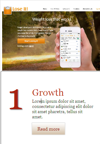
This is just the home page image (at 50% scale). The designs for the Blog page and the Contact Us pages are different. Together, these 3 pages make the whole WP template/theme. I will test the theme tomorrow for how it works, and for any problems too. Designing a theme is always a tedious PITA task. :(

I am sleepy now (1:40 am here), so will talk to you (much) later... :)Bt

w, I will not do any more changes to the design as I had some spare time tonight but cannot assure you that I can spare any more time on it now. (Have to complete my own e-com site fast). So sorry about that! In the mean time, you may continue to search for a better site on the net. Good luck!

P.S.:
The entire image (the top one) is click-able.

Usually I make an options page in the WP admin area, so that my client easily fills in all the details: texts, images, links, etc on that options page, and that reflects on the home page. For this though, I won't be able to create that options page because it takes lot of concentration and time, which I can't find atm from my busy schedule. Sorry again. :)
 
Last edited:
Actually it's not perfect, and that's my problem. I don't want any borders, menus, or anything else showing other than the image.

BTW it's not a real estate site. The term "real estate" refers to the amount of available space within a website page.
 
I think you will need to get a free or paid theme then tweak it as per your requirements . WP programmer maybe within 2-3 hours can program what you are looking for. I also recommend Genesis framework . You can tweak there free child theme to meet your requirements.
 
Is this what you want (near approximately, i.e.):

nr8eR1F


The actual site will be 1280px wide, and responsive too. One can see your site on almost all major devices, hopefully! lol.

See those 3 boxes below the "Click to Enter Site..." text? The bottom of those boxes roughly align the "other" site image. The entire image is click-able. The site is "responsive" too (as you wanted it to resize according to the major devices used). I am held up by the big image and am trying to make it responsive too. Only thing is I have forgotten the code that I must use to make it responsive. lol

The above image is just the beginning. The whole site is in Wordpress. Once I achieve what you want then I can begin work on the rest of the site, and make just (approx. ofc) as you wished in your PM. :)

My problems: Genuine ofc:
I ofc don't have much time to spare. My products supplier was supposed to be here and then we were about to continue our work on my ecom site. His job is to bring the products to my home only, and then photo-shooting, Photoshopping, site coding, making way for finding other solutions, ecom solutions including ... are my headaches. We have to complete my site in another fortnight max...

So giving this job much time is almost next to impossible. Still i will try to complete this by this evening (another 7~8 hours max.). TAfter that, you can safely assume that I cannot do this. :(

Anyway, happy hunting for something lot better. GL!
:D

P.S.:
There is no menu for the above page. The "menu" you see is part of the image taken as sample from that other site (the above the fold image seen on a 1280px wide monitor).

Below the big image, is the normal static page you want. The links on those blocks will take to the normal WP site's inner pages. Rest of the site will be a norml WP site matching the static part of the home page, and it will ofc have a menu, sidebar if you want, and you can use WP plugins, widgets, and whatnots -- hopefully again. I have ofc stopped working on such web designing jobs, and am occupied with my 2 main sites and selling products. SO I won't be able to give you much of pro-quality support either if you decide to go further with this.
 
Last edited:
you can search this term "wordpress above the fold theme" on gg or wordpress.org
 
If the "calorieking" blue bar at the top is part of the image, I think it's very close to what I want, thank you. Please pm me to finalise. :)

Is this what you want (near approximately, i.e.):

nr8eR1F


The actual site will be 1280px wide, and responsive too. One can see your site on almost all major devices, hopefully! lol.

See those 3 boxes below the "Click to Enter Site..." text? The bottom of those boxes roughly align the "other" site image. The entire image is click-able. The site is "responsive" too (as you wanted it to resize according to the major devices used). I am held up by the big image and am trying to make it responsive too. Only thing is I have forgotten the code that I must use to make it responsive. lol

The above image is just the beginning. The whole site is in Wordpress. Once I achieve what you want then I can begin work on the rest of the site, and make just (approx. ofc) as you wished in your PM. :)

My problems: Genuine ofc:
I ofc don't have much time to spare. My products supplier was supposed to be here and then we were about to continue our work on my ecom site. His job is to bring the products to my home only, and then photo-shooting, Photoshopping, site coding, making way for finding other solutions, ecom solutions including ... are my headaches. We have to complete my site in another fortnight max...

So giving this job much time is almost next to impossible. Still i will try to complete this by this evening (another 7~8 hours max.). TAfter that, you can safely assume that I cannot do this. :(

Anyway, happy hunting for something lot better. GL!
:D

P.S.:
There is no menu for the above page. The "menu" you see is part of the image taken as sample from that other site (the above the fold image seen on a 1280px wide monitor).

Below the big image, is the normal static page you want. The links on those blocks will take to the normal WP site's inner pages. Rest of the site will be a norml WP site matching the static part of the home page, and it will ofc have a menu, sidebar if you want, and you can use WP plugins, widgets, and whatnots -- hopefully again. I have ofc stopped working on such web designing jobs, and am occupied with my 2 main sites and selling products. SO I won't be able to give you much of pro-quality support either if you decide to go further with this.
 
I think you will need to get a free or paid theme then tweak it as per your requirements ...
Yes, this is what I have done - but it's not 100% perfect. You'd be surprised how difficult this is!
 
If the "calorieking" blue bar at the top is part of the image, I think it's very close to what I want, thank you. Please pm me to finalise. :)
Yes, the blue bar and everything that's close to the top margin is part of the image.

I am working on my own website at present. The whole day went in addressing multiple issues and I and my supplier were almost dead tired by evening.

The above image can be transformed into the site you want but I can only give it about 2 hours per day. That way, it will complete by Saturday imo, AND that doesn't include the time required to do R&D for the image resizing manipulations to fill the screens of all devices. And making that image into a responsive design as per your specs is extremely difficult. That's because your specs would require the image part to be full visible (as above the fold) both vertically and horizontally on a mobile device. And that will need to fill the device screen! WOW! That's impossible to achieve imo. That's a special case where the requirement is to show only the image (which is seen above the fold in a normal 1280px wide screen of a desktop).

Another problem is that you'll need to convert every image to 1280px width x 1024 px height to fulfill this site's requirement (to show every image as seen above the fold and the part below the image has to go below the fold every time. Getting it? So that condition gets fulfilled ONLY if the image that you'll put in place has always to be of 1280x1024 px size AND if seen only on desktop monitors (because it only has a fixed orientation, unlike the other devices such as a tablet or a mobile device) having the same resolution. Can you get every image of a site to that size -- every time and will that resizing will look ok?

The 3rd biggest problem is to resize the image to fill the screen of a mobile device -- every smartphone that this responsive design will work on! A user will see the image either in vertical or horizontal orientation... how can I program this image to fill the entire screen of whatever device he would using? The image will get cropped, or the below-the-fold portion will be displayed partially depending on the mobile device... Even the best programmer in the world can't fulfill all those conditions and come up with the best solution, imho. You will need to spend a fortune on such a site then.

Your requirements (to show only the above-the-fold part on every device cannot be humanely fulfilled. Please think over this, then we can proceed further.

I have made another design to recheck my own suspicions, but both the designs are still in their infancy. lol.

The major hurdle I'm facing at the moment is to resize the image continuously as the device changes, and I am not even thinking of how to make only the image visible in every device! Hmm.. I don't know what other experts have to say on the fulfillment of the requirements, but it looks almost impossible when I see the design in different simulated devices.

Here is that other design I have made. The actual site design is 1280px wide:

gAMu5zm


The bigger image seen above is what you actually see as above the fold on that site. On a 1280x1024 px wide screen resolution of my monitor, that almost exactly matches the original site. But when some other site you'll be copying from will have a different width, then either the image will have to be modified to fit the 1280px width of this new design. How will the resized copy of the original website look on this design? Some sites are 800px wide, some 1000px, some 1280px and some something else. We will have to make them all be the 1280px size. Will look odd when the fonts etc of the original size will either get enlarged or reduced depending on the original site's width.

The last problem, a major one for me is, I don't have that kind of free time to devote it for R&D of this design!!!

Regards,
 
Last edited:
Does it help if mobile becomes low priority?
 
Yeah! It will be mobile compatible too. Just that the top image will not always fill the complete screen in all orientations -- that would be impossible for anyone imo. Some part of the other part of the home page will show in the device's screen. Also the rest of the full WP site will be completely mobile friendly and responsive in nature for other devices like the tab too. I wanted to just convey to you, honestly ofc, that the IMAGE won't cover the entire screen in all cases.

And where the image covering the entire screen isn't possible, we can always think of some good alternative to convey your special message, instead of using the screenshot of the other site. Will need some brain-storming to think what can replace the required image though...Will take some time for that once I complete the task.

But what have you thought of a smaller sized header image? For example you cannot blow up a 800px wide header to make it 1200px wide image because it will look quite artificial and surprizing for anyone who is familiar with the other site. The width and height ratio should also match our site's above-the-fold area. What I am saying that the image is quite hard to display as the only above the fold contentfor all your visitors. This is a genuine concern for me -- resizing every image in such a way that it become the ONLY content above the fold for everyone who watches it -- Some may have a wider screen resolution, some may have a small. I hope that this limitation is quite clear to you. Any other requirement can be matched by a good programmer/designer, but this is like trying to achieve the impossible.

The desktop monitor is not a big issue, some of the other lower part of the site will be visible and that can be hidden programmatically or through the use of a suitable plugin, and shown for e.g., a arrow or button to open the hidden content, but the mobile devices, tabs including, are a huge challenge to manage the matching of the image and mobile device orientation.
 
Last edited:
Yeah, AJ, I recommend that you use him and see how it goes.

I was worried when no one was coming forward with a strategy to complete your job.

Regards!

You can do that with any theme man. If you still need it Pm me your skype
 
...I hope that this limitation is quite clear to you...
It is now! Maybe I asked for the wrong thing. I want the image to behave like any normal responsive site would in most given scenarios. In other words I want it to give the visitor the impression that he is looking at a site. So if a site would have padding in some scenarios, it's ok if the image does too. Likewise if a site became cropped in some way in certain scenarios, it's ok for the image to do that too. Does that make a difference?
 
OK, will do the trials and let you know. Will see how it looks on a various devices simulator.
 
I have sent you a PM in which there are 5 screenshots (5 different URLs) taken on a software emulator showing the site on:

1. desktop, 2. mobile horizontal orientation, 3. mobile vertical, 4. Tablet horizontal, and 5. Tablet vertical orientation.

They are approximate images i.e., the general image viewed on the above-mentioned devices' screens will be approximately cropped as shown there. Remember please, those are emulator views and may vary in reality (on actual devices). But when I checked the image for the desktop emulator view, with that of the actual screen of my website created for this demo, both almost exactly matched at my monitor's 1280px x 1024px screen resolution.

The actual website atm is the image shown here:
http://www.blackhatworld.com/blackh...89844-simple-wordpress-theme.html#post7050568

BTW, the image is actually 1278 x 854 px in size on the website.

Please let me know what you think of those emulator images. I can see that the mobile vertical and the tablet horizontal views are showing a bit of the other content, while the rest 3 are quite ok. :) But again, we know only after the site is completed in totality!

The mobile vertical emu. shot (image below) is what concerns me. It shows a lot of extra content below our header image...:

im3wunb


P.S.: The sample site is here:
Code:
https://www.loseit.com/
and the above the fold is from that site's actual screen resolution (width x height) at 1024x768 px. That shot was enlarge to the above size 1278 x 854 px to fit in the new demo site. Hence, you'll have to increase or decrease the image sizes to fit approx. 1278 x 854 px ever time you create a new site for each new project to view similar results as shown in those images included in my PM. That'd be a headache for you, lol, to manage the sites, and I won't be available to help you there every time.
 
Last edited:
Back
Top