Zwielicht
Elite Member
- Aug 31, 2013
- 21,128
- 40,576
Those of you who are posting short positive or negative responses, it's important to elaborate on why you like or dislike the theme.
Of course, as you mentioned, colour psychology isn't black and white. Whilst I don't know the specific reason for the red in certain elements on the forum now, I've chalked it up in my head to it being "chocolate themed". Seriously, when I was asked the write the announcement thread for the new theme, I looked over the new design and wanted to make several comparisons to the dark theme using dark chocolate, caramel chocolate, and ruby chocolate as a possible inspiration. However, as this was just meant to be an announcement rather than a review thread, I felt it was best to simply describe some of the new features and to limit most of my personal interpretations in regards to the designer's inspiration.
It's more like some people are throwing shots in the dark because they don't know who to be angry at.
But really, come on, there'd be at least some purple if I designed the theme. I thought people here would know this by now!

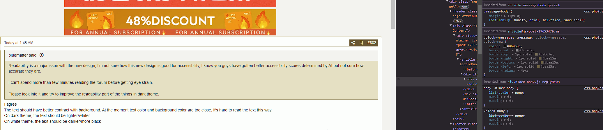
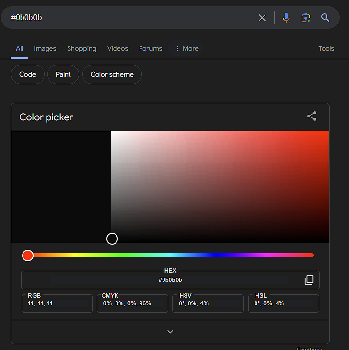
I checked the text colour on the white theme using inspect element and it's #0b0b0b. That's pretty close to #000.
There's an FAQ thread in the opening post. I'd recommend to everyone to read that before posting.
- "I like the new theme" - That's good, but what about it do you like? Do you find it easier to use, do you like the colours, maybe the new layout?
- "I hate the new theme" - Good, it's important to voice your opinion on this, but what do you hate? Is it the navigation, the change in colours, something about the new layout?
I understand this very well. When I was learning internet marketing, It was a general rule to avoid red CTAs as they can come off as alarming and to use orange CTAs instead.Yes, color psychology on CR isn't as black and white as most think and very much depends on context.
Red CTAs can very much work, if it aligns with the brand.
A good portion of my business revolves around CRO, and my biggest client currently has been a multi-million euro (annual revenue) bakery. Helped them increase CR on B2B contact inquiries by 370%.
In my limited experience, the red sign-up button in this context/branding just feels odd.
Though, I'm not a fortune teller with a crystal ball nor do I have the data on what the actual performance is, so what do I actually really know.
It just still feels weird, for me at least, to press a red button to do any actions (such as posting this reply) on this forum.
Of course, as you mentioned, colour psychology isn't black and white. Whilst I don't know the specific reason for the red in certain elements on the forum now, I've chalked it up in my head to it being "chocolate themed". Seriously, when I was asked the write the announcement thread for the new theme, I looked over the new design and wanted to make several comparisons to the dark theme using dark chocolate, caramel chocolate, and ruby chocolate as a possible inspiration. However, as this was just meant to be an announcement rather than a review thread, I felt it was best to simply describe some of the new features and to limit most of my personal interpretations in regards to the designer's inspiration.
I wouldn't quite say that. I'm not the designer of the new theme, although some people have erroneously thought that because I posted the announcement thread.Heh, how about NO
Poor @Zwielicht catching strays
It's more like some people are throwing shots in the dark because they don't know who to be angry at.
But really, come on, there'd be at least some purple if I designed the theme. I thought people here would know this by now!
Which theme are using at the moment, out of curiosity?I agree
The text should have better contract with background. At the moment text color and background color are too close, it's hard to read the text this way.
On dark theme, the text should be lighter/whiter
On white theme, the text should be darker/more black
I checked the text colour on the white theme using inspect element and it's #0b0b0b. That's pretty close to #000.
Can you post a screenshot of what you're referring to?Maybe get quoted text even darker; it's quite hard to differentiate between a quoted message and a response.
Can we go back to the previous theme? It was much better and clean layout.
The forum owner answered this question here: https://www.blackhatworld.com/seo/announcement-introducing-the-new-bhw.1585112/post-17648961Give us option to retrieve the previous theme. Its look very odd now like other forum which you can't understand where is the conversation started and where ended
There's an FAQ thread in the opening post. I'd recommend to everyone to read that before posting.