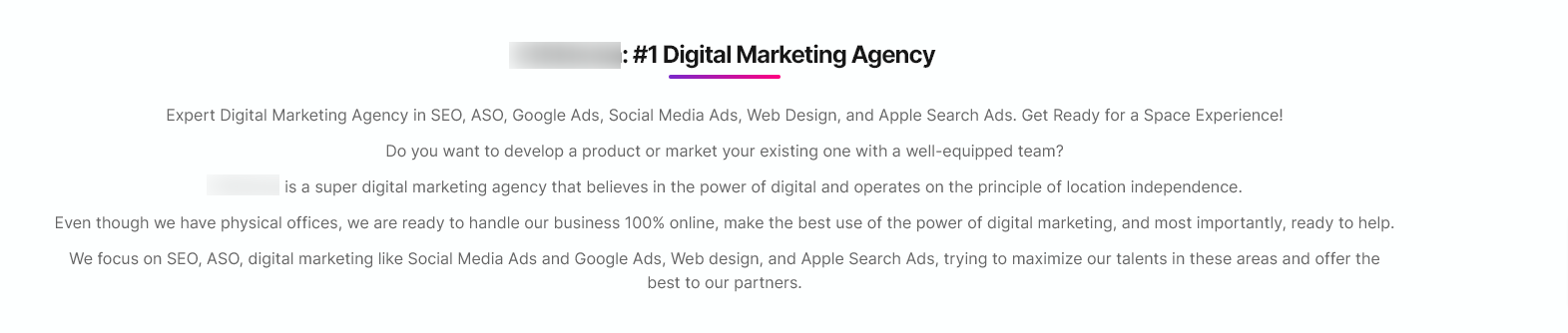
I would suggest removing the gradient color swatches of the Homepage title.
I would not put a CTA above the title.
I don't understand the logo, with that icon to the left. Suggest make it cleaner and it possible centre it.
The Homepage (as the footer) are cluttered. I sense this is for SEO purposes, but the perception isn't optimal, and you can better balance UX and SEO.
The value prop seems too broad: "Faster and more personalized" for all those services? As a user, why should I believe that?
Why is the FAQ section in the Homepage?
7/24 Support should be 24/7 Support. Don't change universal conventions that work for users.
"Request an online meeting during business hours.", which are?
Overall the content is missing the mark, which will cost you dearly.