
You are using an out of date browser. It may not display this or other websites correctly.
You should upgrade or use an alternative browser.
You should upgrade or use an alternative browser.
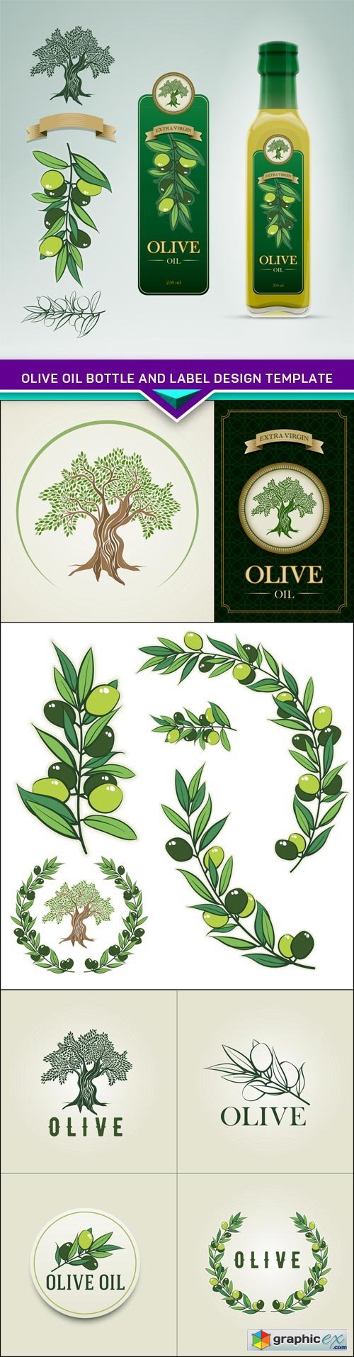
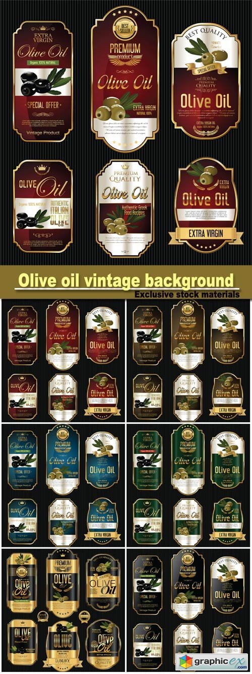
Bottle Label Design critique
- Thread starter nayannp
- Start date


nick nalisis
Newbie
- Jun 26, 2018
- 40
- 11
Very cool , i like your designs this is awesome


nayannp
Power Member
- Oct 1, 2017
- 740
- 199
nayannp
Power Member
- Oct 1, 2017
- 740
- 199
Thanks for suggesting sirLeft one looks better to me. White also symbolises purity so may be better to go with it.


nayannp
Power Member
- Oct 1, 2017
- 740
- 199
Thanks for your honest review sir.These are not "harsh" in anyway they keep me working and improving my work.Thanks for your reviews again i hope you keep giving more of these reviews in my future worksHonestly, the second font looks shitty, and the color isn't that great either. Sorry for being a bit harsh, but those are my thoughts regarding the design.

Dominor001
Power Member
- Dec 22, 2015
- 518
- 298
The design looks good, I like the left one better. The logo is good but the text in bottom, I don't like the font
nayannp
Power Member
- Oct 1, 2017
- 740
- 199
thanks for the critique.the majority is going towards left till nowThe design looks good, I like the left one better. The logo is good but the text in bottom, I don't like the font

nayannp
Power Member
- Oct 1, 2017
- 740
- 199
Thanks for the suggestion,Yes i will be putting them in the mockup these are actually for a olive oil bottle and i need to make or find cause i dont have such mockup right now.Why don't you put them in a bottle mock-up? You should always put your designs on products you're designing for, because they often look different from the art-board.

safeSEOboost
Elite Member
- Mar 22, 2010
- 3,277
- 2,273
I would say it is a good start, but we need to see the entire design.
Test different fonts.
Test different fonts.
nayannp
Power Member
- Oct 1, 2017
- 740
- 199
Thanks i will definitely try different fontsI would say it is a good start, but we need to see the entire design.
Test different fonts.

- Mar 21, 2013
- 24,772
- 31,559
Funny most recommended the left one, I like the colors on the right better.
- Mar 21, 2013
- 24,772
- 31,559
I think that the left is more eyecatching, the right one the colours are more subtle and blend in and give a calmer feel.
Exactly. The left one has more contrast. The one on the right is more "relaxing" indeed. Left one may attract more sales on the shelf, hadn't thought of it that way.
nayannp
Power Member
- Oct 1, 2017
- 740
- 199
Funny most recommended the left one, I like the colors on the right better.
So,These two posts give me idea of why not i try to gather both of these feautures in them and make the fonts correctI think that the left is more eyecatching, the right one the colours are more subtle and blend in and give a calmer feel.
CaptainKorruptz
Registered Member
- Apr 11, 2018
- 57
- 17
Left for sure, the font is the only problem in my opinion, you need to make the top part be the focal point and the bottom half be less important... change size and style and you'd be good to go
nayannp
Power Member
- Oct 1, 2017
- 740
- 199
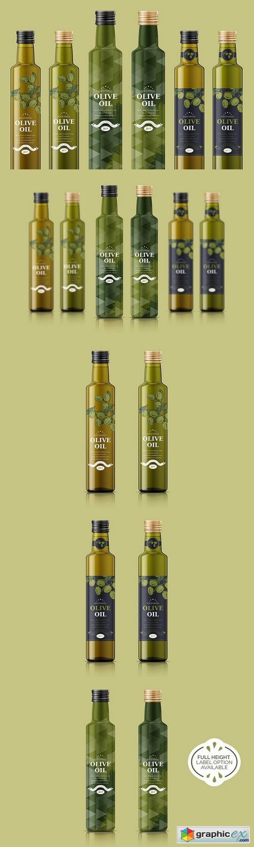
the bottle mockups in the last are great.The clients want something similar but in small size cause its 15ml