
You are using an out of date browser. It may not display this or other websites correctly.
You should upgrade or use an alternative browser.
You should upgrade or use an alternative browser.
Cryptocurrency analysis and predictions using AI and big data
- Thread starter healzer
- Start date

healzer
Elite Member
- Jun 26, 2011
- 2,974
- 3,063
Yes indeed, that would turn $10k into $374k in 365 daysIf you can get a ROI of 1% daily on a $10k investment, that alone will give you a massive gain over the course of 1 year.

Let's do our best to make this happen!
shakenbake
Newbie
- Jun 5, 2015
- 1
- 1
check solume.io bro you might be interested with it

geoffreycelen
Newbie
- Feb 13, 2018
- 3
- 1
Well explained in the post. I really like it and it is very beneficial to many people who are going to invest in the cryptocurrency.
Last edited by a moderator:
healzer
Elite Member
- Jun 26, 2011
- 2,974
- 3,063
Normal (fiat) currencies are influenced by many more factors.hmm very interesting, can this be used on normal currencies?
Crypto's are not (yet) -- they are very early stage making them a wonderful research topic.
Thanks, a few other people have mentioned solume on here before.check solume.io bro you might be interested with it
What we are building is quite different and much more advanced.
If you wish to learn more, you could go through some of our previous replies on this thread.
Yes it definitely is, and I hope more people will start using it.Well explained in the post. I really like it and it is very beneficial to many people who are going to invest in the cryptocurrency.
I can tell from experience these charts have helped me make trading decisions.
Right now I don't trade large amounts -- but even for testing purposes I've found it valuable to take calculated risks.
====================
==== Feb. 14, 2018 ====
Since a few days ago I've started day trading on an exchange.
I don't have any crazy margins to brag about yet, but I've made between 1% and 5% on every trade.
In this post I will briefly explain my current trading strategy and how I make a decision.
Then I'll post some updates regarding the project itself.
A basic Bitcoin trading strategy for beginners
This strategy can be applied to any cryptocurrency, but I've only used it on Bitcoin for one particular reason.
Correct me if I'm wrong, but when I look at the past few days, and unless you're lucky, it's not very easy to make more than 3% ROI on a certain trade.
It is possible with big coins such as BTC and ETH, but for smaller ones there is much less margin if you want to buy and sell within an hour or so.
In my opinion making an investment and expecting over 10% returns (on a single trade) within a couple of days is pure speculation -- unless there is a high probability of such a thing happening.
Here's an example of how I make between 1% and 5% returns on an investment.
The screenshot below is taken from my exchange (you can use gdax, bitfinex, binance, whatever...) they all are very similar.
And if you don't like using an advanced exchange then Coinbase is more than enough to buy/sell.

Each candlestick is 15min apart. So the idea is to buy when the price is LOW (= green rectangle).
And then sell when it's HIGH, such that your "sell price" / "buy price" = between 1% and 5%
It's the most basic formula, and it works just perfectly.
E.g. on the above, we could've bought for $8400/btc and sold for $8700/btc, yielding 3.5% ROI (excluding negligible fee).
But the big question is, how do you know when it's the right time to buy/sell?
The reality is we don't, but we can use various tools to help us make a decision.
To give you one example, there is the "moving average" index, it's a widely used tool:

But in reality, it's just a tool -- it's not perfect.
And in this case, the moving average indices don't indicate the ideal buys (a.k.a entry points) as I've indicated with my rectangles above (nor the sell points).
And when we are trading, we can only look at the past and speculate of what will happen in the near-future.
Assume that we are currently at the highlighted date/time (Feb. 13, 11am).
So our trading view actually looks like the image below (the black rectangle is the unknown future).
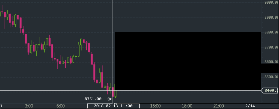
Note: I have removed (using Photoshop) the trading volume graph which sits between the timeline and candlesticks.
As a trader we want to know whether now is a good time to invest, and as I've shown earlier, the Moving Averages aren't always trustworthy.
So what I did next was look at my own generated predictions, here are some of them:
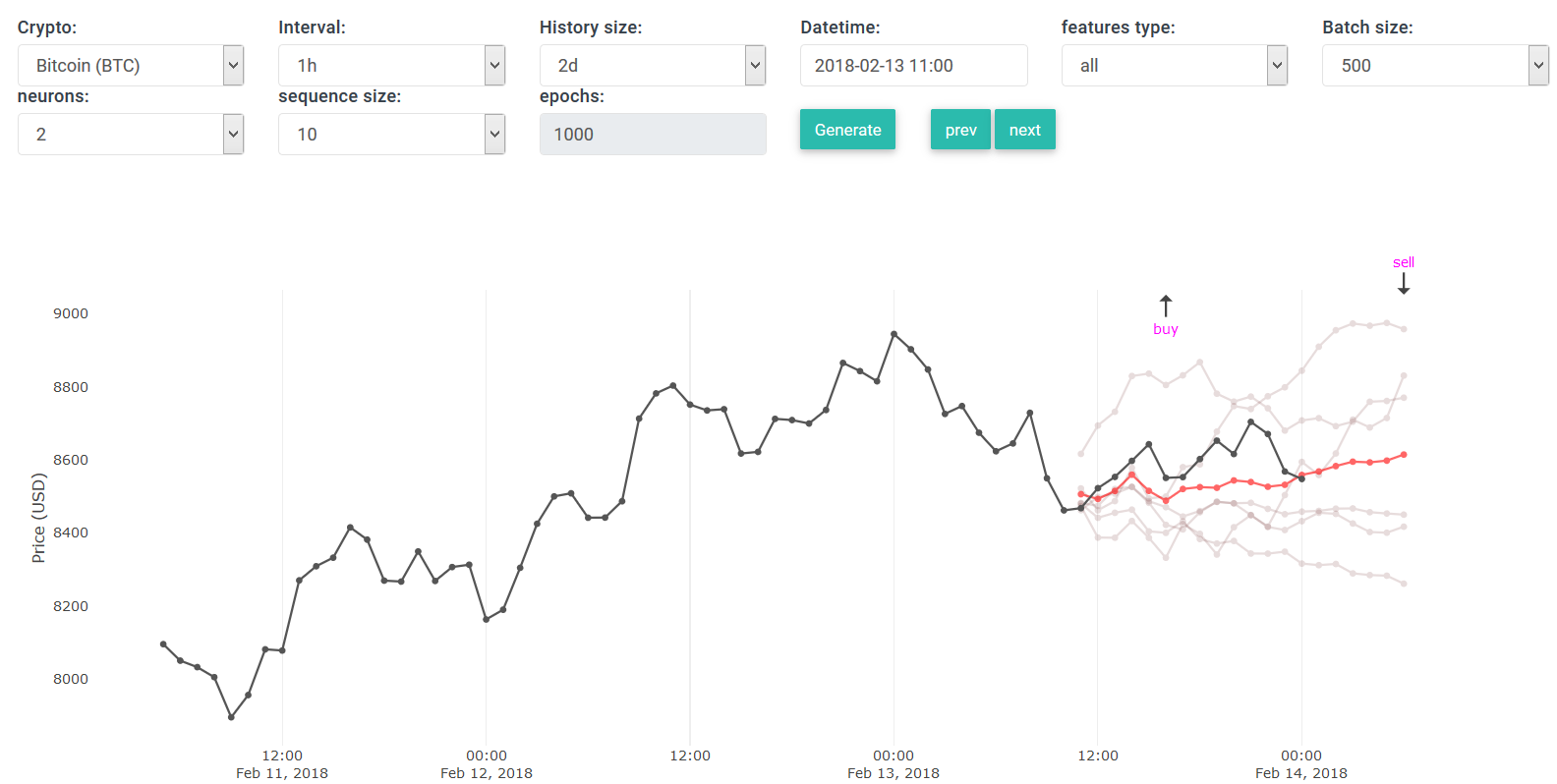

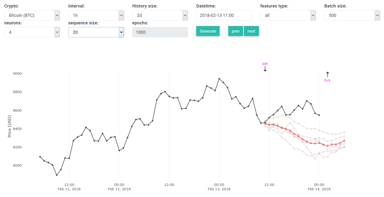
As you can see, depending on the selected parameters, the results vary quite a lot.
The first two charts indicate the price will rise, the third one (and probably other ones) show a decline.
This doesn't really help us at all. So let us look at all the predictions (and this is a new feature):

Notice how all parameters are "all" in this case. Every point on this plot is at hourly (60min) intervals ( remember that our exchange view is only at 15min intervals ).
On the screenshot above we are able to see what the actual price looked like, and compare it against the generated predictions -- this is because we look at past data.
When you are "in the moment", you won't see the black line extend into the unknown, you'll only see the red prediction lines.
After a bit of scrolling on the y-axis, and zooming in on the (red) predicted average -- we see it shows a bump for 15:00.
But even at 12:00 it indicates a slight increase compared to 11:00.
Notice that the first signal is a "buy", because it predicts an increase in price later on.
There's also a third signal (last one), which is also a "buy", but as mentioned in one of my previous posts -- this one is highly speculative and guarantees no exit point.
Since we have the actual price on top of the predictions, we can see how well these signals perform, they are not perfect so don't rely on them exclusively.
The above is pretty convincing to me to make a "buy", but I want more validation.
Let's look at another chart:
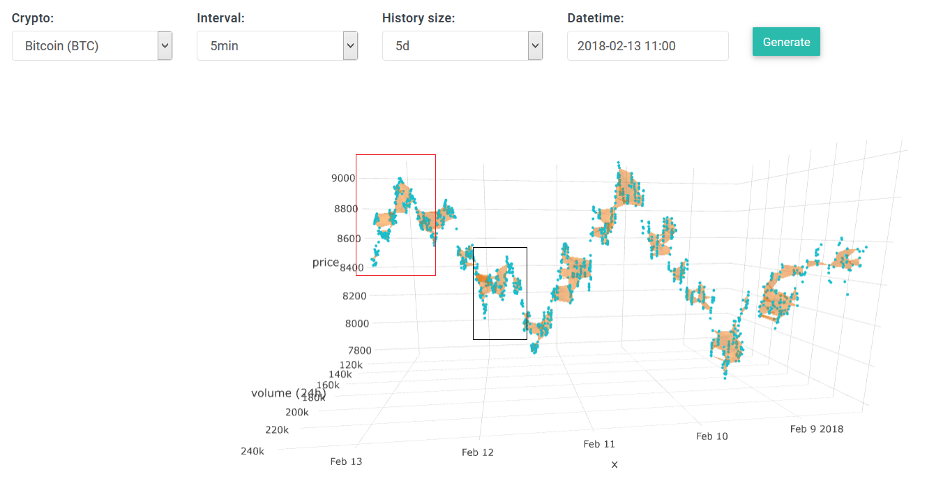
What I love about this 3D plot are these local orange "clusters".
I believe there is something to learn from the size/shape of a cluster, they may contain some forecasting characteristics.
- Firstly, notice the top/max in the red rectangle, it looks like the top/max at "Feb 10" on the x-axis.
What happened after Feb 10 was a decline until midway Feb 11.
There is a chance the same will happen here, we already see a strong decline midway Feb 13.
- Secondly, notice how the black rectangle looks like the red one. It indicated a decline but then the price jumped back up.
Let's look at a third type of chart:

On the chart above we see the avg price (orange filled area), and the red line is the traded volume (delta values).
A basic economic principle is that increase in demand causes increase in price.
If you look carefully, you'll see that peaks in trading volume resolve around valleys in price. Thus when the price drops, people start buying/selling.
So on the far end of the chart is our current situation with data until 11:00 am. We see there is a small increase in trading volume, thus people are starting to buy (or sell).
Notice that the past 5 intervals (from 6am until 11am) look somewhat similar to what happened between [ 18:00 and 00:00 ] on Feb 11.
It's not a good practice to use historical patterns to make future decisions by, but we'll do it anyway.
The theory goes like this: price is relatively low --> people start buying --> price starts to go up --> we sell --> ... (cycle repeats)
In trading, we usually have these basic scenarios:
- We buy --> price goes up --> we profit.
- We buy --> price goes down --> we'll have to wait a few hours/days before it (hopefully) reaches a new max so we can profit.
- We wait --> price goes down --> we wait for a better entry point.
- We wait --> price goes up --> we lost our chance (we'll either buy and end up with a lower margin, or wait until some next entry point).
So by not doing anything we actually lose.
To deal with a situation where the future is quite unpredictable, you could invest let's say 10% and wait for a few intervals to re-consider buying/selling/holding.
Sometimes we really feel the urge to "buy", and we do everything we can to validate our intentions.
It's always best to back it up with logic, and not just your "gut feeling".
===============
==== updates ====
On the predictions chart above you have seen that I've added "all" type to some settings.
As a result, we can put all predictions of a certain datetime on a single chart.
This could be somewhat heavy on your browser, so be careful of crashes if you've got a crappy laptop.
Yesterday I have spent most of my time generating predictions and running backtests (most of the time was just waiting for the calculations to finish, which take about two hours for a full 10-days worth of predictions).
I realized that these "meany" feature types aren't superb. Thus they can still yield crappy ROIs depending on market's state (if it's declining or stable/growing).
So instead of trying to optimize the data itself, I added a different backtesting algorithm.
Below is a snippet of ROI outcomes using the original backtesting algo:
The average ROI is -2.1338%2018-02-02 --> 2018-02-03
meany8: -5.635118619677337
meany3: 0.8976543891417554
meany10: 2.6583180505304282
meany9: -1.965998197499863
meany7: -4.769953217497369
meany4: -2.159330477748267
meany11: -8.21509401491286
meany6: 0.9659699392301713
meany5: -5.635118619677337
meany2: -4.215662816797594
avg: -2.807433358490827
2018-02-03 --> 2018-02-04
meany8: 3.546141916992429
meany3: 6.120354428503205
meany10: 6.87684439811258
meany9: 2.5028309116981395
meany7: 1.3188447325701347
meany4: 4.418163240519735
meany11: 2.1874043562755796
meany6: 11.273307563500957
meany5: 1.3624547622486993
meany2: 1.9149354409172092
avg: 4.152128175133867
2018-02-04 --> 2018-02-05
meany8: 2.720446334560811
meany3: -11.802053938760293
meany10: 0.9183743508467179
meany9: -7.438226833171302
meany7: 1.6364535826615345
meany4: -10.860562625996407
meany11: -4.43856139934603
meany6: -9.11001086087454
meany5: -1.8944225476429932
meany2: -2.8547285145033463
avg: -4.312329245222585
2018-02-05 --> 2018-02-06
meany8: -19.062341809662264
meany3: -21.978045595477013
meany10: -17.009087295270696
meany9: -17.805204839873657
meany7: -6.496018570759954
meany4: -24.586259971390977
meany11: -9.741122916022583
meany6: -14.67166797614613
meany5: -15.611445235321842
meany2: -18.26259440339709
avg: -16.52237886133222
2018-02-06 --> 2018-02-07
meany8: 4.315973236319226
meany3: -1.6251680768298193
meany10: -2.3535647336026533
meany9: -5.523099171744339
meany7: -2.345785347757845
meany4: -6.031071530934606
meany11: -4.763884217233949
meany6: -13.741292016991736
meany5: -2.8735706713140297
meany2: 1.9508209114879493
avg: -3.29906416186018
2018-02-07 --> 2018-02-08
meany8: -1.2838011978283936
meany3: 9.457395576360806
meany10: 0.0983755612006254
meany9: 2.2358247641605544
meany7: -3.418565088865466
meany4: 1.147983323844226
meany11: 1.3730080468654426
meany6: -0.30545048553032306
meany5: -2.20151576179598
meany2: -4.04872710016323
avg: 0.30545276382482617
2018-02-08 --> 2018-02-09
meany8: 0.0
meany3: 1.2943086082326083
meany10: 6.34847861958201
meany9: -3.6070586125381165
meany7: -1.8376852571405422
meany4: 1.687824793173398
meany11: 0.5163316528394857
meany6: 2.7003351119121666
meany5: 8.887875645909983
meany2: 3.1984199536538194
avg: 1.918883051562481
2018-02-09 --> 2018-02-10
meany8: 5.467887857698894
meany3: 5.495903169143412
meany10: 10.994849580720501
meany9: 7.8016623533202045
meany7: 4.9741014962451535
meany4: 5.505258102472088
meany11: 1.601733592475063
meany6: 0.9971115379550088
meany5: 6.725418713369313
meany2: 5.36662263222607
avg: 5.493054903562571
2018-02-10 --> 2018-02-11
meany8: 0.05365471278897527
meany3: -7.598721071535397
meany10: -5.846578904560462
meany9: -5.3384368970067815
meany7: -5.568325667078044
meany4: -5.477332370284871
meany11: -6.36087336117942
meany6: -3.962112768320969
meany5: -0.22279933700669607
meany2: -1.004338394069415
avg: -4.132586405825308
Definitely not great, out of $10k that our Maggy started with, she would've lost $213/day on average -- had she followed the signals blindly that is.
When I look at the predictions, I notice that quite a lot of first-interval predictions are pretty accurate.
In most cases the first 3 intervals are pretty accurate, everything beyond is more and more speculative/incorrect.
So I added a new backtesting algo that uses only the first predicted value -- in this case we let Maggy buy/sell depending on whether the prediction is lower/higher than the previous (actual) price.
It still remains a stupid backtesting simulation because Maggy has to blindly obey the signals -- but allowing us to assess the quality of the signals/predictions.
In this new scenario the average ROI is +1.489%2018-02-02 --> 2018-02-03
meany8: 2.2424265943444155
meany7: 0.8477165307889223
meany5: 2.1661396492433704
meany9: -0.7548572133279419
meany11: -0.7548572133279419
meany4: -0.7108990792090153
meany3: -1.53815868273256
meany2: -1.5897020240209558
meany10: 0.6212909411992262
meany6: 4.934853632479874
avg: 0.5463953135437393
2018-02-03 --> 2018-02-04
meany8: 2.0483196355912225
meany7: 0.40725079728520797
meany5: 4.0574284578852815
meany9: -1.5895759686337052
meany11: -0.6973050761392541
meany4: -1.757471885823092
meany3: -1.6205225985086558
meany2: -1.8520412084903737
meany10: -1.5895759686337052
meany6: 3.4777024138282764
avg: 0.0884208598361202
2018-02-04 --> 2018-02-05
meany8: -5.883147252322562
meany7: 0.29566078345133473
meany5: -2.3700023136884685
meany9: -1.665654604283795
meany11: -4.802413802285521
meany4: -4.866857835598237
meany3: -4.10758937513126
meany2: -2.696463617718292
meany10: -3.440958810185124
meany6: -1.9022653616565188
avg: -3.1439692189418444
2018-02-05 --> 2018-02-06
meany8: 0.0
meany7: 0.0
meany5: 1.9908128161849836
meany9: -7.2722211818417986
meany11: -7.331424873303827
meany4: 0.3794159429129529
meany3: -3.1442917627300115
meany2: -5.817929111596653
meany10: -7.5282610805266215
meany6: -0.8245756761340317
avg: -2.9548474927035007
2018-02-06 --> 2018-02-07
meany8: 17.418803087486758
meany7: 5.369340265761435
meany5: 3.0255318945520138
meany9: 11.535930915666203
meany11: 10.624728526661876
meany4: 12.92792634847444
meany3: 11.123822114245607
meany2: 11.01933793211549
meany10: 8.30746473182058
meany6: 1.2643904342050538
avg: 9.261727625098946
2018-02-07 --> 2018-02-08
meany8: -3.280102006535568
meany7: 6.2395034558244244
meany5: 4.4465336894378815
meany9: 0.45397203980726
meany11: 0.6051890534227722
meany4: 0.2813912994547474
meany3: -4.512688747627125
meany2: -0.46649209297482397
meany10: -1.0398442885615977
meany6: 6.428155600210395
avg: 0.9155618002458364
2018-02-08 --> 2018-02-09
meany8: -2.0031288290013105
meany7: 6.192359002080949
meany5: 4.762086663004483
meany9: 0.7080165040427078
meany11: 4.750075496344741
meany4: -1.347238911113291
meany3: 2.118837563200926
meany2: 0.7080165040427078
meany10: 1.8415263159883288
meany6: 5.267827458838448
avg: 2.299837776742869
2018-02-09 --> 2018-02-10
meany8: 8.065345418657843
meany7: 5.522537864118648
meany5: 8.487958486243908
meany9: 5.299944733995865
meany11: 6.324625139481577
meany4: 7.90966597365248
meany3: 6.481147459394987
meany2: 2.9573257117346374
meany10: 8.12929730190688
meany6: 6.0180842464454765
avg: 6.5195932335632305
2018-02-10 --> 2018-02-11
meany8: 0.0
meany7: 0.0
meany5: 0.9652155687239983
meany9: -0.6662159639043042
meany11: 1.0888468457065814
meany4: 1.0996028962271032
meany3: 0.796877105537197
meany2: -5.465226129550215
meany10: 0.2638815311739817
meany6: 0.6265278155041187
avg: -0.1290490330581539
Thus her average return would be about $148.90/day.
I have yet to test this new backtesting algo on our original feature types.
I am quite skeptical whether these "meany" types (using SMA data) perform any better on average.
But it's not a trivial to figure this one out because each computation is very time-expensive.
I also experimented with a dark theme for our platform:


The dark version is not "live", but I will make it possible to switch between light/dark by preference.
Let me know what you guys think -- the color schemes do need some adjustments though.
Cheers!
Ilya
healzer
Elite Member
- Jun 26, 2011
- 2,974
- 3,063
This is a short follow on my previous post.
Yesterday, at 21:20 I sold all my Bitcoins for about ±$8700/btc :

But then I made a mistake. In my trading view I saw a lot of other people selling as well.
I don't know what went through my head but an hour later later, at 22:25 I used 50% of cash to buy Bitcoins for $8690/btc.
My reaction was: the price is going down, but it looks like a short decrease --> it will most likely spike up to $8.8k in the coming hour or two.
This decision was validated by two charts:
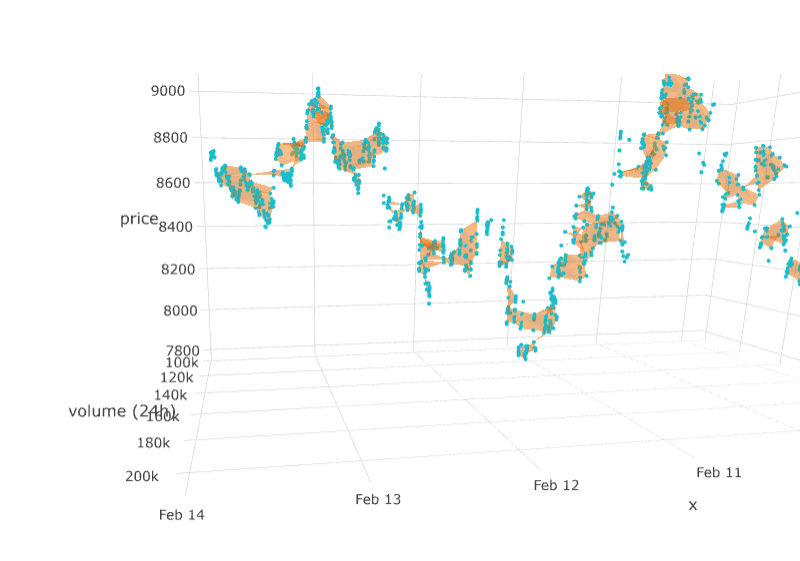
On the 3D plot, this cluster near the end of Feb 13 looks pretty big and solid -- like a good platform for growth.
And then I also noticed that predictions with a shorter sequence length (=10) are pretty accurate short-term:
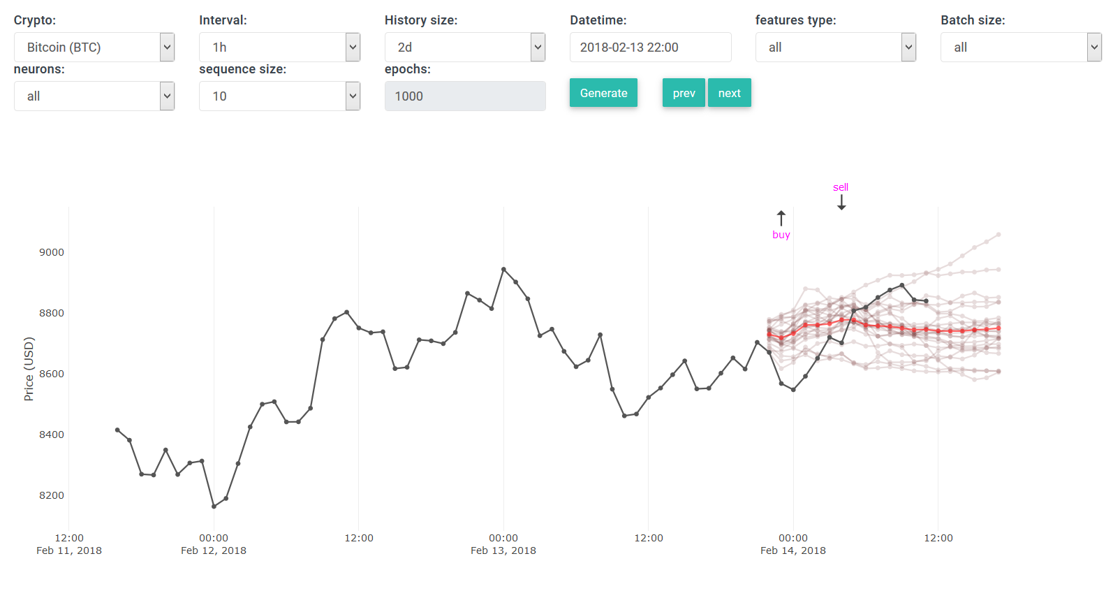
So it showed me a buy signal within 2 hours.
I don't know why I didn't do it, but I should've waited longer to start buying -- because the signal was damn accurate this time.
What happened next hurt me a little bit, but it was my own fault to go against the data:

The price went down, just as the predictions showed.
Fortunately enough, it started going up again.
So as soon as I opened my exchange, I waited until the price hit $8870/btc to sell it.
Right now the price keeps growing:


But the longer I wait, the more risk I'd take of the price going down again.
The new predictions don't look too positive:

Basically yesterday I bought at $8690/btc and sold it for $8870/btc => 2% ROI
In my opinion, following this strategy is a relative safe way to make $50-200/day depending on the amount of money you have available.
If you have $5k of cash available for trading, 2% on that yields about $100 -- enough to quit your job soon.
The rest of the day I'll be working on improving various components on the platform.
Stay tuned for the next update.
Take care all!
Ilya
Yesterday, at 21:20 I sold all my Bitcoins for about ±$8700/btc :
But then I made a mistake. In my trading view I saw a lot of other people selling as well.
I don't know what went through my head but an hour later later, at 22:25 I used 50% of cash to buy Bitcoins for $8690/btc.
My reaction was: the price is going down, but it looks like a short decrease --> it will most likely spike up to $8.8k in the coming hour or two.
This decision was validated by two charts:
On the 3D plot, this cluster near the end of Feb 13 looks pretty big and solid -- like a good platform for growth.
And then I also noticed that predictions with a shorter sequence length (=10) are pretty accurate short-term:
So it showed me a buy signal within 2 hours.
I don't know why I didn't do it, but I should've waited longer to start buying -- because the signal was damn accurate this time.
What happened next hurt me a little bit, but it was my own fault to go against the data:
The price went down, just as the predictions showed.
Fortunately enough, it started going up again.
So as soon as I opened my exchange, I waited until the price hit $8870/btc to sell it.
Right now the price keeps growing:
But the longer I wait, the more risk I'd take of the price going down again.
The new predictions don't look too positive:
Basically yesterday I bought at $8690/btc and sold it for $8870/btc => 2% ROI
In my opinion, following this strategy is a relative safe way to make $50-200/day depending on the amount of money you have available.
If you have $5k of cash available for trading, 2% on that yields about $100 -- enough to quit your job soon.
The rest of the day I'll be working on improving various components on the platform.
Stay tuned for the next update.
Take care all!
Ilya

Christopher87
Regular Member
- Aug 27, 2015
- 308
- 70
Still looking good my friend!
Do you have any more views on smaller currencies that have major shifts if pricing points?
I can see the potential to make larger gains if if predictions are still good for 2-3 hours into the future, to make small but higher frequency of trades to earn the same if not more.
Do you have any more views on smaller currencies that have major shifts if pricing points?
I can see the potential to make larger gains if if predictions are still good for 2-3 hours into the future, to make small but higher frequency of trades to earn the same if not more.
healzer
Elite Member
- Jun 26, 2011
- 2,974
- 3,063
Hey, thanks for the kind words mateStill looking good my friend!
Do you have any more views on smaller currencies that have major shifts if pricing points?
I can see the potential to make larger gains if if predictions are still good for 2-3 hours into the future, to make small but higher frequency of trades to earn the same if not more.
!Right now my priority is to focus on Bitcoin predictions and backtesting the results.
But I feel like I am approaching a phase where my efforts do not contribute much to the quality/accuracy of the predictions.
Very soon I will be taking a step back and focus on using the predictions to generate signal notifications -- this way you can receive notifications on your device (web browser, smartphone, email, sms, ...) about special events such as:
- When the price is low and will rise sharply, making it a great moment to buy.
- When the price is high and all data show it's going to drop -- making it a good moment to sell.
Note: there is a reason why I'm working solely with BTC right now, it's because most other altcoins follow BTC's trend -- when BTC goes up, almost all of them go up. So practically you can use the BTC predictions to trade altcoins.
=================================
=== Analysis of BTC's resent increase ===
Earlier today BTC's price went from less than $8.8k to over $9.2k in just a few short hours.
That's a very nice increase of +4.5%. If someone had invested $10k when it was 8.8k, they would've made over $450 in just over two hours.
There is a possibility that someone received several million dollars from his/her Valentine and bought bunch of Bitcoins. But I doubt that was the case lol.

On the candlechart above we can see when this increase started happening: ± 1:30pm (Feb 14)
Our system did not predict this increase, so I went on a small investigation to figure out what triggered this event.
I started by analyzing the 3D plot:
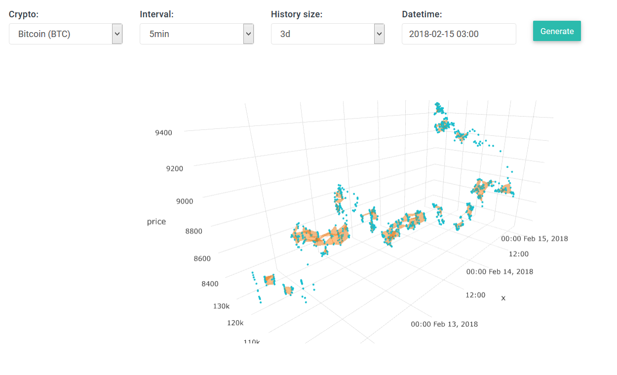
At the far end of the 3D plot, we see the path of the datapoints going from $8800 to over $9200.
What's interesting is that this happened so quickly, there are barely any clusters between 9100 and 8000, just a few points floating in space.
This could be a very useful technique to detect anomalies in the market such these.
However, there is no further indication of why the price went up.
It's possible that a group of computers/bots caused this increase intentionally, but even then it would require tons of money -- highly unlikely.
A more realistic scenario is if a large group of people (regular traders like us) were influenced by media/news and started investing more heavily.
Let us look at the hype figures:

On the above 3D chart we see the price went up, but there is nothing unusual about the hype, it's about the same as when the price was lower.
Notice: those two data points floating between "12:00 and Feb 14" on the x-axis.

On the above we see how the volume went up at the time when the price went up.
But just as we've previously explained -- nothing unusual about the shape/trend of hype data.
Notice: those two data points floating high up at 12:00 on the x-axis.
There was nothing unusual about what we've seen thus far, except for those two floating/anomaly data points.
On the "general chart", I took a look at the hype/mentions on a long-term:

The blue line indicates social hype, but it's not unusual high.
However, the orange does have an unusual peak between "Feb 14 and Feb 15 (= end of graph)" !
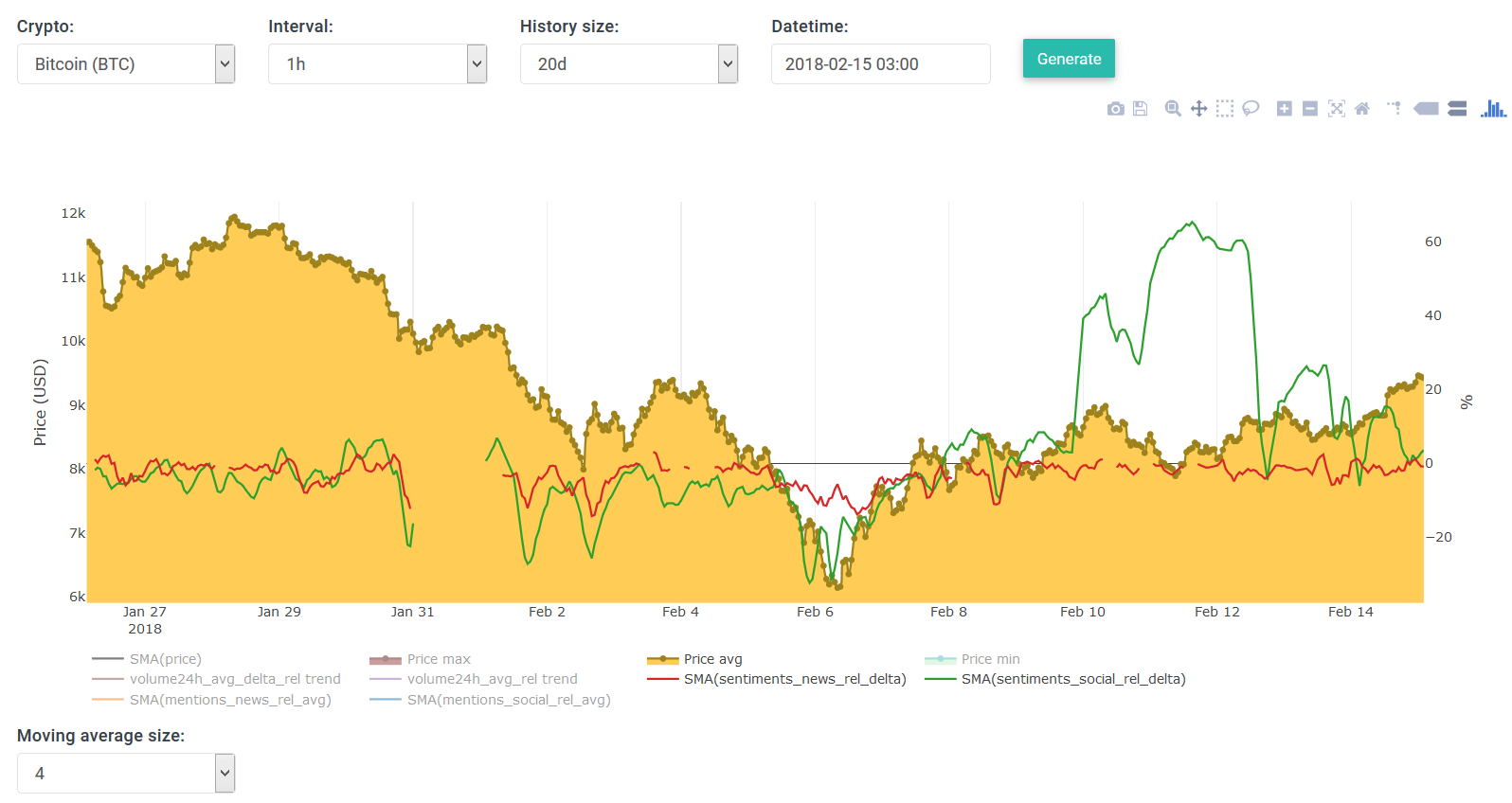
The above shows the sentiments, from social sources (green), and news sources (red).
Except for the anomaly between Feb 10 and Feb 12, we do see that the sentiments nearing Feb 15 are pretty much between neutral and positive.

Let us zoom in on this peak we noticed for the "news mentions".
We clearly see the peak resolving around 12:00 (GMT+1), and it may indicate why the price went up at 12:00 and beyond.
There must've been some news on big channels that triggered people to buy/invest.
By clicking on some datapoint (on the general chart), it pulls all news headlines (and a fraction of social media mentions) from our server, then displays them below:
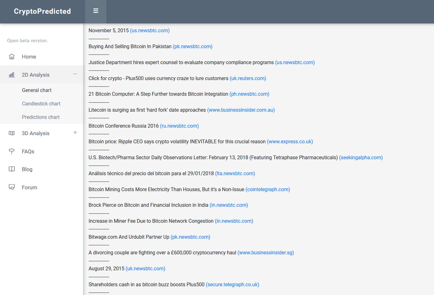
The number of news headlines was unusual high, usually there are less than 5-10 headlines per hour, sometimes none.
But this time there were 90 of them!!! I believe this was the major reason why the price went up that fast.
I also took a screenshot of some social mentions.
This one is about when the price was just starting to increase:

^ poor guy, he should've hodl'd for 30min longer lmao.
And here's one 3 hours later:
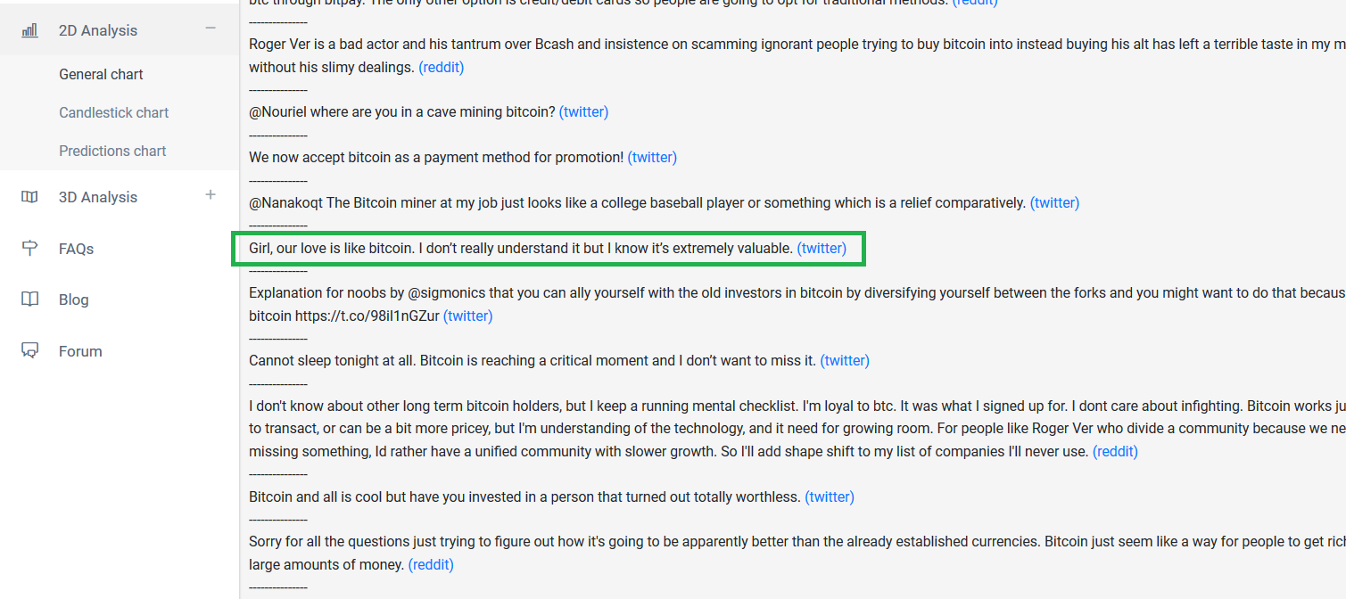
Happy Valentine's everyone
- Ilya
healzer
Elite Member
- Jun 26, 2011
- 2,974
- 3,063
In my previous post I've made a pretty big statement/claim, which was actually incorrect -- my apologies.
Yesterday I posted this image:
As you can see, there is a peak shortly after 12:00 on Feb 14.
My claim was that the big increase of BTC's price was due to news mentions/speculation, while actually it wasn't.
What I missed was that the interval was set to 3 hours. So three hours worth of data is cramped together.
Here's a more correct picture:

This time I used hourly intervals, and as we can see this huge news spike occurred between 15:00 and 16:00 GMT+1 (14:00 - 15:00 UTC).
So it was not the reason why price went up in the first place.
We should reconsider why the price went up.
It is possible that a group of wealthy investors decided to buy around 12:00 -- so they influenced the price/market.
Another hypothesis is that a big group of people (e.g. subscribers) received insider information. As a result a majority of them decided to invest.
A more realistic approach is that the news/media is working closely with wealthy investors, so they work together on when to push the market and influence the masses to stimulate the growth.
If any of my theories are correct, then it's not possible to predict this increase in price, because it's a rigged event and not due to natural growth.
Unless we gain access to this clique of market influencers, but highly unlikely.
This is one of the major reasons why I am working on a notifications system -- this system will notify us when an anomaly is detected.
To illustrate this, have a look at the following:

It shows, for 10 minute intervals, how the social hype (blue), trading volume (red) and price (yellow) are related.
During stable periods (e.g. first half of the graph) there is a beautiful natural cycle of ups/downs in trading volume.
At these short intervals we see a pattern in the trading volume, until about 13:00 -- where the price shot up rapidly and the cycle was broken.
Afterwards, the natural cycle started healing again, and looks less predictable than during the stable period, but it seems to be recovering.
The social hype (blue) has no apparent predictable cycles -- making it less useful at such small intervals.
However, this trading volume pattern is a valuable find and allows us to quickly detect + notify any anomalies.
I have also found a small bug in my price forecasting algorithm, which may give us significantly better short-term predictions.
Stay tuned for the next update
Cheers!
- Ilya
Yesterday I posted this image:
As you can see, there is a peak shortly after 12:00 on Feb 14.
My claim was that the big increase of BTC's price was due to news mentions/speculation, while actually it wasn't.
What I missed was that the interval was set to 3 hours. So three hours worth of data is cramped together.
Here's a more correct picture:
This time I used hourly intervals, and as we can see this huge news spike occurred between 15:00 and 16:00 GMT+1 (14:00 - 15:00 UTC).
So it was not the reason why price went up in the first place.
We should reconsider why the price went up.
It is possible that a group of wealthy investors decided to buy around 12:00 -- so they influenced the price/market.
Another hypothesis is that a big group of people (e.g. subscribers) received insider information. As a result a majority of them decided to invest.
A more realistic approach is that the news/media is working closely with wealthy investors, so they work together on when to push the market and influence the masses to stimulate the growth.
If any of my theories are correct, then it's not possible to predict this increase in price, because it's a rigged event and not due to natural growth.
Unless we gain access to this clique of market influencers, but highly unlikely.
This is one of the major reasons why I am working on a notifications system -- this system will notify us when an anomaly is detected.
To illustrate this, have a look at the following:
It shows, for 10 minute intervals, how the social hype (blue), trading volume (red) and price (yellow) are related.
During stable periods (e.g. first half of the graph) there is a beautiful natural cycle of ups/downs in trading volume.
At these short intervals we see a pattern in the trading volume, until about 13:00 -- where the price shot up rapidly and the cycle was broken.
Afterwards, the natural cycle started healing again, and looks less predictable than during the stable period, but it seems to be recovering.
The social hype (blue) has no apparent predictable cycles -- making it less useful at such small intervals.
However, this trading volume pattern is a valuable find and allows us to quickly detect + notify any anomalies.
I have also found a small bug in my price forecasting algorithm, which may give us significantly better short-term predictions.
Stay tuned for the next update
Cheers!
- Ilya
healzer
Elite Member
- Jun 26, 2011
- 2,974
- 3,063
Hi guys
For over a week I've been working on improving the predictions algorithm and chart.
I am proud to announce the new and third version:

What's new!?
Lastly, below is an animated gif, showing all predictions on every 10min interval, for about 7 hours:

The GIF's speed is pretty high, so it's hard to analyze it, but we can see it makes some really nice predictions from time to time.
It's definitely not accurate every single time, sometimes there are long periods of bad predictions -- definitely something we have to improve in the future.
Either way I am super pumped about our progress thus far, it's been a wild ride already and we're just getting started
Have a great weekend everyone!
- Ilya
For over a week I've been working on improving the predictions algorithm and chart.
I am proud to announce the new and third version:
What's new!?
- The chart's legend is now located on the right side, and you can still preserve the same view as before be toggling on/off graphs.
- I separated "Price avg" from the extended price. The extended price is the known price. It is shown whenever we look at a historical time.
- I have decreased the number of different parameters to the best selection (based on results). And made "all" the default selection for all settings. So you don't need to mess around with these complex settings yourself, I recommend using the "all" value.
- There is no more "daily" interval. I had to remove it because there isn't enough data to make day to day predictions yet -- I noticed this when inspecting the previous results. Besides the hourly interval, I also added 10min intervals -- if you've read my previous post well, you will understand why 10min intervals could yield really good results.

- SMA stands for "simple moving average". This is a technical summary of these graphs (skip this paragraph if you don't care).
On the chart there are three SMA graphs, each one uses the actual price data ("price avg"), to which we concatenate the respected min/max/avg data from the predicted set.
The idea behind this is to present three prediction graphs which are calculated based on the SMA function, making it smoother and more realistic. And instead of showing all predictions we just show the min/avg/max ones -- because there could be 4, 8, 20+ of them depending on how many I allow to be calculated (but you can toggle on all the predictions as shown above).
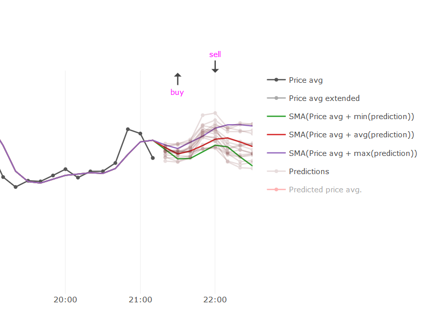
Since these are SMA's, you can use the drop down selector to choose a different SMA size, by default it is set to 3.
Below is an animated gif showing how SMAs are transformed when I select a different size. We see that the graphs flatten and become smoother.

The purpose of the min/avg/max SMAs would be to calculate the probability of the future price being between the [avg, max] and [min, avg] graphs.
The "avg" line is like neutral ground, thus depending on the distance between the min/max and the avg, we can use this as the probability of the price going up/down in the next X intervals. Here's an example: at certain interval 'T', if the "avg" line is closer to "max" then the price is more likely to go up, rather than than down.
Once I have enough data I will statistically verify to what degree this "probability" method is correct.
Allow me to illustrate this:

On the screenshot above, I have marked a specific interval (green rectangle, indicating interval 22:40 ).
The light gray line is the actual future price, these values are known because we're analyzing a historical event.
We see that the green line (=min) is closer to the red line (=avg) compared to the purple line(=max). So by my theory the future/predicted price has a higher probability of being somewhere between green and red line. But in actuality it appears to be closer to the purple line. This does not prove that my theory is incorrect: this is just one example and we need statistical validation to disprove it by analyzing hundreds/thousands of cases.
- The performance of the predictions has been greatly improved, both server-side as client-side. The previous predictions algorithm used a lot of parameters and contained several bugs which made it much slower than the new version. But also from a UI perspective has it been improved by changing the way we store predictions.
The old version has accumulated over six million of records in our database, in just over two/three weeks -- it had to be dealt with:

Because of this reason I have shutdown the previous predictions version -- so it won't make any new predictions.
However, you may still consult its historical predictions for a limited time. You'll find the links to both the new and old prediction charts in the sidebar/menu on our site.
Lastly, below is an animated gif, showing all predictions on every 10min interval, for about 7 hours:
The GIF's speed is pretty high, so it's hard to analyze it, but we can see it makes some really nice predictions from time to time.
It's definitely not accurate every single time, sometimes there are long periods of bad predictions -- definitely something we have to improve in the future.
Either way I am super pumped about our progress thus far, it's been a wild ride already and we're just getting started
Have a great weekend everyone!
- Ilya
Last edited:
healzer
Elite Member
- Jun 26, 2011
- 2,974
- 3,063
=================
=== Feb. 19, 2018 ===
The past weekend has been productive but in a slightly different way.
I've spent most of my time reviewing my progress, writing down ideas, brainstorming and conducting some research.
The most important thing right now is to start simplifying what we have, making it accessible to a wider audience -- people who generally don't want to (or can't) read our charts.
So I started working on a really simple mobile app (only for Android right now).
This app will have several crucial features that help people decide when to buy/sell cryptocurrencies.

The screenshot above shows a forecast of BTC's price at 19:45.
PlotlyJS, = the library I used for all our charts, is incompatible with mobile devices. So I am using a different library for the mobile web app.
This is a good thing because on mobile devices we don't need any complex (3D) charts with a bunch of features.
Instead we follow the "no crap policy" -- meaning only the most crucial/important data should be made available in a very intuitive manner.
Another feature I'm super excited about are real-time push notifications, I plan to use anomaly detection to notify us about irregularities in the market -- e.g. if the price/volume/hype has suddenly increased by +5%, this could indicate it's a good entry position.
I will write more updates about the app as I add more features, and I plan to have the beta version available in Play Store within a week or two.
Here's another interesting find. On the screenshot below I display data for Litecoin (LTC).
What's interesting is that the blue line (= social mentions) looks very similar to the price (in yellow).
It appears to be an even better indicator than the trading volume (red line).

If found this to be true solely for Litecoin; while other currencies don't have this behavior, here's BTC for instance:
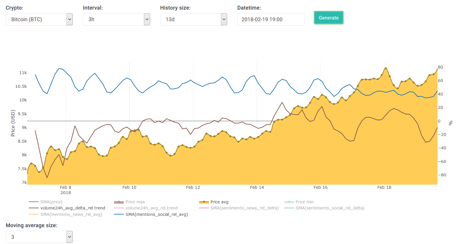
In the above (as for most coins), trading volume appears to be the best indicator thus far for making predictions.
Social data, news data and their respective sentiments appear to be useless for making short-term future predictions.
However, this may be untrue for long/mid-term predictions, but to validate this we need much more data.
In the time being I am looking to use social/news data for anomaly detection, because some peaks/regions do correspond to increases/decreases in price.
Coming back to my initial paragraph, this weekend has been a time for self-reflection.
This past Saturday I became one year older and hopefully a bit wiser.
As a gift to myself, I ordered a few interesting books from Amazon.
And what else does a man need in life other than a cup of good tea

PS: I love Amazon. Initially I ordered 4 books, but received only 3 of them. One was probably lost/stolen in transition, as the parcel I received was damaged/opened. I wrote about this to Amazon and in a couple of hours they immediately refunded me for that one book.
=== Feb. 19, 2018 ===
The past weekend has been productive but in a slightly different way.
I've spent most of my time reviewing my progress, writing down ideas, brainstorming and conducting some research.
The most important thing right now is to start simplifying what we have, making it accessible to a wider audience -- people who generally don't want to (or can't) read our charts.
So I started working on a really simple mobile app (only for Android right now).
This app will have several crucial features that help people decide when to buy/sell cryptocurrencies.
The screenshot above shows a forecast of BTC's price at 19:45.
PlotlyJS, = the library I used for all our charts, is incompatible with mobile devices. So I am using a different library for the mobile web app.
This is a good thing because on mobile devices we don't need any complex (3D) charts with a bunch of features.
Instead we follow the "no crap policy" -- meaning only the most crucial/important data should be made available in a very intuitive manner.
Another feature I'm super excited about are real-time push notifications, I plan to use anomaly detection to notify us about irregularities in the market -- e.g. if the price/volume/hype has suddenly increased by +5%, this could indicate it's a good entry position.
I will write more updates about the app as I add more features, and I plan to have the beta version available in Play Store within a week or two.
Here's another interesting find. On the screenshot below I display data for Litecoin (LTC).
What's interesting is that the blue line (= social mentions) looks very similar to the price (in yellow).
It appears to be an even better indicator than the trading volume (red line).
If found this to be true solely for Litecoin; while other currencies don't have this behavior, here's BTC for instance:
In the above (as for most coins), trading volume appears to be the best indicator thus far for making predictions.
Social data, news data and their respective sentiments appear to be useless for making short-term future predictions.
However, this may be untrue for long/mid-term predictions, but to validate this we need much more data.
In the time being I am looking to use social/news data for anomaly detection, because some peaks/regions do correspond to increases/decreases in price.
Coming back to my initial paragraph, this weekend has been a time for self-reflection.
This past Saturday I became one year older and hopefully a bit wiser.
As a gift to myself, I ordered a few interesting books from Amazon.
And what else does a man need in life other than a cup of good tea
PS: I love Amazon. Initially I ordered 4 books, but received only 3 of them. One was probably lost/stolen in transition, as the parcel I received was damaged/opened. I wrote about this to Amazon and in a couple of hours they immediately refunded me for that one book.
Last edited:
healzer
Elite Member
- Jun 26, 2011
- 2,974
- 3,063
==================
=== Feb. 20, 2017 ===
Today was slightly less productive than usual as I had some personal stuff to do.
But nonetheless I've made some progress on the mobile android app.
Here's a screenshot of the main view:

And then I also let it notify (push notifications) every time a new prediction has been generated.
A push notif makes a buzz/noise when you receive it, and it's broadcasted to all devices who have the app installed and running.
When you click on the notification's message, it will reload/refresh the app and show the broadcasted message with the most recent predictions:

Edit: on the screenshots above, the x-labels may be incorrect, it has already been fixed.
Edit 2: the two blue lines are the SMA "avg" and SMA "max" predictions as of our predictions charts (v3). My initial plan was to only use the "avg" one but I notice that the "max" has many more positive matches than "avg" and way more than "min" one.
Right now these notifications are enabled by default, the next step is to let users enable/disable them and choose how often to receive them (every 10mins or every hour).
On top of that, not every notification is meaningful, sometimes it notifies us about predicted price changes that are just a tenth of 1%.
We should filter these out by default -- and/or let the user specify a threshold.
Afterwards we can start adding anomaly detection features and incorporate them into more meaningful notifications.
I've also been asked elsewhere when it's a good time to buy crypto.
I may have written this in one of my previous posts, but if a newbie is reading this it may prove its worth.
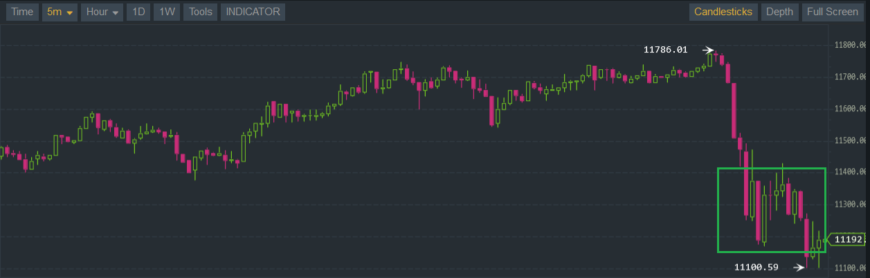
Basically you want to wait until the price has fallen down and there appears to be a valley as indicated by the green rectangle:
On first sight it may appear to be a good point to start buying, but there is no guarantee whether or not the price will go down/up.
You can use various trading indicators (SMA, EMA, DEMA, ...) but these don't always work.
I personally prefer looking at our 3D plot and the predictions chart to improve my chances of making the right call. To learn more about this analysis method you should read the previous posts though.
Have a great day !
- Ilya
=== Feb. 20, 2017 ===
Today was slightly less productive than usual as I had some personal stuff to do.
But nonetheless I've made some progress on the mobile android app.
Here's a screenshot of the main view:
And then I also let it notify (push notifications) every time a new prediction has been generated.
A push notif makes a buzz/noise when you receive it, and it's broadcasted to all devices who have the app installed and running.
When you click on the notification's message, it will reload/refresh the app and show the broadcasted message with the most recent predictions:
Edit: on the screenshots above, the x-labels may be incorrect, it has already been fixed.
Edit 2: the two blue lines are the SMA "avg" and SMA "max" predictions as of our predictions charts (v3). My initial plan was to only use the "avg" one but I notice that the "max" has many more positive matches than "avg" and way more than "min" one.
Right now these notifications are enabled by default, the next step is to let users enable/disable them and choose how often to receive them (every 10mins or every hour).
On top of that, not every notification is meaningful, sometimes it notifies us about predicted price changes that are just a tenth of 1%.
We should filter these out by default -- and/or let the user specify a threshold.
Afterwards we can start adding anomaly detection features and incorporate them into more meaningful notifications.
I've also been asked elsewhere when it's a good time to buy crypto.
I may have written this in one of my previous posts, but if a newbie is reading this it may prove its worth.
Basically you want to wait until the price has fallen down and there appears to be a valley as indicated by the green rectangle:
On first sight it may appear to be a good point to start buying, but there is no guarantee whether or not the price will go down/up.
You can use various trading indicators (SMA, EMA, DEMA, ...) but these don't always work.
I personally prefer looking at our 3D plot and the predictions chart to improve my chances of making the right call. To learn more about this analysis method you should read the previous posts though.
Have a great day !
- Ilya
Last edited:
healzer
Elite Member
- Jun 26, 2011
- 2,974
- 3,063
Hey all !
Got some exciting news.
Yesterday I've finished the first version of our mobile app.
After several test runs and updates on the release version, I'm proud to announce CryptoPredicted's app:
Google Play Store url: https://play.google.com/store/apps/details?id=com.cryptopredicted.cryptopredicted_android_v1
Keyword: CryptoPredicted
Right now we only have an app for Android, but in the near future we'll also release an iOS app.
There are two primary reasons for releasing this app:

Apart from developing this app I've also been working on improving the predictions.
As usual I've been looking for different ways to look at the data that could help me improve our accuracy.
This remains an ongoing research topic, something without a definite goal.
Next up I'll be working on Anomaly Detection and notification.
I would like to receive notifications on my app when something very odd has occurred, such as:
- Ilya
!Got some exciting news.
Yesterday I've finished the first version of our mobile app.
After several test runs and updates on the release version, I'm proud to announce CryptoPredicted's app:
Google Play Store url: https://play.google.com/store/apps/details?id=com.cryptopredicted.cryptopredicted_android_v1
Keyword: CryptoPredicted
Right now we only have an app for Android, but in the near future we'll also release an iOS app.
There are two primary reasons for releasing this app:
- It allows us to quickly look at the actual (avg) price and the Crypto predictions / forecast.
- The app notifies us every time a new prediction is generated (every 10 minutes or every hour -- you can change this on the settings page).
Apart from developing this app I've also been working on improving the predictions.
As usual I've been looking for different ways to look at the data that could help me improve our accuracy.
This remains an ongoing research topic, something without a definite goal.
Next up I'll be working on Anomaly Detection and notification.
I would like to receive notifications on my app when something very odd has occurred, such as:
- An usual increase/decrease trading volume.
- An unusual increase/decrease in price.
- Idem ditto for social sentiments, news sentiments, etc.
- Ilya
fullwall3t
BANNED
- Apr 22, 2015
- 2,141
- 431
It doesn't support my poor old android /:Hey all
Got some exciting news.
Yesterday I've finished the first version of our mobile app.
After several test runs and updates on the release version, I'm proud to announce CryptoPredicted's app:
Google Play Store url: https://play.google.com/store/apps/details?id=com.cryptopredicted.cryptopredicted_android_v1
Keyword: CryptoPredicted
Right now we only have an app for Android, but in the near future we'll also release an iOS app.
There are two primary reasons for releasing this app:
It already simplifies my life. I no longer have to visit the website manually and refresh the data -- I get notified automatically:
- It allows us to quickly look at the actual (avg) price and the Crypto predictions / forecast.
- The app notifies us every time a new prediction is generated (every 10 minutes or every hour -- you can change this on the settings page).
Apart from developing this app I've also been working on improving the predictions.
As usual I've been looking for different ways to look at the data that could help me improve our accuracy.
This remains an ongoing research topic, something without a definite goal.
Next up I'll be working on Anomaly Detection and notification.
I would like to receive notifications on my app when something very odd has occurred, such as:
Have a great weekend all!
- An usual increase/decrease trading volume.
- An unusual increase/decrease in price.
- Idem ditto for social sentiments, news sentiments, etc.
- Ilya
But other than that, great app. Thx
healzer
Elite Member
- Jun 26, 2011
- 2,974
- 3,063
What version of Android do you have?It doesn't support my poor old android /:
But other than that, great app. Thx
Maybe I can lower the API target version
fullwall3t
BANNED
- Apr 22, 2015
- 2,141
- 431
5.1.1 I would install it via bluestacka on my pc, but I was never able to get bluestacks with never version of androidWhat version of Android do you have?
Maybe I can lower the API target version
healzer
Elite Member
- Jun 26, 2011
- 2,974
- 3,063
Try now5.1.1 I would install it via bluestacka on my pc, but I was never able to get bluestacks with never version of android
I have downgraded the target version to Android 5.0 (and above):

Does it work now on your phone?

TWdesigns69
Power Member
- Aug 2, 2015
- 665
- 146
awesome. congrats. youve worked hard on this. inspiring to see such dedication. am not yet investing but once i do your app will be the first on my phoneTry now
I have downgraded the target version to Android 5.0 (and above):
Does it work now on your phone?