======
====== 21 Jan. 2018
======
Today I've spent most of my time changing the charting library (from ChartJS to PlotlyJS).
I must admit that Plotly is much richer, but also a bit harder to customize and lacks a few elements.
The screenshot below is the new chart. It looks almost identical to the previous ones.
However, it's not very convenient to set interval ticks on X-axis for the date/time (e.g. hourly, 1minute, 5 minutes, ...). In ChartJS this was automatically generated, here I have to mess around with code to get it right. I do like the fact that PlotlyJS comes with a toolbox which allows me to zoom in, select, drag, scroll, ... This was not possible in ChartJS.
Once I was done with the above, I immediately tackled a new challenge.
For quite some time I wanted to cluster data visually and this is one of the reasons I changed to PlotlyJS -- it has 3D charts.
The idea is to use clustering to categorize coins by their "stage", as suggested by
@Ensili (on page 2). I haven't gotten to this part yet, so that's still work in progress.
My first attempt was to visualize 3 variables: time, hype and price. But this didn't appear to be very meaningful (a 2D chart was better for this).
My second attempt was: hype, price, trading volume (past 24hrs) -- yet again not much to conclude for this plot.
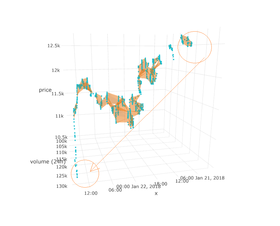
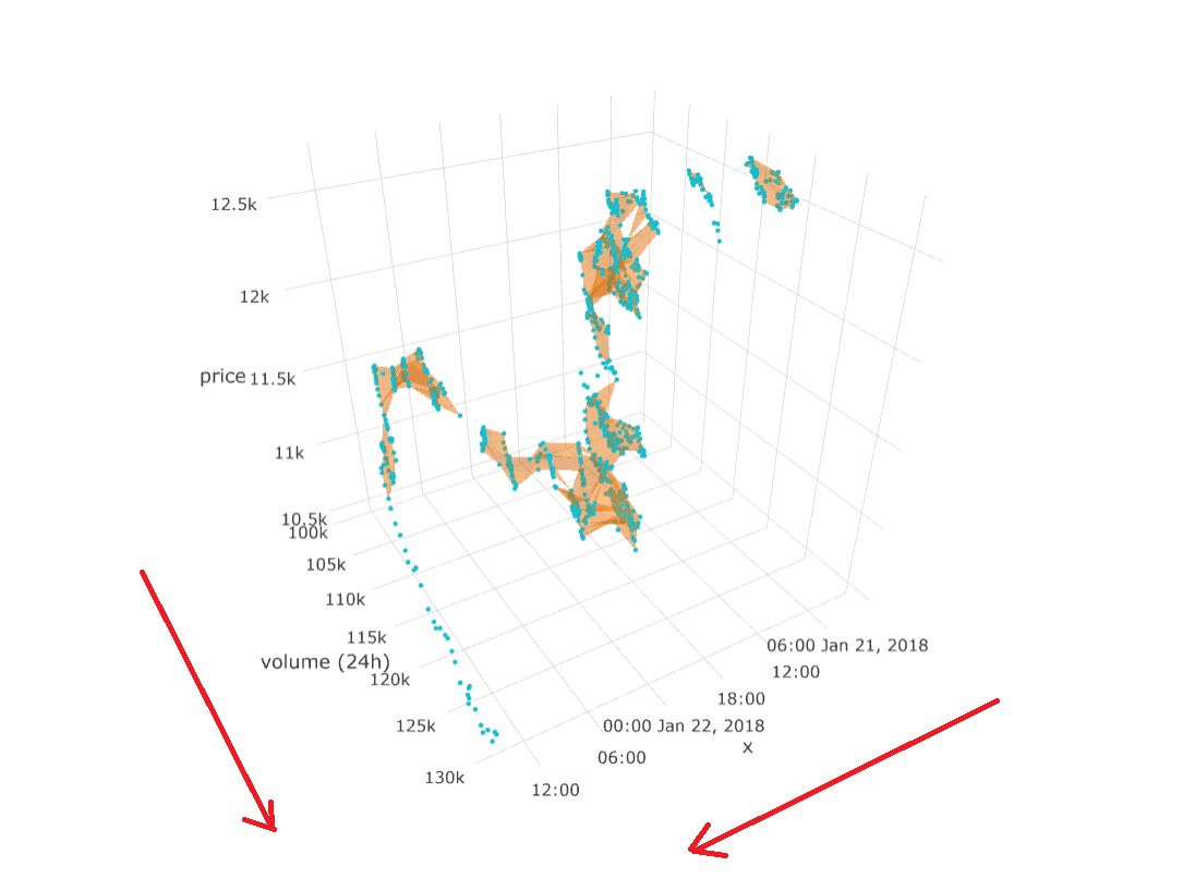
But the following did have something to say:
I have plotted (for the past 24hours, with 2-min intervals): time, BTC/USD price and trade volume (24hrs).
Here are a few things we can conclude:
- The cluster where most trades were done ==> the price was lowest (so at midnight UTC Jan. 22): buy low.
- There is a specific cluster between volumes 115k and 120k, where the price was highest: sell high.
- All volumes in between the highest price and lowest price are people who were too late to the selling/buying party -- or don't know what the heck is going on.
Have a good night all

!
--edit--
here's a slightly different angle of the above 3D plot: