healzer
Elite Member
- Jun 26, 2011
- 2,974
- 3,063
@elavmunretea
I love your input ! Thanks a lot.
I do agree with you on most points, since most of those are already on my to-do list and some already under development.
Unfortunately I haven't had the time to write every single thing I plan to do (and have already done).
=========
========= Since Jan. 1 to Jan. 7, 2018
=========
Shortly after our nice findings I started working on a few additonal features:
I love your input
! Thanks a lot.I do agree with you on most points, since most of those are already on my to-do list and some already under development.
Unfortunately I haven't had the time to write every single thing I plan to do (and have already done).
=========
========= Since Jan. 1 to Jan. 7, 2018
=========
Shortly after our nice findings I started working on a few additonal features:
- I added some additional news sites to my data (this was a 10 min job lol).
- I've tweaked and optimized the trendline functions, since they contained bugs here and there.
- A lot (too much) time went into fixing bugs, new ones are popping up every day... well that's life, never give up!
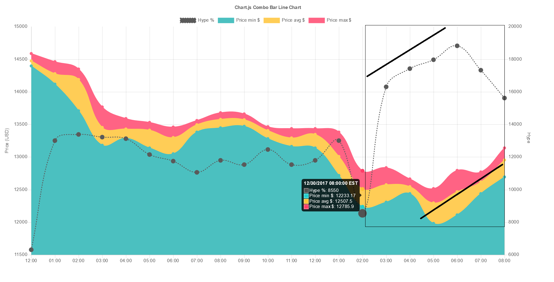
- Added the ability to visually move a certain line (to left, or to the right). This is particularly useful to better understand peaks and make up scenarions in my head of what could've happened at that time:

- Sentiment analysis. I have done quite some reading (academic papers and professional advice) about this topic.
If you don't know, sentiment analysis is to determine whether a certain text/article/tweet is Negative or Positive.
The reality is that it is very complex, and I read this nice piece of advice:
"A negative article/text can still yield positive economic benefits"
There are two primary methods to do sentiment analysis: the hard way and the easy way.
The hard way is to incorporate machine-learning (usually supervised) where we teach the computer whether X is negative/positive (this is difficult in practice).
The easy way, is well, much simpler in my case. I was lucky enough to have found a list of thousands of words each labeled "neg" or "pos".
But more importantly, these words are specifically chosen, labeled and created for stock-market analysis. And their results were slightly above a random pick -- so it will do for now
So each tweet/post from twitter/reddit that came through (thousands every minute), I ran them through my sentiment-analysis algorithm that works like this:
It detects and counts number of positive, and number of negative occurences of words. Then does #pos - #neg = delta.
Finally the delta value is normalized and converted to percent % - so we can easily plot it on our graph together with Hype %.
Here is a snippet of the data at some random time period I chose:

The blue line is the Hype (social mentions).
The dark-red line represents the Sentiments at each interval. Notice that these values can be negative, which indicates an average negative sentiment at a certain time period.
I have drawn the red horizontal line to indicate that all above it is positive, and all below is negative.
Notice that the red line is very similar to the Hype, which makes sense since it is derived from it.
From these graphs we cannot make any conclusion, apart from indicating which periods has more "negative" than "positive" mentions and how the sentiment evolves.
When we add the "BTC Price" graph then it really becomes a mess.
I thought that sentiment follows the Hype graph, but sometimes often times doesn't.
Below is a chart with BTC Price in black, and Sentiment in dark-red: (trendlines made of 4 consecutive points)

It is one of the few regions I have seen where both have some kind of visual relationship.
At the start of the graph, the price started to increase and so did the overall sentiment (but much steeper).
After the first peak the price dropped and the sentiment followed but it looks like people weren't ready to give up their hope, a few hours later the price went up again.
But what the heck do you think happened at 17:30?