
-
Please take a moment to look over the Suggestions & Feedback rules before making a post: READ RULES HERE
You are using an out of date browser. It may not display this or other websites correctly.
You should upgrade or use an alternative browser.
You should upgrade or use an alternative browser.
[Announcement] Introducing: The New BHW
- Thread starter Zwielicht
- Start date
- Status
- Not open for further replies.

D
Deleted member 1923072
Guest
Fix these themes or give us option to reterve back to OG black

Illumi_96x
Junior Member
- Feb 4, 2022
- 193
- 197
I don't know how to feel about this new one. On one hand it is easier to navigate but on the other hand it looks like every other forum thread out there.
Also, the colors seem a bit "off": it took me a few seconds to realize it wasn't my Dark Reader add-on going crazy again.
All-in-all, this new UI/UX gets the job done. I think it's a question of time before it becomes the new standard and the old theme gets forgotten.
Also, the colors seem a bit "off": it took me a few seconds to realize it wasn't my Dark Reader add-on going crazy again.
All-in-all, this new UI/UX gets the job done. I think it's a question of time before it becomes the new standard and the old theme gets forgotten.

- Oct 27, 2005
- 85,043
- 22,533
As I said before, $20 was not enough boss. Contrast between background and text sux hard. Please fix this.
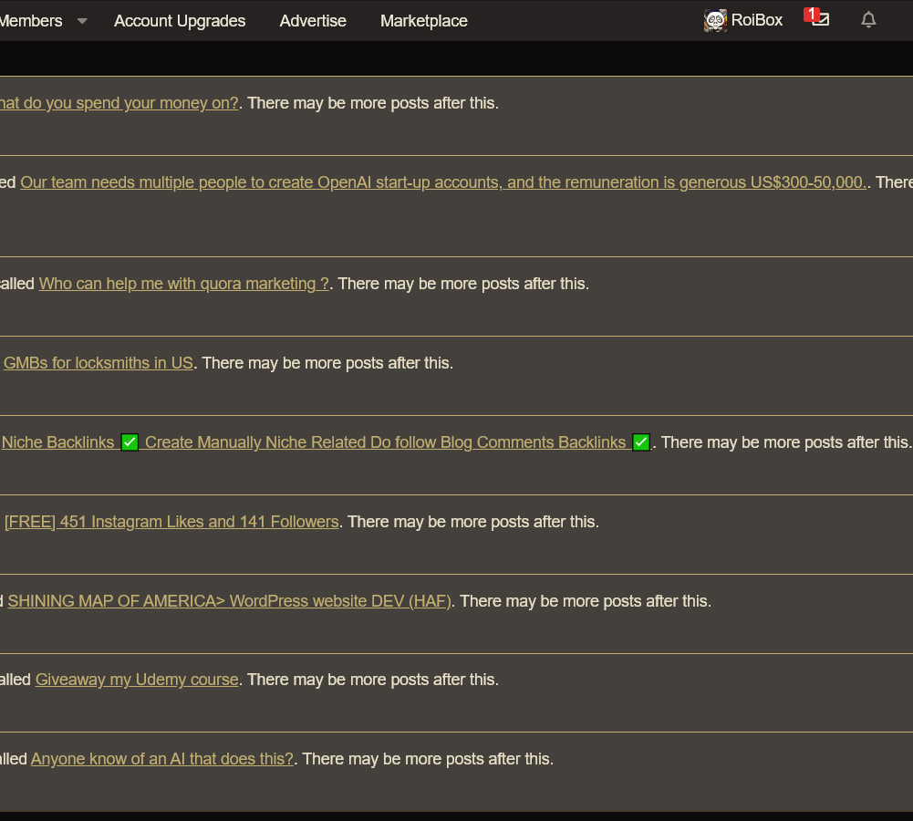
This gives us a better Accessibility score than the old style; therefore, we're happy with this format.
As per the announcement here, I've moved your post into the relevant section. Can you keep all comments about the change in the official thread so we can manage them more efficiently?
Please post any further comments - ideally with screenshots - in the official thread .

PURSUIT MEDIA
Elite Member
- Dec 27, 2019
- 3,133
- 823
Maybe we should vote on each of the changes so you can weigh our preferences.

- Oct 6, 2020
- 2,626
- 9,931
Yes.As I said before, $20 was to much boss. Contrast between background and text sux hard on the dark theme. Please fix this.
And multiquote.(text sizes, colors, they blend together)
And lines between elements. so many lines. lines everywhere.
And avatar sizes. why so small? many of us build our personalities here using avatars
And element proportions. (more internal screaming)
And reaction scores. yes, I use them to judge you.
And color fuckery on Jr VIP profiles, so much blue

xReminisce
Elite Member
- Dec 29, 2012
- 7,329
- 36,654
too much gold tooYes.
And multiquote.
And lines between elements.
And avatar sizes.
And element proportions.
And reaction scores.
And color fuckery on Jr VIP profiles, so much blue
I am find with most of the rework and looks good honestly and it's nice to see a refreshing change every now and then.
However, there just too much gold.
The Title for each threads
Proposing to change this to just plain old black as it just looks visually better and also doesn't blend in completely with everything else.
While at the same time, it still fits the theme nicely.
- Nov 16, 2011
- 19,803
- 11,280
You should also ask a mod to create a thread to report bugs.New Style is now live https://www.blackhatworld.com/seo/change-log-behind-the-scenes-at-bhw.1268318/page-4#post-17648578
We are aware of an issue relating to long usernames going over the profile into the thread and dealing with that now.
Like on this page
https://www.blackhatworld.com/form/thread-edit-request.2/select
There is a tab of thread edits in bottom. What is the need of that option on that page ? When I click on it, it says not accessible to me. What is the purpose of showing it then ?
- Oct 27, 2005
- 85,043
- 22,533
Thanks for your feedback. Screenshots outlining your ideas are always appreciated for future changes.somehow was hoping it's April's fools day joke haha
edit: is there a way to keep the old theme, please? this just killed my UX-sensitive eyes
edit2: the lines between elements?
- "how many lines you would like in your new design"
- "yes"
I just did read there is no way to use old one.

it's snappier and faster tho.

tylero
BANNED - Failed to resolve a dispute
- Sep 26, 2023
- 899
- 328
Same opinion. It feels very foreign.I dont feel confortable at all..

- Apr 4, 2009
- 13,911
- 70,951
Yeah, accessibility for people that are not 20 in their eyes is really screwed up now. Redo it and do it right, imagen deliver this to a customer, I would be bankrupt by now.Yes.
And multiquote.
And lines between elements.
And avatar sizes.
And element proportions.
And reaction scores.
And color fuckery on Jr VIP profiles, so much blue

Finn
Elite Member
- Apr 22, 2013
- 3,645
- 1,620
First of all, congratulations BlackHatWorld on this new style update and theme.I'd like it if you guys let us switch back to the OG theme. Why isn't that an option?
However, @joseph15 made a valid point here. From my perspective, I liked the OG style and theme a lot more.
@Diamond Damien Could you guys please implement an option for users to switch back to the old theme, or is that not possible?
For example, I have sensitive eyes and the new style gives me a hard time while reading/browsing the site.
So for users like me, it would be great to have an option to switch back to the OG theme.
Thanks!

- Oct 6, 2020
- 2,626
- 9,931
I can only imagine the silence in presentation room from client's company, those 1-2 minutes of silence when they try to decide is they are being pranked or notYeah, accessibility for people that are not 20 in their eyes is really screwed up now. Redo it and do it right, imagen deliver this to a customer, I would be bankrupt by now.
I would suggest hiring professional designer and UX person for the job, I'm neither one of them, my eyes hurts right now and not in a sarcastic wayThanks for your feedback. Screenshots outlining your ideas are always appreciated for future changes.
tylero
BANNED - Failed to resolve a dispute
- Sep 26, 2023
- 899
- 328
I support this please.First of all, congratulations BlackHatWorld on this new style update and theme.
However, @joseph15 made a valid point here. From my perspective, I liked the OG style and theme a lot more.
@Diamond Damien Could you guys please implement an option for users to switch back to the old theme, or is that not possible?
For example, I have sensitive eyes and the new style gives me a hard time while reading/browsing the site.
So for users like me, it would be great to have an option to switch back to the OG theme.
Thanks!

Nessuno
Senior Member
- Aug 13, 2016
- 1,035
- 496
I agree, in comparison, update on white theme feels nicerBlack theme could be better but still can't wait to see that.

terrycody
Elite Member
- Sep 29, 2012
- 6,423
- 3,324
Now the different color here and there (white theme), and future-ish design are so distracting for eye, I would say the design not ugly, but not fit for a forum which should focus on reading texting, all in all not good as before at least for readability and accessibility. Avatar is much smaller and quality decreased a lot, ugly as hell.
I also vouch for switch back to previous white theme option, if possible.
I also vouch for switch back to previous white theme option, if possible.

- Jul 30, 2012
- 7,666
- 1,482
It seems like the new theme prioritizes text over images or graphics. I want to buy a new lens to adapt to this new theme

- Oct 27, 2005
- 85,043
- 22,533
theme is okay but need bit larger texts plzz
Interesting thanks for the feedback - we're reviewing this.
I dont liking at all theme please keep a option to revert to black to old them
There is no option to revert back.
why isn't the reaction score displayed in the profile box when viewing posts? I don't like that you now have to hover over username to view it
The reaction score relates to the users profile, not that post. It was seen as misleading therefore removed. If I'm missing the point there - screenshots with more detail would be appreciated.
Option to revert back, thanks.
No option to revert back is available due to a complete rewrite of the back end.
Feedback on the new Design: first, thanks for the Update & Good Job to the ones who worked on it.
Now to the Feedback:
It looks great, but the Jr. VIP / Exec VIP Role is doubled in the Thread, and the Shape of the Box doesn't match the Layout 100%.
And yes, the gold could be a liiiitttle bit lighter.
Anyways, Good job!
Edit: It's like "Reactions" are not that prominent anymore for all the Reaction Farmers.
Even though I like the Red Contrast for the "SAVE" button or "SEND" in the thread, it makes me feel like I should cancel.
Re Jr. VIP / Exec Roles it's always been that way - this just makes the status more obvious, it's something we'll consider in the future to make the badge less busy.
Shape of the box could you elaborate here? Screenshots appreciated.
I need to get used to this one, feels odd
Change always takes getting used to but this, for accessibility etc reasons, is a move in the right direction for the forum.
request: return the link to the profile to be visible in posts when posting on the forum. Motivation...

Do you mean the Website? this is more about the user and not the post so it's been moved under profile. This won't be changed.

- Status
- Not open for further replies.